Anton Maliauski Anton Maliauski

Tags / Project ‣ Identity

RSS


March 15, 2026
[С01 → D01]
Favourite

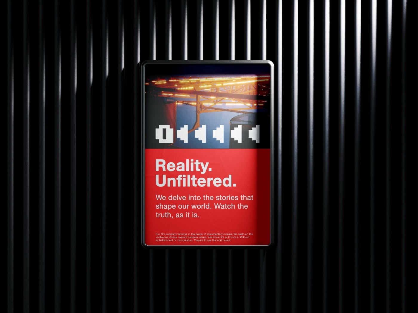
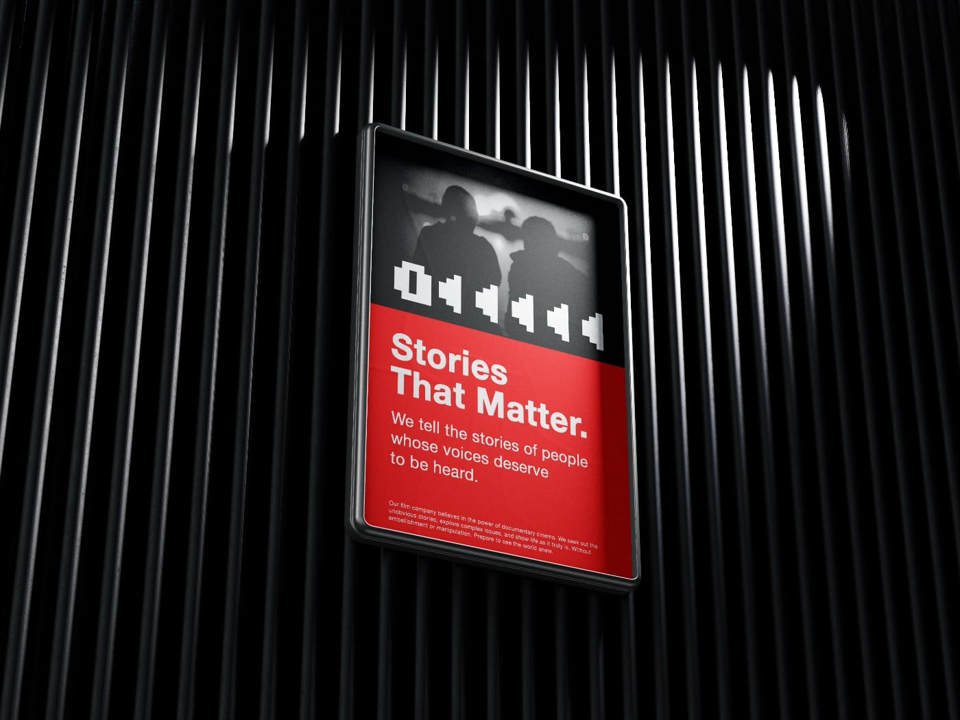
My task was to create the visual identity for LA NOTE, a digital cultural publication focused on contemporary art, exhibitions, photography, and the emerging artistic scenes of Paris. The project was conceived as a subscription-based media platform with a clear editorial rhythm, where each issue is built not around the news cycle, but around a single theme, a single observation, or a single cultural shift. From the outset, the visual language was intended to convey not decoration, but focus, precision, and editorial rigor.

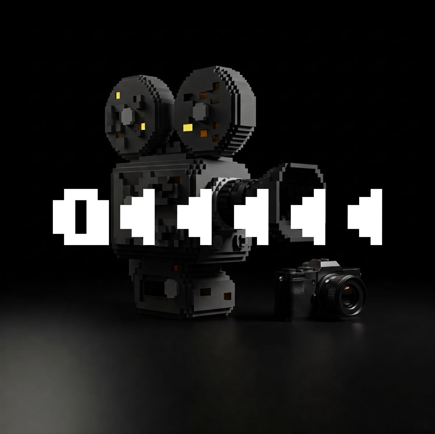
Initially, the client expected a more refined, distinctly French-style logo, with serifs and a recognizable Parisian cultural tone. I proposed a different approach and built the mark around dense typography, rhythm, and the discipline of print layout. This led to a logo in which the name merges with abstract lines of text, immediately setting the tone for the publication.

The LA NOTE logo, featuring bold black lettering and horizontal lines.

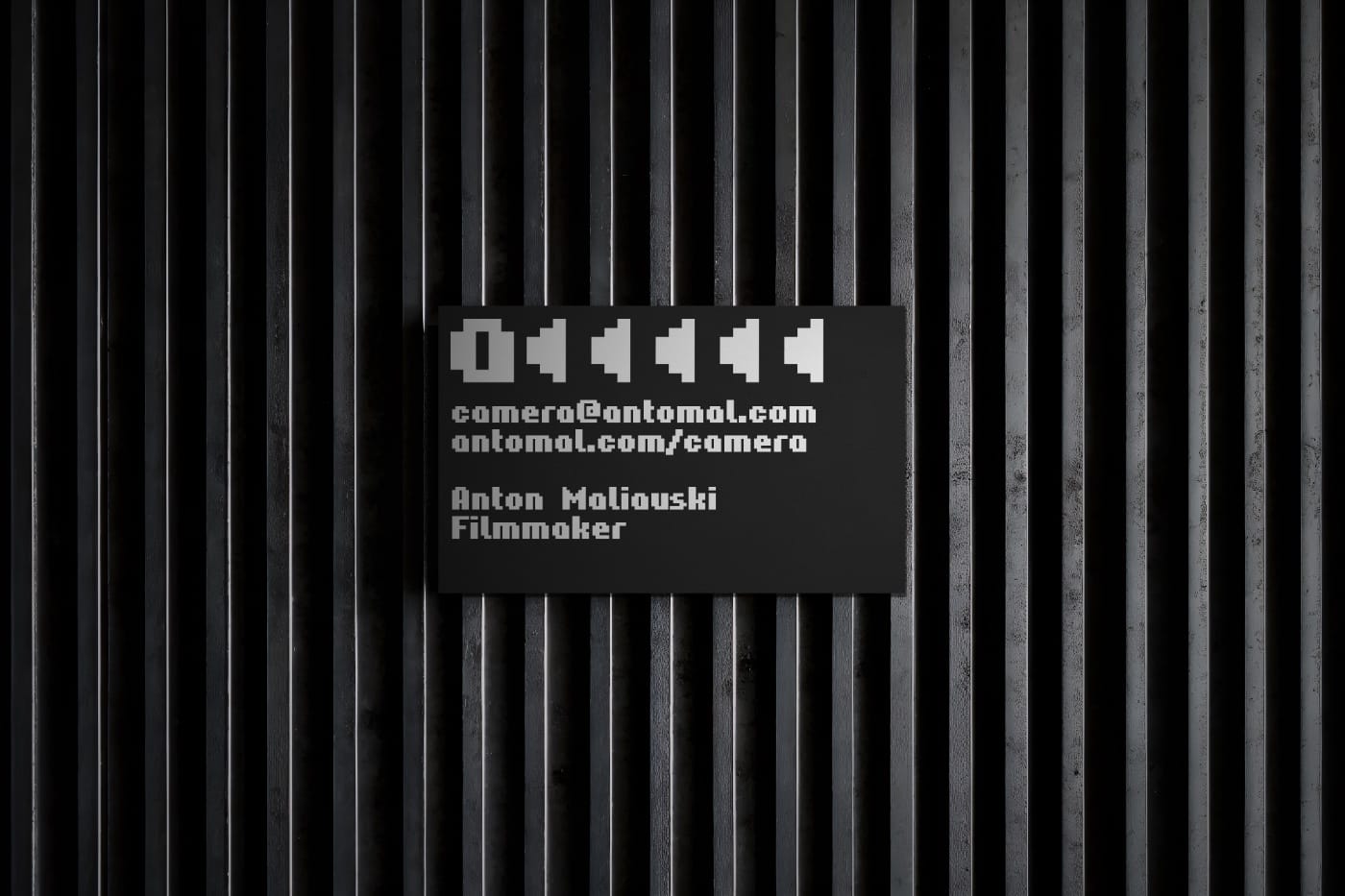
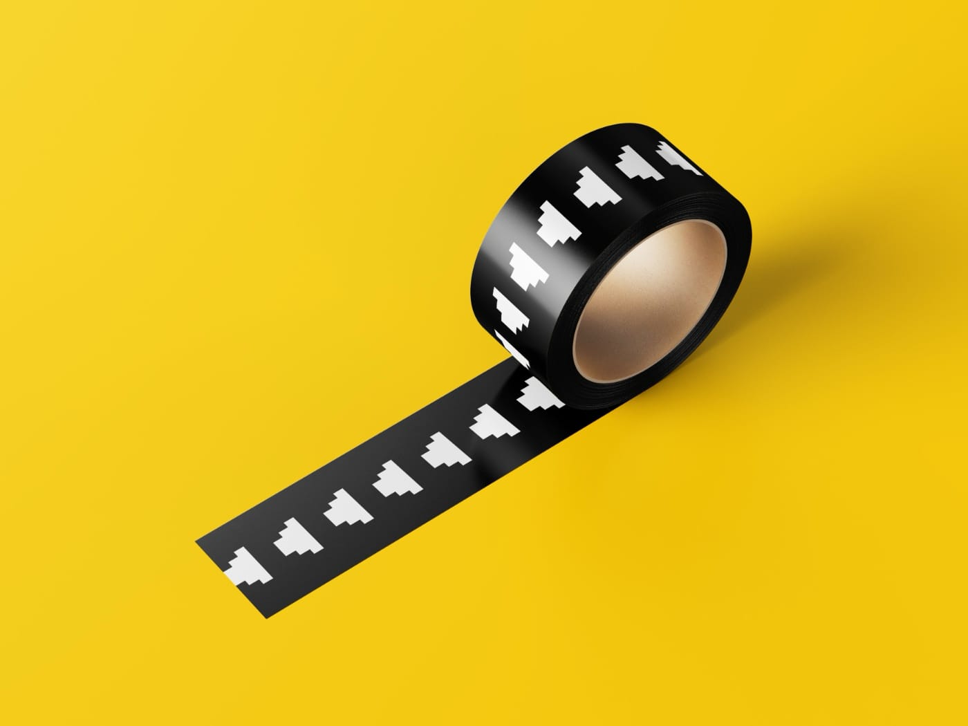
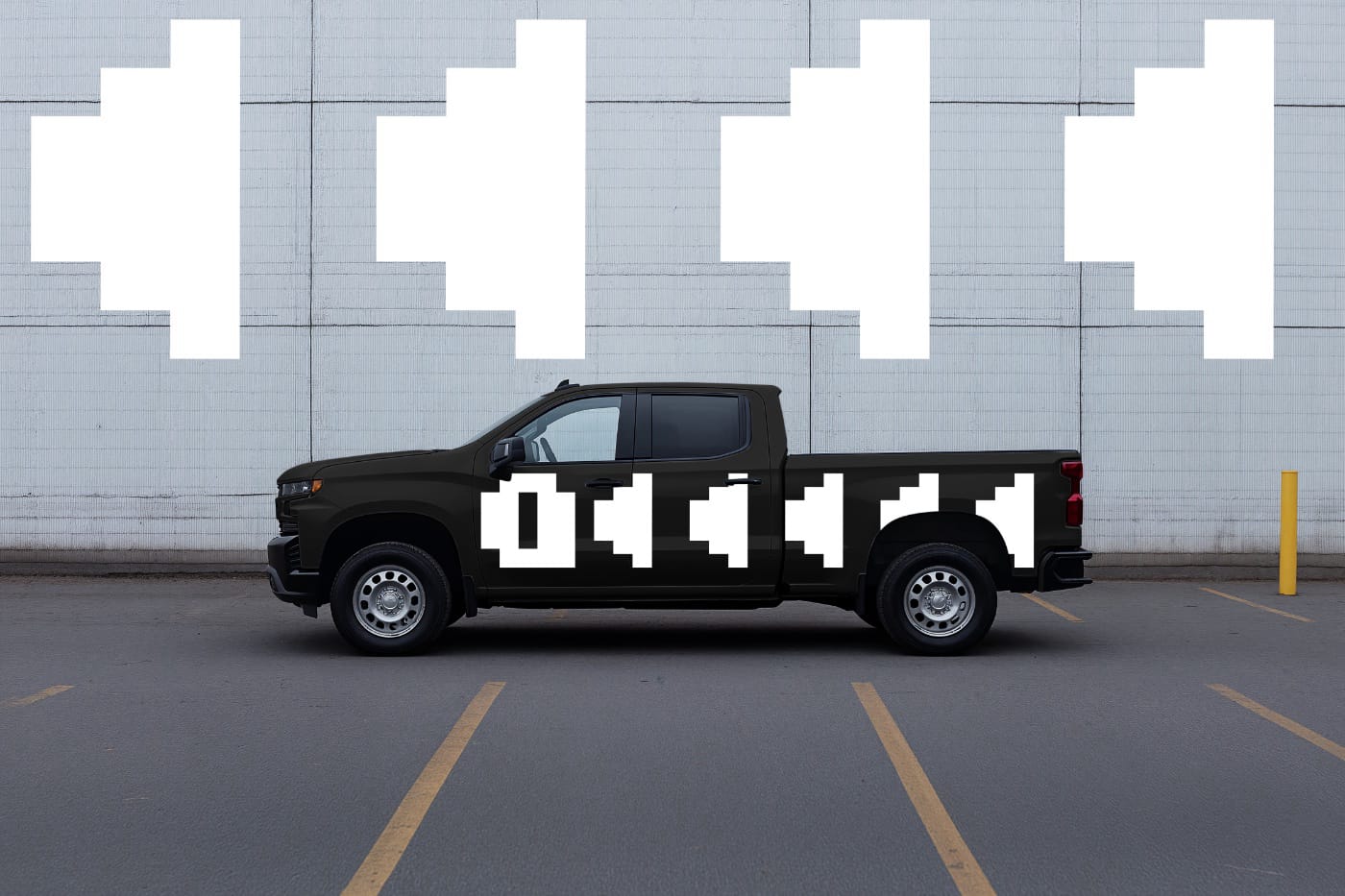
The next task was to reduce the mark without losing its character. The shortened version was created for situations where the full logo would be impossible or impractical to use: in limited space, at small sizes, and across more compact formats. At the same time, it was important to me that it would not feel like a simplified symbol, but would retain the core elements, structure, and rigor of the original solution. As a result, the reduced version works as an independent part of the system while preserving the character of the main mark.

The abbreviated LN logo, with a horizontal line beneath the letters on a white background.
Short version of the logo

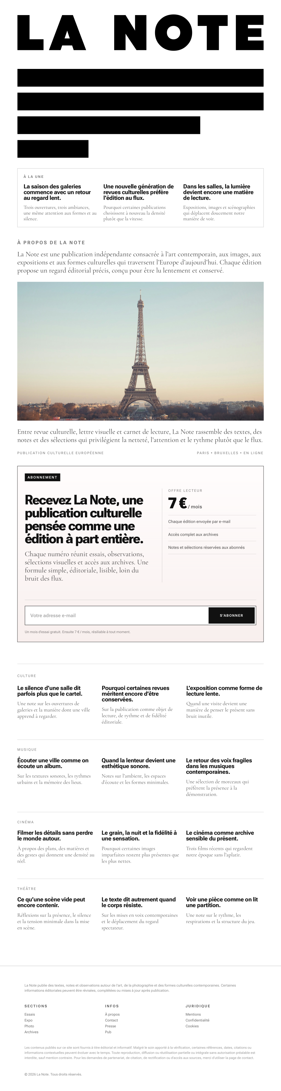
After creating the mark, I translated this logic into the publication’s homepage. Here, the visual identity unfolds more fully and operates not only through the logo, but through the editorial structure itself. Article previews, the introductory block about the publication, a strong visual focal point, sections, and subscription are brought together into a single, coherent system. It was important to me that the homepage would not simply present LA NOTE, but immediately show how the publication is structured, what kinds of themes it engages with, and what reading rhythm it offers.

Against the backdrop of the Eiffel Tower, the LA NOTE title appears alongside subscription information for the publication.
Homepage of the publication
March 4, 2026
[С01 → D01]

I designed a logo for my personal media archive — Sirius.

Sirius Logo
Sirius Logo
Sirius Logo
February 9, 2026
[С01 → D01]

Another small tool for my workspace. And one more logo.

Iskra logo
December 24, 2025

I created a small tool for my workspace and decided to design a logo for it. It matters to me that even a utilitarian thing has a simple, recognizable cover: in the Obsidian interface, in the repository, and in the portfolio, the project immediately comes together as a coherent object instead of looking like a collection of files.

AI ALT plugin logo on a black background.

This is not about a brand or a service, but about a neat working tool. There is a calm version for everyday use, and an accent red one for moments when you want to present the project as a standalone artifact.

AI Alt plugin logo on a red background.
September 20, 2025
[С01 → D01]

In 2022 my friends and I created a small men’s Telegram chat. A private place where you could drop something interesting, share news, arrange meetings, or argue, finally. We launched it during one of our gatherings in Minsk — spontaneously, in just a couple of minutes. There were no ideas for a name. Why not just put a fruit emoji 🍑 instead of text? Perfect.

For three years we didn’t touch or change anything. It worked well enough. This year I decided to play with the group’s visual identity using AI. The task was simple: to pull the peach out of the emoji world into reality.

First I drew our main character. Now it’s an image you can use as an avatar, send to friends, print, and even hang in a frame.

Illustration for the men’s chat: peach
Peach — the main symbol of our chat
Screenshot of our group’s main page
This is what our fruit chat now looks like

But of course I didn’t stop there. I created a boyfriend for our peach so it wouldn’t be lonely. After all, it’s good when fruits have friends.

Illustration for the men’s chat: banana
Banana — the boyfriend of our peach
April 29, 2025
[С02 → D02]

I’m making movies.

camera.antomal.com - logo on image
camera.antomal.com - logo
camera.antomal.com - business card
camera.antomal.com - logo (long)
camera.antomal.com - pattern on the photo
camera.antomal.com - scotch tape
camera.antomal.com - logo
camera.antomal.com - Advertising Banner
camera.antomal.com - car

July 6, 2024

Architectural design app identity.

lyrs identity
lyrs identity
Использоватн шрифт «Inter»
June 23, 2024
[С01 → D01]
Favourite

The task was to create a brand identity for a cargo delivery company. Transportation companies today have a similar style, do not stand out and are not memorable. For example, in Russia (and the CIS countries), many transportation companies are called “Transauto”, “Transtechtsal”, etc. I wanted the name to stand out, reflecting the delivery process - from point A to point B.

Identity “A — B”
July 4, 2023
Favourite

Deadlines are abstract concepts that are represented by calendar events or phone reminders. But what if we could make them real? I came up with a device (and created its logo) that has only one function: to show deadlines.

DEADLINER logo
DEADLINER

« Earlier
Later »