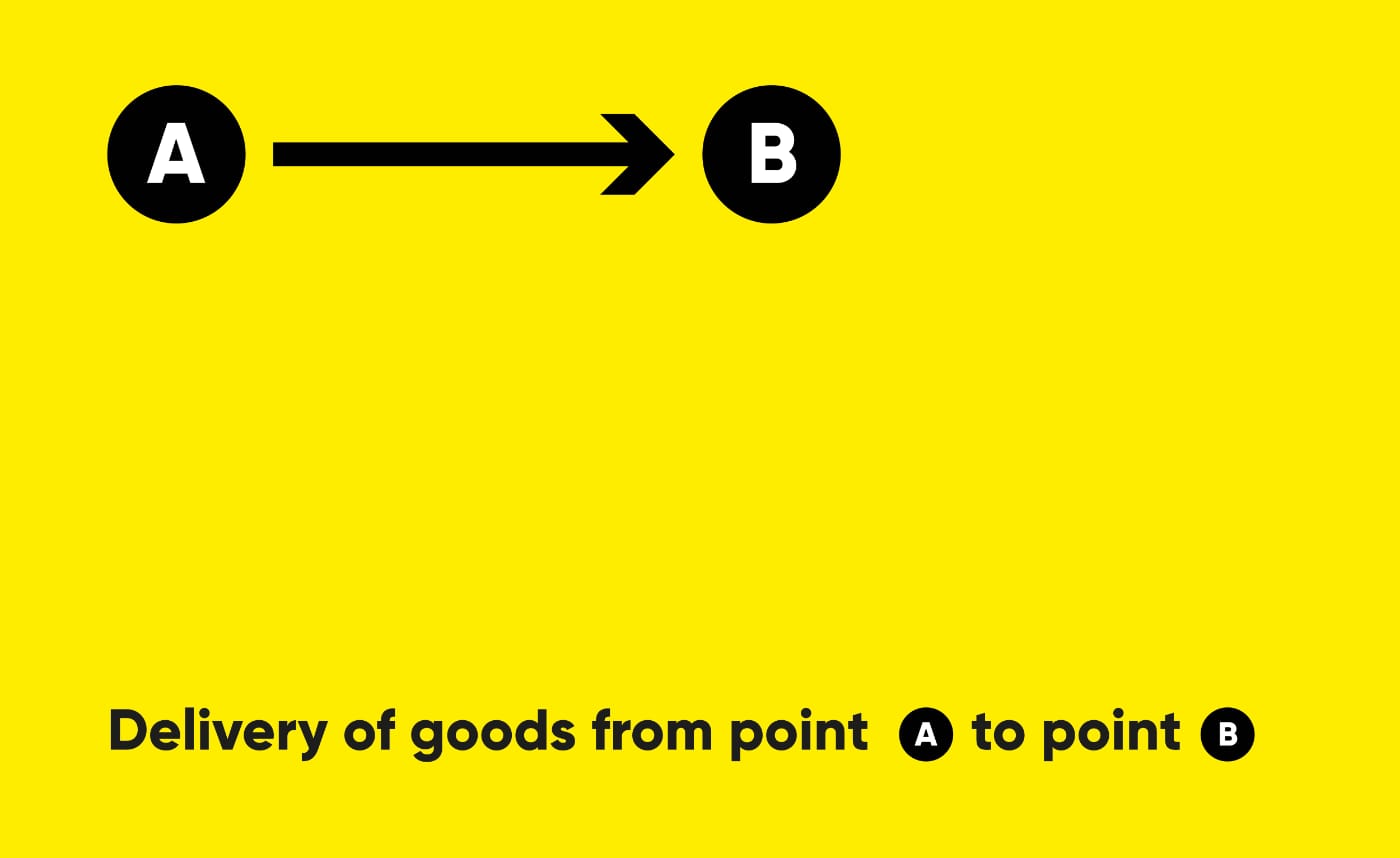
The task was to create a brand identity for a cargo delivery company. Transportation companies today have a similar style, do not stand out and are not memorable. For example, in Russia (and the CIS countries), many transportation companies are called “Transauto”, “Transtechtsal”, etc. I wanted the name to stand out, reflecting the delivery process - from point A to point B.
We live in an age of stupidity, sarcasm, irony (and self-irony). The age of “yellow masks”.
I haven’t done poster graphics for a long time; I decided to start again this year. 😜
Yesterday I received a letter from Pika in the mail… Who is Pika and why is she (he) writing to me. The letter contains congratulations - cool! It’s just not happy. Everything must be on time. Having visited the site, I remembered what Pika is, but now I don’t need it, because “a spoon is expensive for dinner.”
Invitation letter to the PikaI think there are too many waiting lists. Instead of immediately building a wall between the product and the user, it is better to create a friendly account - when you don’t even need a password to log in.
And if you decide to send the user such a letter, again interest him in the product. Well, what is it? A few lines of text, and the button is somewhere unknown…
I’ve noticed that I get the most satisfaction from systemic change. For example, I added a new feature, fixed something on the site, drew a logo, corporate identity or a key interface element. These are changes that affect not one element (section) of the system, but the entire system as a whole or its larger part (section, branch).
I decided to go to the web version of Threads, but did not expect to see anything new - “Subscribe!”, buttons and menus, more buttons, an important switch, and a lot of important legal information.
But I’m shocked, honestly!
Home screen. Feed.ProfileCreating a messageHere, for comparison, is what I see when I go to the X (Twitter) web interface.
Everything is here at once: creating a message (otherwise I might go somewhere), a feed, recommendations, a menu (so you don’t miss), messages, a call to subscribe, legal information (so you don’t get bored).
Unfortunately, I think that it won’t be this good for long and soon designers will start adding more and more of everything. Now minimalism supports the main function of Threads - it allows you to read and write - design in the user’s world. I can see how quickly Meta will spoil it.
If anyone doesn’t remember, this is what the Lebedev Studio logos looked like a long time ago (on the left) and recently (on the right). Barcode styling, continuity - everything is cool!
And now the new episode of the series “Degradation” - (Spoiler alert!) everyone is exchanging good logos for dull shit. But I sincerely don’t understand why.
Deadlines are abstract concepts that are represented by calendar events or phone reminders. But what if we could make them real? I came up with a device (and created its logo) that has only one function: to show deadlines.