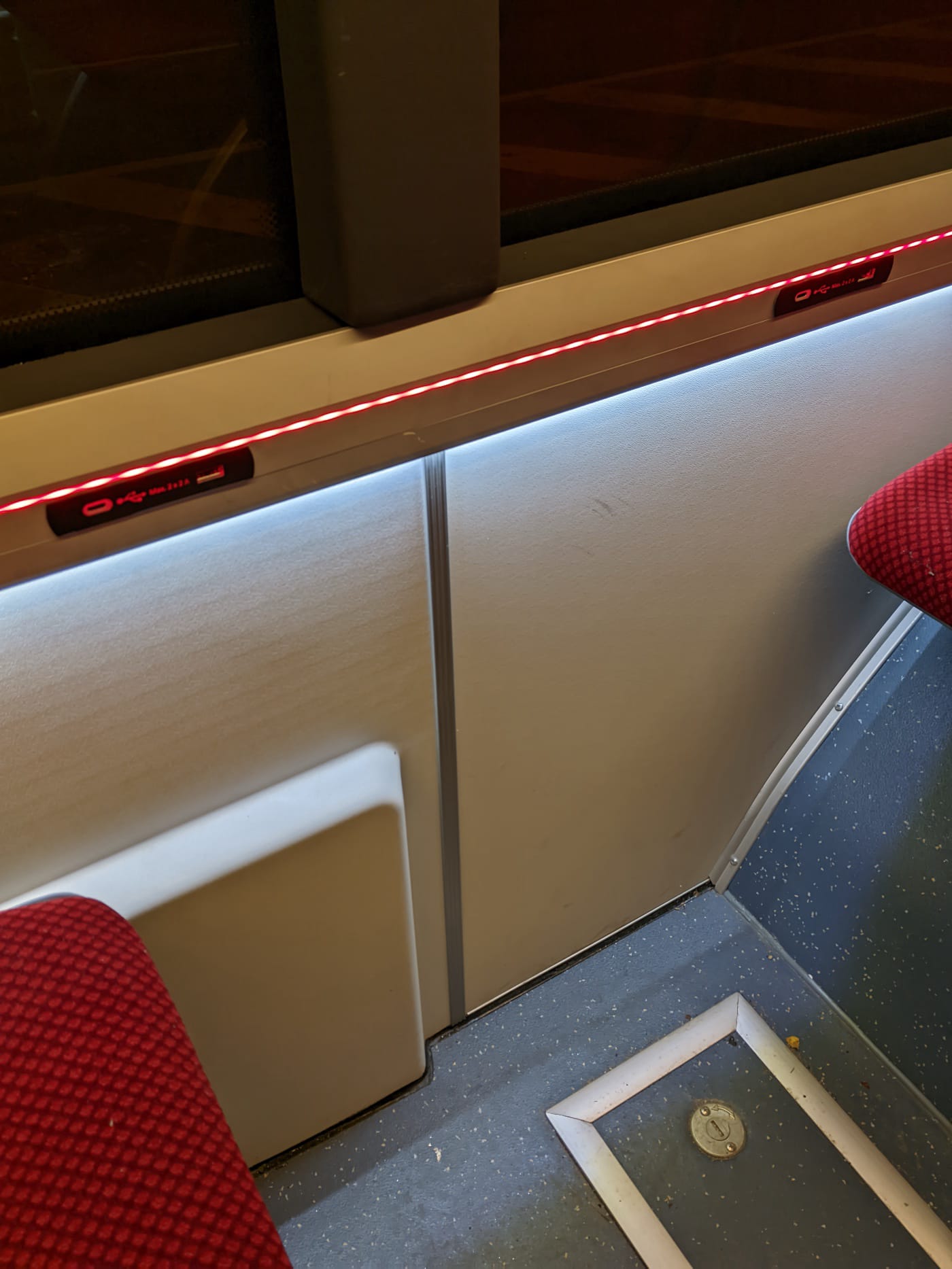
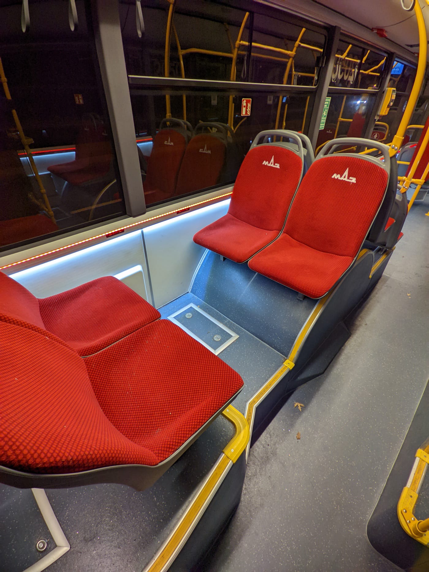
Recently I already wrote about the lighting that pretends. I had a feeling they’d outdo themselves. And just the other day, I was “lucky” (and there’s really no other word for it) to ride yet another version — or configuration — of this miracle of engineering and design thinking. Are you ready? They’ve added a red LED strip along the windows. Cool, right? Innovation!
But that’s not all.
Now there’s a red strip too!
Huh? What do you think of this design? I even had to squint from how bright the interior was.
Now, seriously.
When there’s no taste, everything slowly turns into a Christmas tree.
Unfortunately, that’s the case here now.
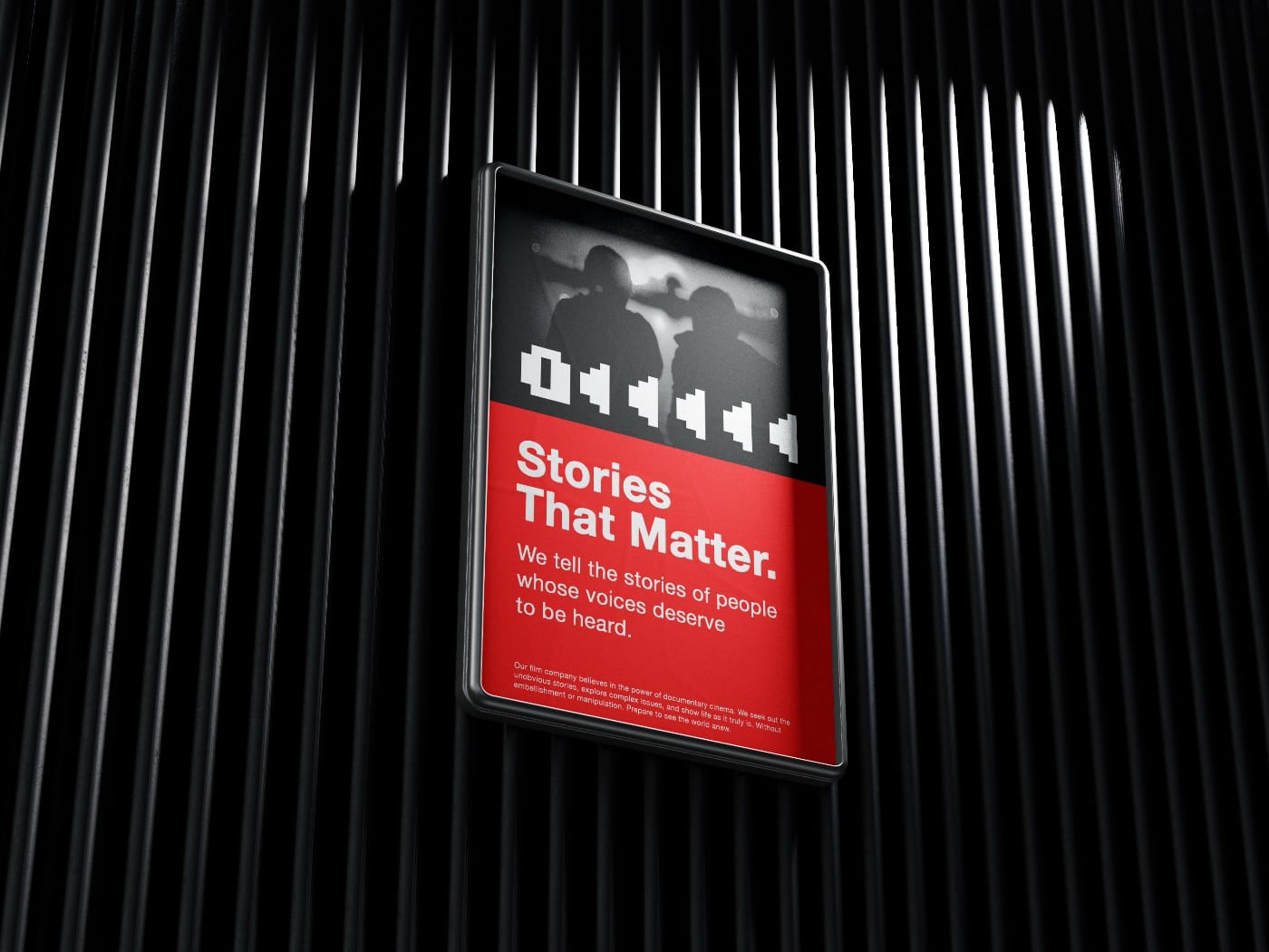
Recently I stumbled upon the idea of liveness (see “Liveness” by Venkatesh Rao). I think it’s better to approach such ideas gradually — to let them unfold and notice how they echo in reality. I’m not yet sure it fits here, but I’ll see later. For now — a small step in that direction.
Why do modern trolleybuses have LED strips running along the windows? Stylish? Fresh?
I don’t think good design has to be invisible — but it depends on where we apply it.
In a Mercedes or a Tesla, that kind of lighting works: motion, speed, space as an extension of yourself — dynamic, successful, hair blowing in the wind, your favorite song playing — welcome to the future!
Meanwhile, somewhere in an unheated office of a design department, a cheerful young designer proudly presents his project, pointing out all the stylish details. The designer has done his job well: the task was to make the trolleybus interior modern. Time to issue a bonus — and maybe a long-awaited can of government-issued condensed milk, as a reward for obedience.
Light for show, not for life
But let’s go back to the trolleybus. Dirt, slush, sleepy people coming back from work. This “freshness” feels out of place here, and it only highlights the gray reality. Practical use? Only if the lights help you find what you dropped, or notice that your shoes are covered in chemical slush. Venkatesh Rao has a notion called “liveness” — when a thing truly lives instead of pretending. In public transport, it’s the kind of light that helps you see and read, clear signs, comfortable handles — things that serve people and, over time, become part of the route’s history, its continuation. It turns out that this lighting isn’t a continuation of the story but a glitch: an element that carries nothing forward on its own. I’m not even talking about the fact that the LED strips will need replacing soon — knowing the quality of things around here, that’ll have to happen very soon. Will anyone bother? Of course not.
Yes, we need progress. Of course things should improve, become more beautiful and relevant. But when we create, it’s important to consider context, to find the link between past and future, and to have the courage to say “No” to everything unnecessary.
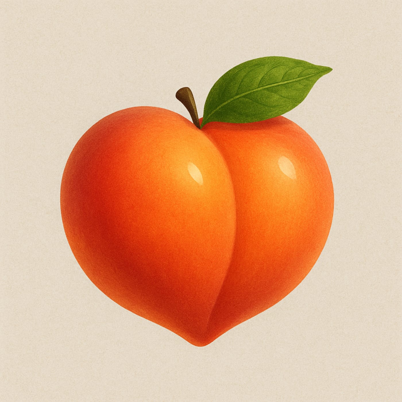
In 2022 my friends and I created a small men’s Telegram chat. A private place where you could drop something interesting, share news, arrange meetings, or argue, finally. We launched it during one of our gatherings in Minsk — spontaneously, in just a couple of minutes. There were no ideas for a name. Why not just put a fruit emoji 🍑 instead of text? Perfect.
For three years we didn’t touch or change anything. It worked well enough. This year I decided to play with the group’s visual identity using AI. The task was simple: to pull the peach out of the emoji world into reality.
First I drew our main character. Now it’s an image you can use as an avatar, send to friends, print, and even hang in a frame.
Peach — the main symbol of our chatThis is what our fruit chat now looks like
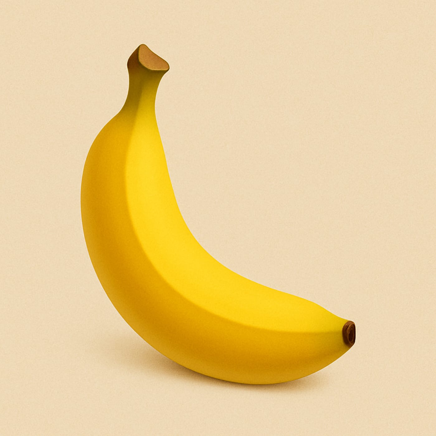
But of course I didn’t stop there. I created a boyfriend for our peach so it wouldn’t be lonely. After all, it’s good when fruits have friends.
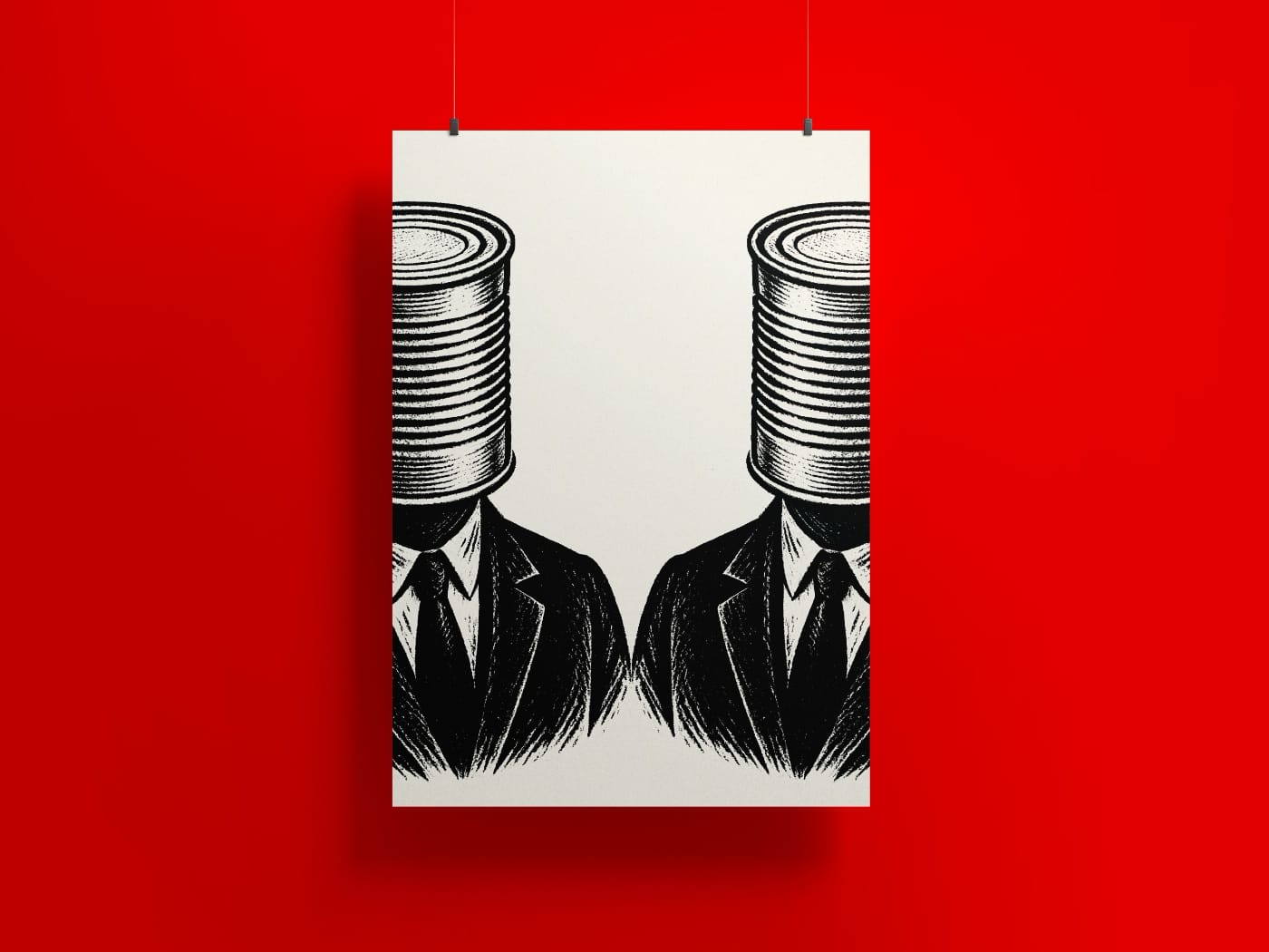
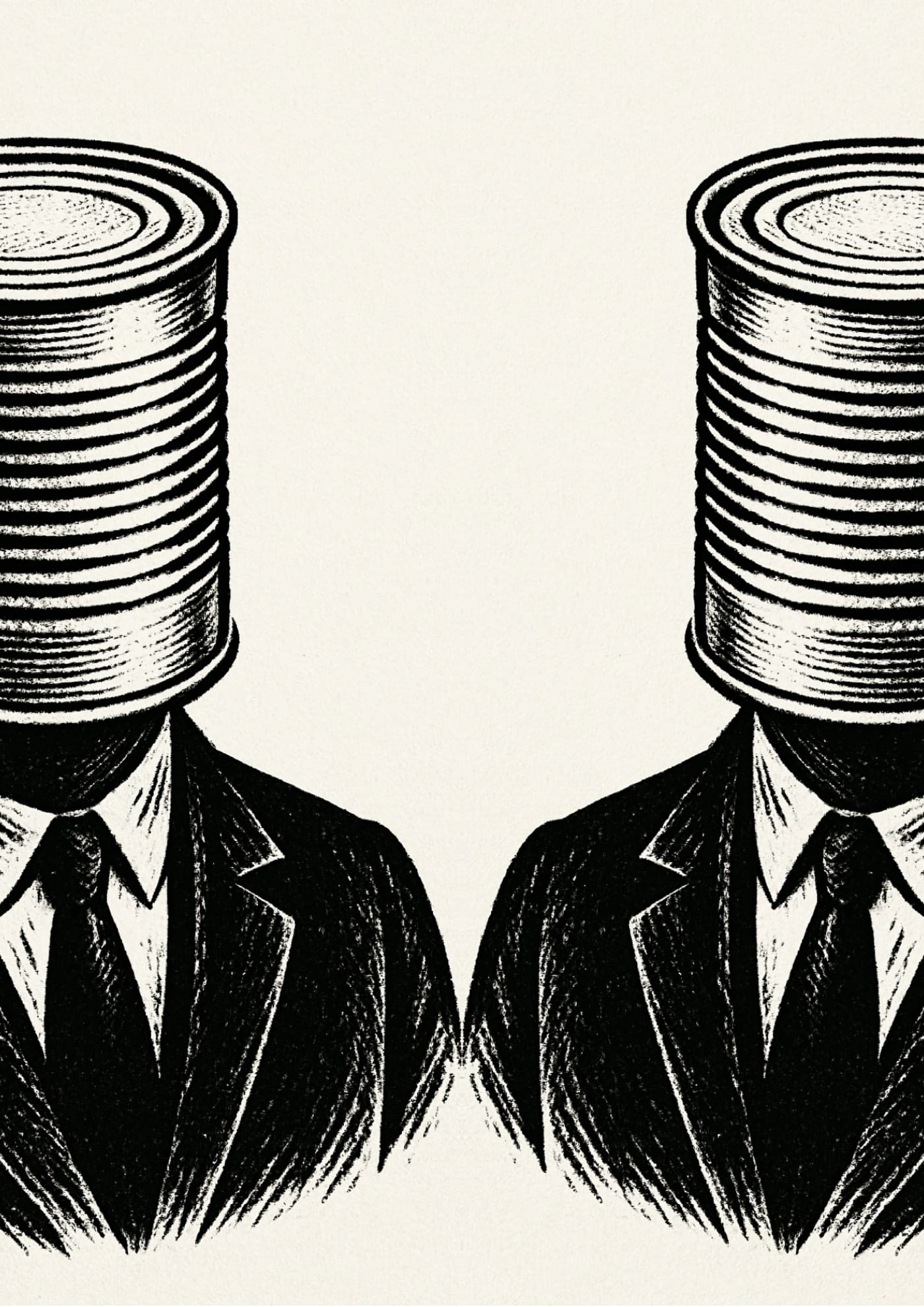
This poster is a reflection on the standardization of thought, on the habit of hiding behind ready-made forms. On people who choose convenient packaging over living presence.
Canned — a symbol of how we preserve ourselves: sealed, sterile, faceless. But inside — there’s still a human. Maybe.
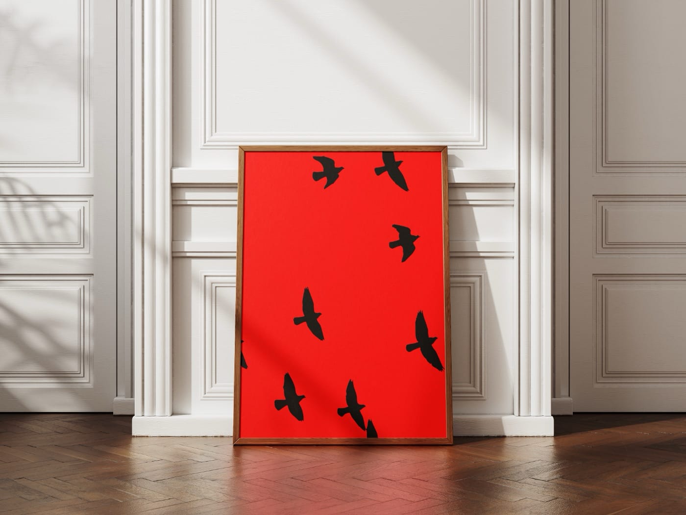
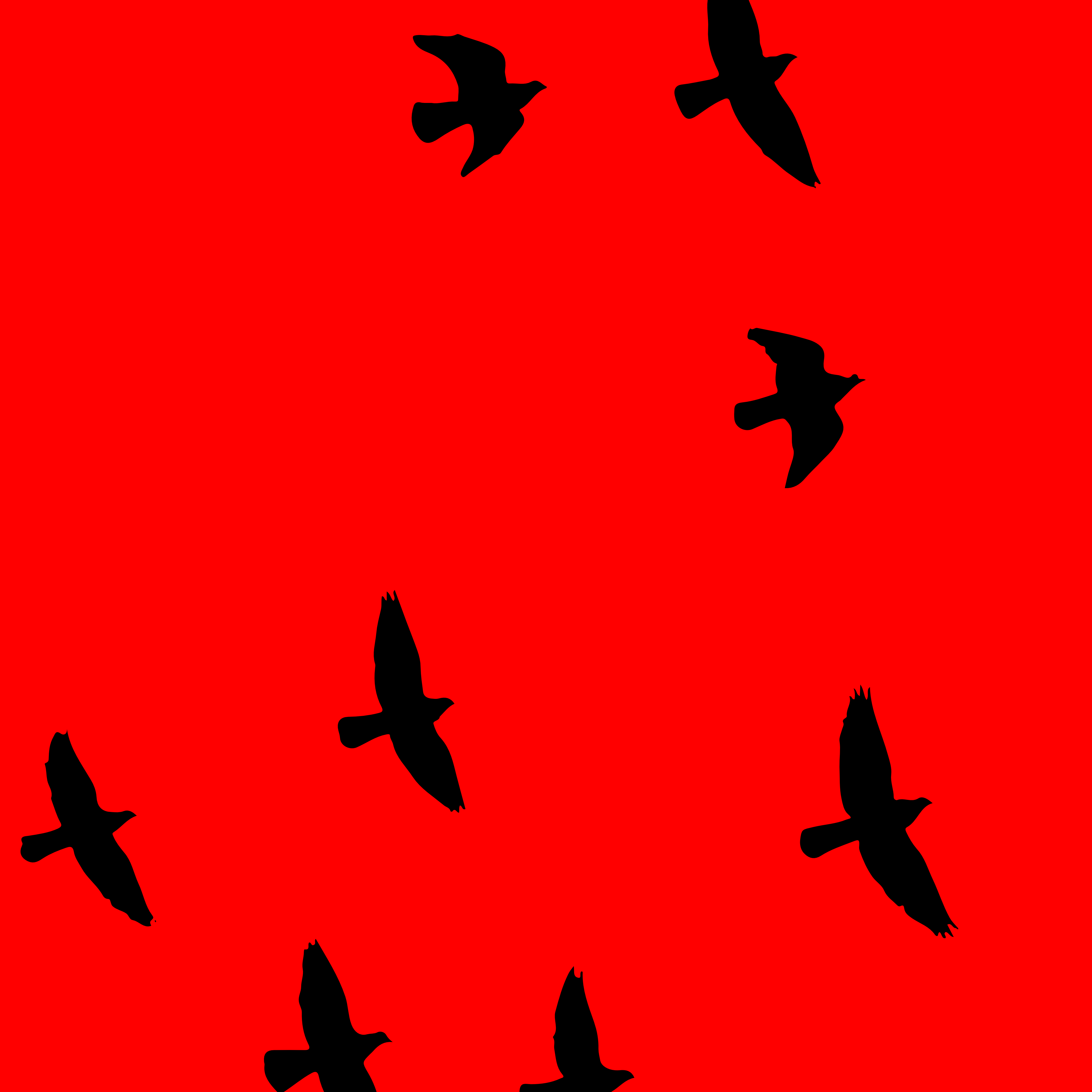
Sorrows like black birds circle above us. You can’t accept it, but something has changed right now. You revel in the beauty of flight. The grandeur and silent revolution of this moment are mesmerizing.