June 28, 2026
[С01 → D01]
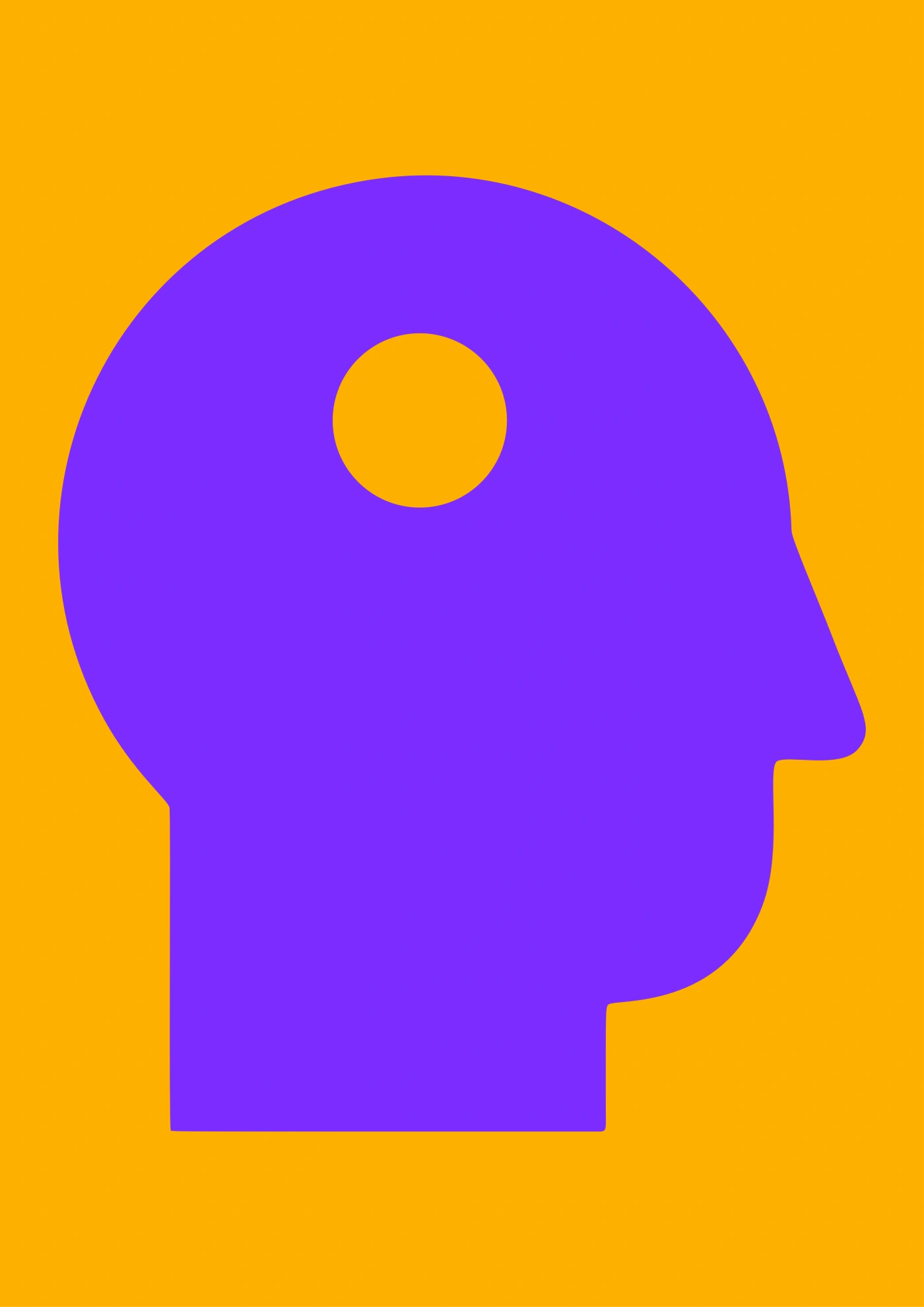
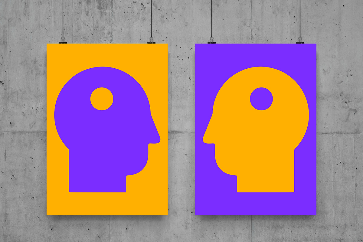
A visual reflection on the inner and the outer.
Two silhouettes.
Two subjects.
In each, a reflection of the world.
In each, a reflection of the other.
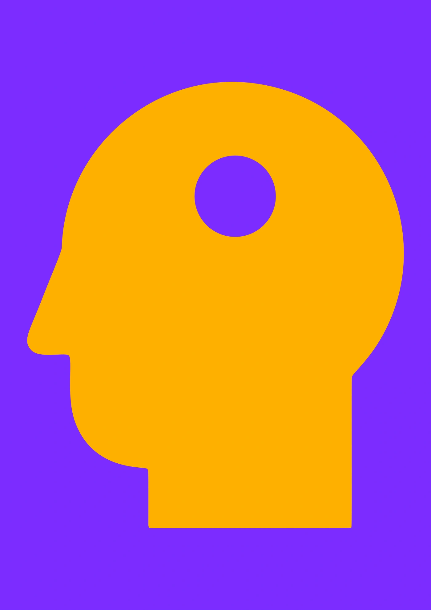
A visual reflection on the inner and the outer.
Two silhouettes.
Two subjects.
In each, a reflection of the world.
In each, a reflection of the other.
Title, concept, and visual identity of Denis Orlov’s novel.
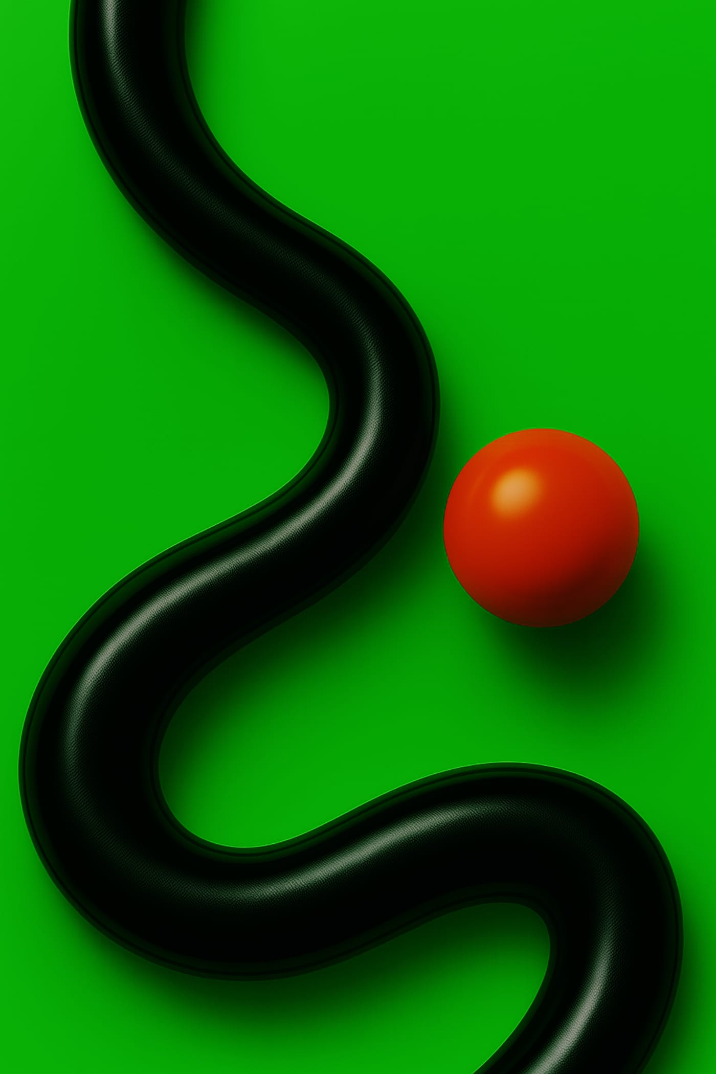
This is a novel about a man who follows an elusive goal. His movement becomes a form of existence and a way not to disappear. He lives in a new environment where the familiar has lost its shape. The world around him loses density, turning into a network of reflections and surfaces. Reality feels like a program, and its glitch holds the memory of the past. He is not looking for an answer but for the sensation of purpose, like a snake reaching toward a point that cannot be caught.
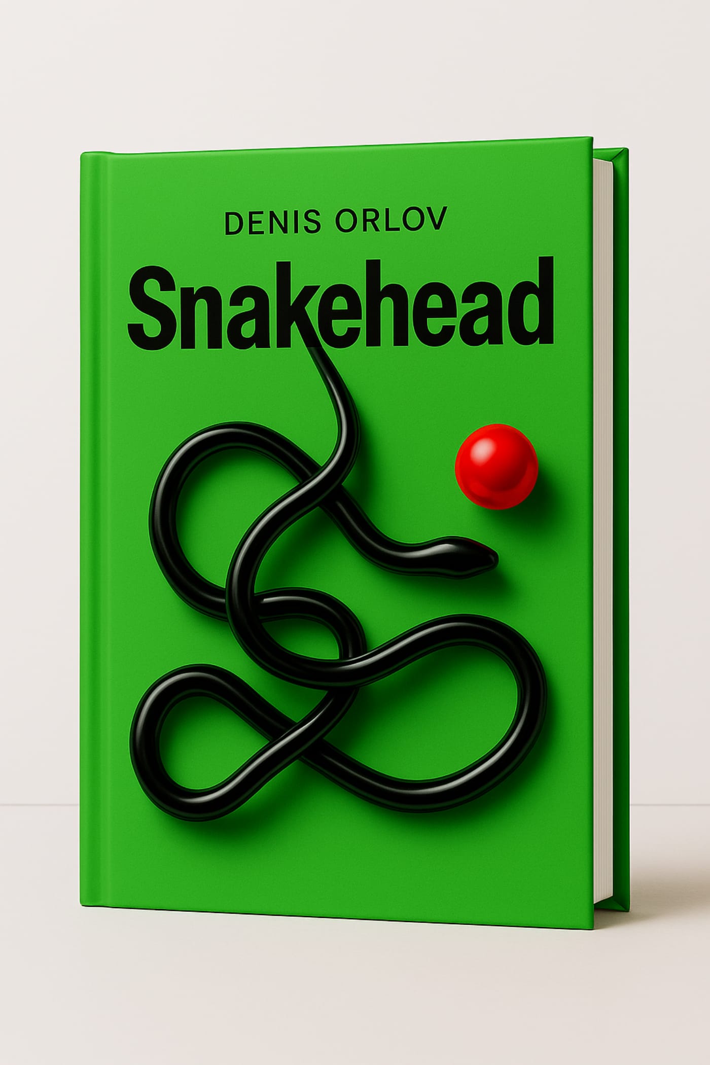
Usually a designer joins the process when the idea is already complete and only the text needs to be shaped. Here it’s different. At an early stage, we work with the author to identify the story’s core, define its axis and title. From this foundation emerges the concept, which evolves into a visual language and image that set the direction for the novel.
The cover and visual imagery are not decoration. They are part of the statement, the same line that resonates in the text. The visual code makes meaning visible, giving the story form and a point of entry for the reader.
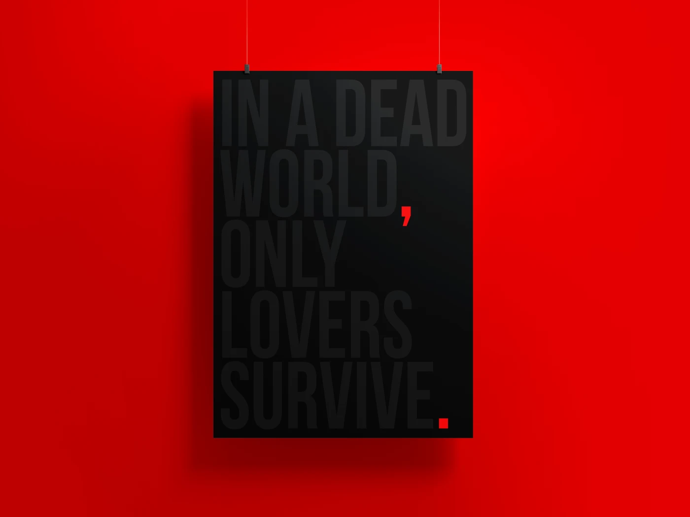
I noticed that this poster behaves in a very interesting way on a smartphone screen.
On a sunny day, I can barely see the text on it. To see it, you have to get the angle right. Point the screen straight at the sun, wait for the light sensor to kick in and for the screen to light up at maximum brightness. Only then does the barely discernible text begin to appear. Of course, this works if auto-brightness is enabled. Indoors or at night, on the other hand, the text becomes much more visible.
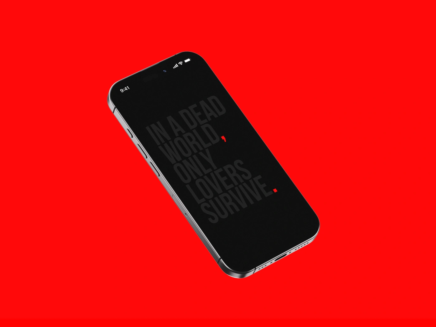
When I made this poster, I was not yet thinking of it as a digital object. I imagined it in physical space. For example, on matte paper, with the letters printed in a slightly glossier layer or made with some kind of embossing. You walk past the wall and suddenly notice that there is something on the poster. You come closer, and the text almost disappears. You look at it slightly from the side, and there it is again.
But it turned out that something similar happens on a screen. Digital space also has its own conditions. Light, brightness, sensors, the behavior of the device, the position of your hand, the time of day. The work begins to live a life of its own in an environment I had not originally accounted for.
I think we need to pay closer attention to how digital devices behave today. A smartphone, a TV screen, a chat with an artificial intelligence, virtual reality glasses. All of these have their own strangeness, their own sensors, their own small glitches and peculiarities.
And the better we notice this, the more precisely we can use this new space. Not just as a medium, but as part of the expression. Even if the meaning is very simple. Like on this poster.
I saw this pictogram in an underground passage and felt all of its pain.
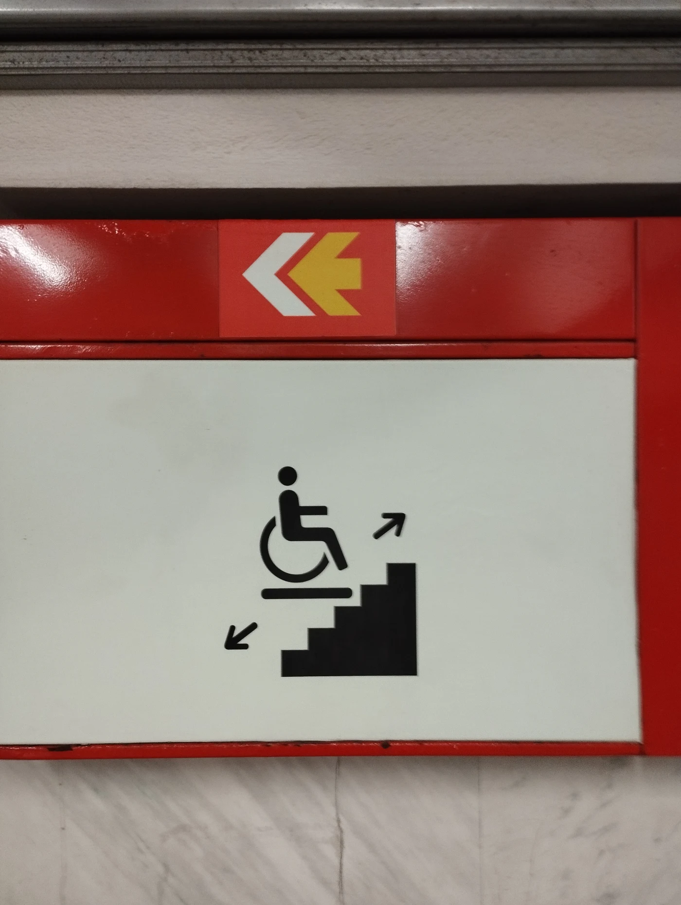
Honestly, I don’t know how to draw it better. I haven’t looked into the details or researched how signs like this are designed around the world. But what I see here scares me more than it reassures me.
There is a staircase here. These jagged steps are very prominent, very active. There is a wheelchair user on some kind of surface. But it is unclear how this surface is supposed to move along the steps, and why this movement should create any sense of safety.
I’m not saying the pictogram needs to show the entire mechanism. But it should contain at least the idea of smooth movement. Here, it doesn’t. The eye does not move upward with the platform. It trips over the steps.
The arrows look strange, too. They seem to live in a world of their own. It is unclear what exactly they are explaining. If the sign is located below, inside the passage, then the downward arrow no longer makes sense. The task is not to go even lower, but to get back up. Yes, I understand that there is standardization and that there are standard templates. But the standard should follow the meaning, not the other way around.
Formally, this pictogram has everything. Stairs. A wheelchair. Some kind of platform. Arrows. The logic seems to be assembled. But the meaning gets lost.
A pictogram of this kind should be a saving symbol. A sign that a person’s problem has been solved here. But this pictogram does not solve the problem. It creates a new puzzle. Where should this person go? What will move? How does it work? Is this person supposed to overcome this staircase?
I look at it and see not accessibility, but a barrier. Not “you will be lifted,” but “here are the stairs, good luck.”
This is a small scene of tension, not a sign of help.
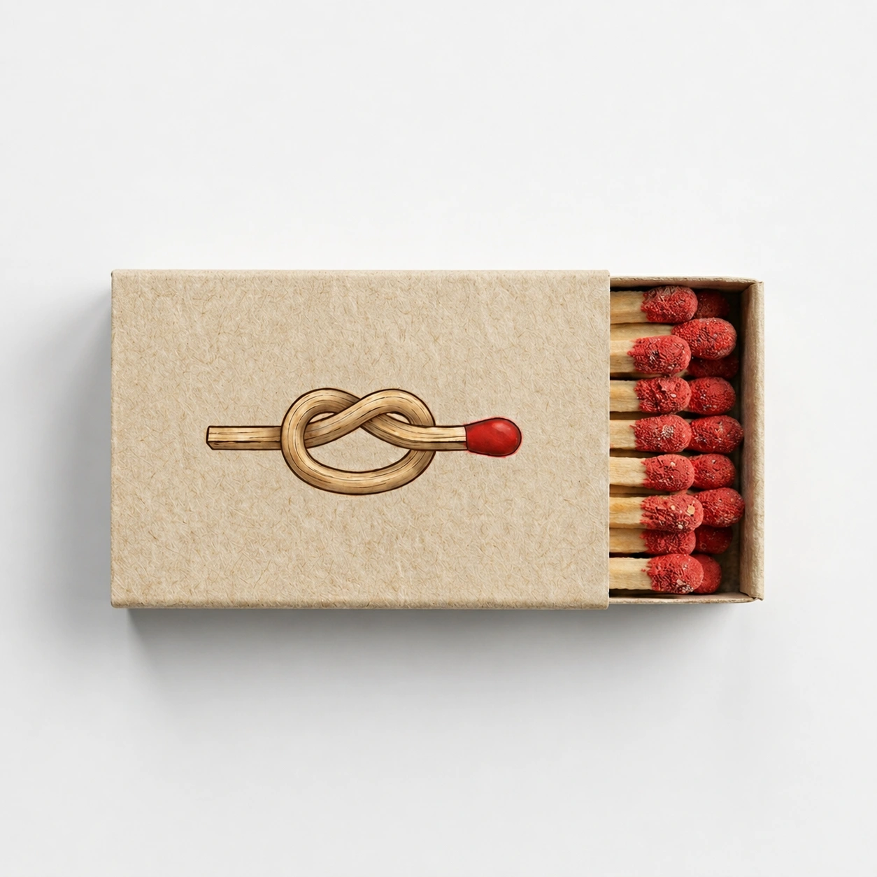
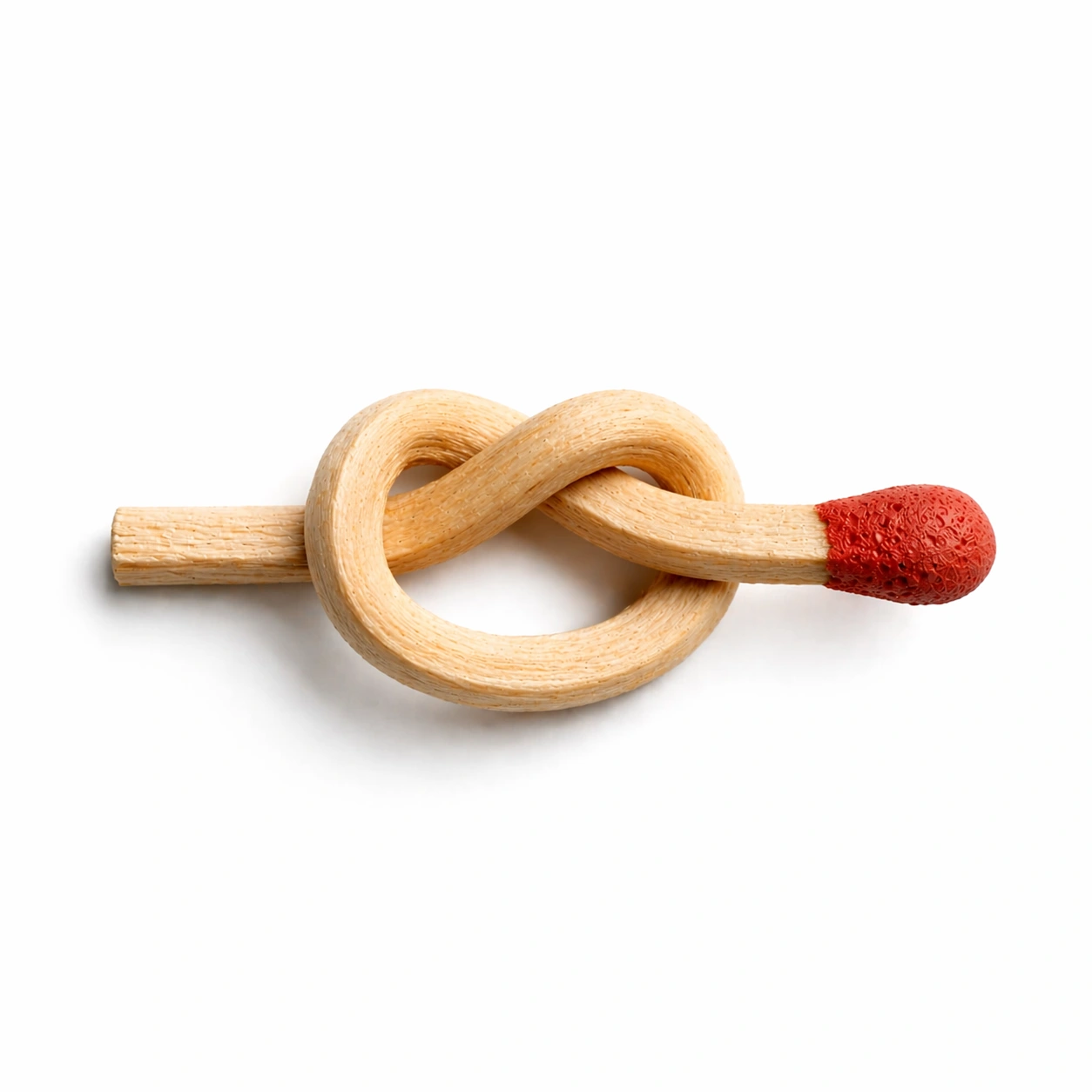
I wanted to make the packaging of an ordinary matchbox more noticeable and interesting. The visual idea is based on a match tied into a knot. I was interested in the paradox: a simple and familiar object begins to be perceived differently when its form becomes impossible.
Logo for an Obsidian plugin that processes and uploads images to my website. “Iskra” refers to the moment of a brief spark: a rapid transition from a local file to a processed and published result.
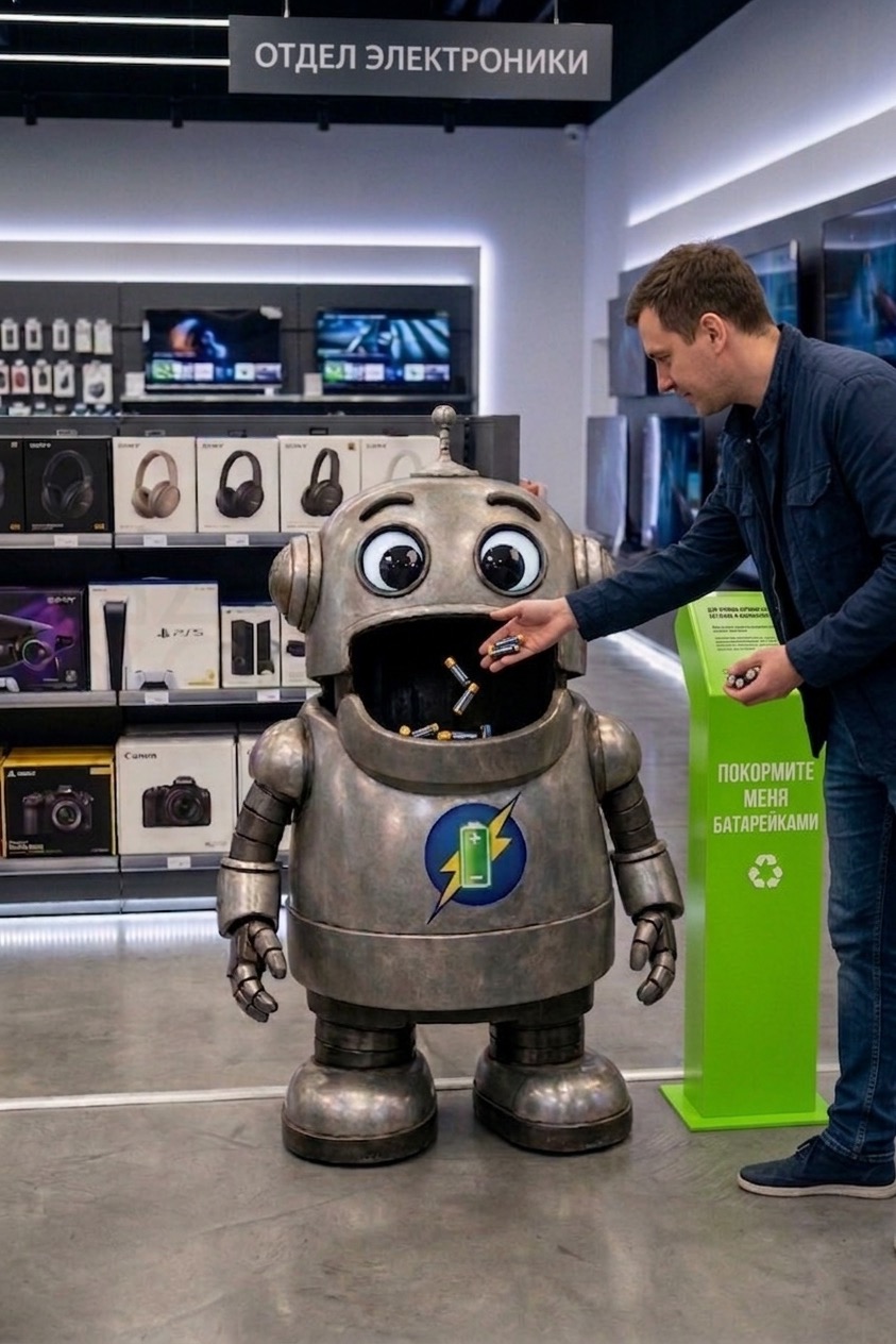
A typical battery collection container almost always looks like a technical necessity. It communicates its function, but it doesn’t attract attention. It can be placed in a store, accompanied by instructions and an environmental message, but the interaction itself still feels dull and impersonal. I wanted to turn an unnoticed, obligatory object into something people would want to approach.
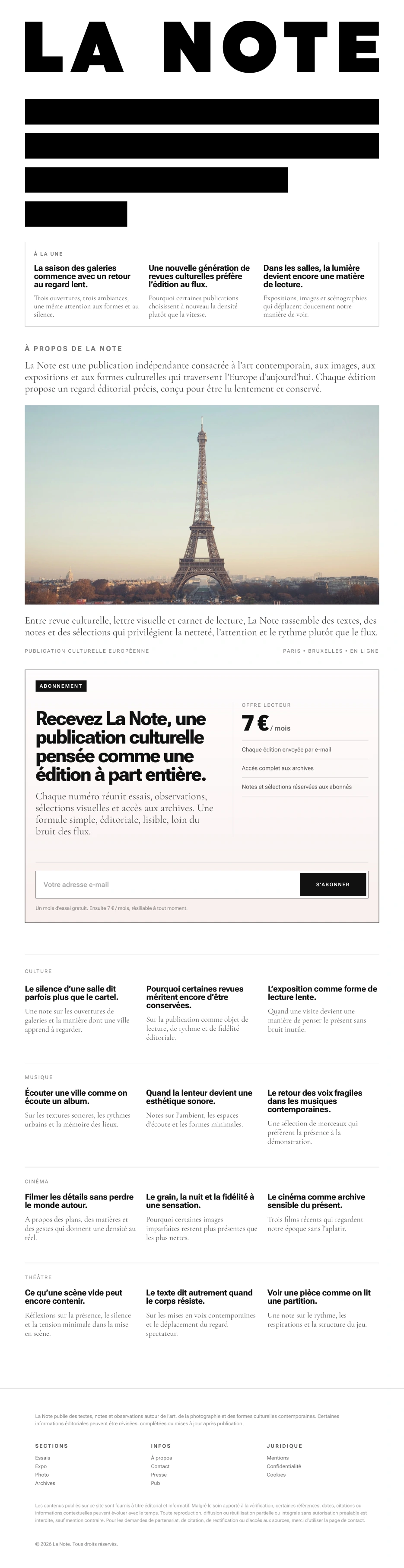
My task was to create the visual identity for LA NOTE, a digital cultural publication focused on contemporary art, exhibitions, photography, and the emerging artistic scenes of Paris. The project was conceived as a subscription-based media platform with a clear editorial rhythm, where each issue is built not around the news cycle, but around a single theme, a single observation, or a single cultural shift. From the outset, the visual language was intended to convey not decoration, but focus, precision, and editorial rigor.
Initially, the client expected a more refined, distinctly French-style logo, with serifs and a recognizable Parisian cultural tone. I proposed a different approach and built the mark around dense typography, rhythm, and the discipline of print layout. This led to a logo in which the name merges with abstract lines of text, immediately setting the tone for the publication.
The next task was to reduce the mark without losing its character. The shortened version was created for situations where the full logo would be impossible or impractical to use: in limited space, at small sizes, and across more compact formats. At the same time, it was important to me that it would not feel like a simplified symbol, but would retain the core elements, structure, and rigor of the original solution. As a result, the reduced version works as an independent part of the system while preserving the character of the main mark.
After creating the mark, I translated this logic into the publication’s homepage. Here, the visual identity unfolds more fully and operates not only through the logo, but through the editorial structure itself. Article previews, the introductory block about the publication, a strong visual focal point, sections, and subscription are brought together into a single, coherent system. It was important to me that the homepage would not simply present LA NOTE, but immediately show how the publication is structured, what kinds of themes it engages with, and what reading rhythm it offers.
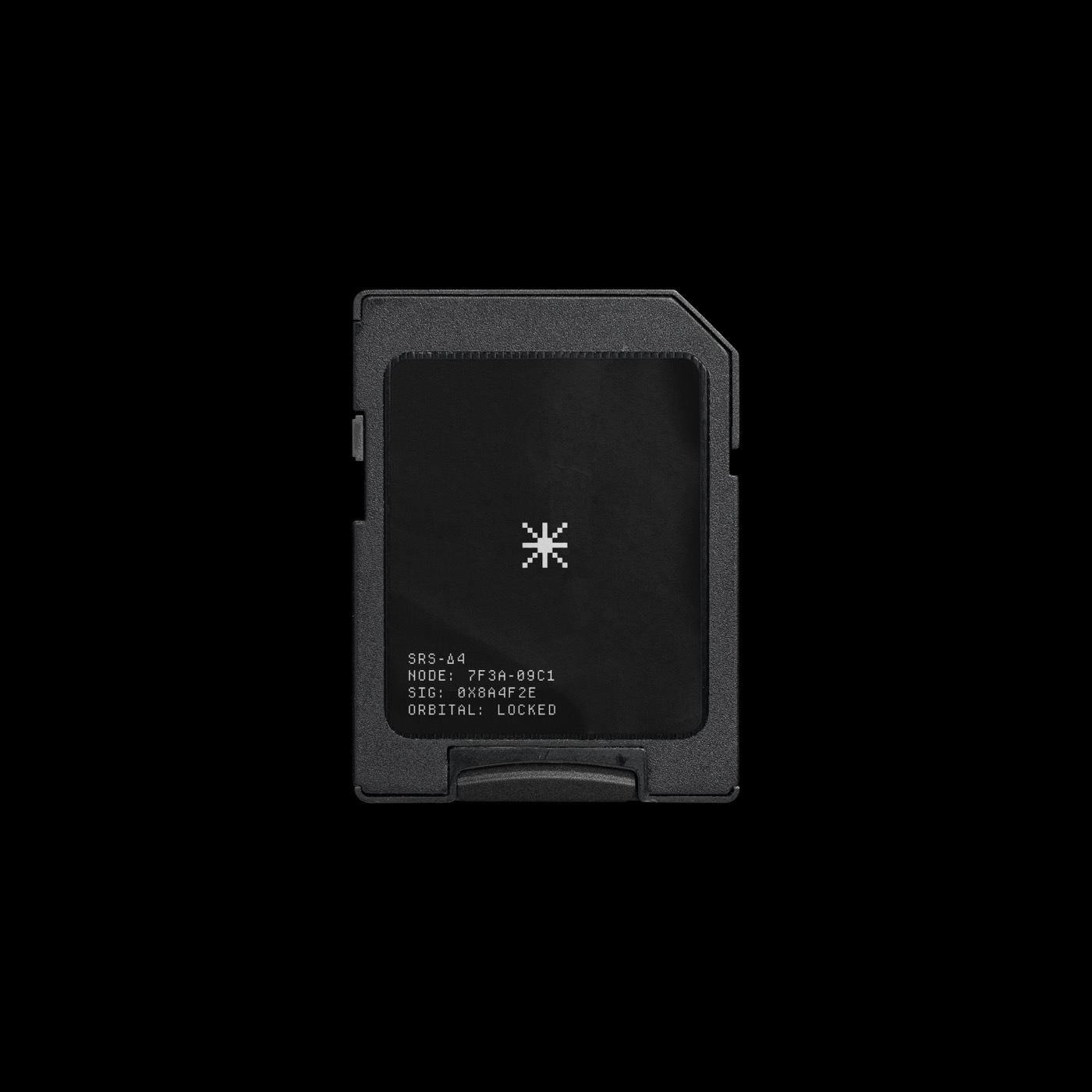
I designed a logo for my personal media archive — Sirius.