Anton Maliauski Anton Maliauski

Tags / City

RSS


I saw this pictogram in an underground passage and felt all of its pain.

A sign showing a person in a wheelchair, with arrows pointing toward a staircase and an exit.
An accessibility pictogram in an underground passage in Minsk.

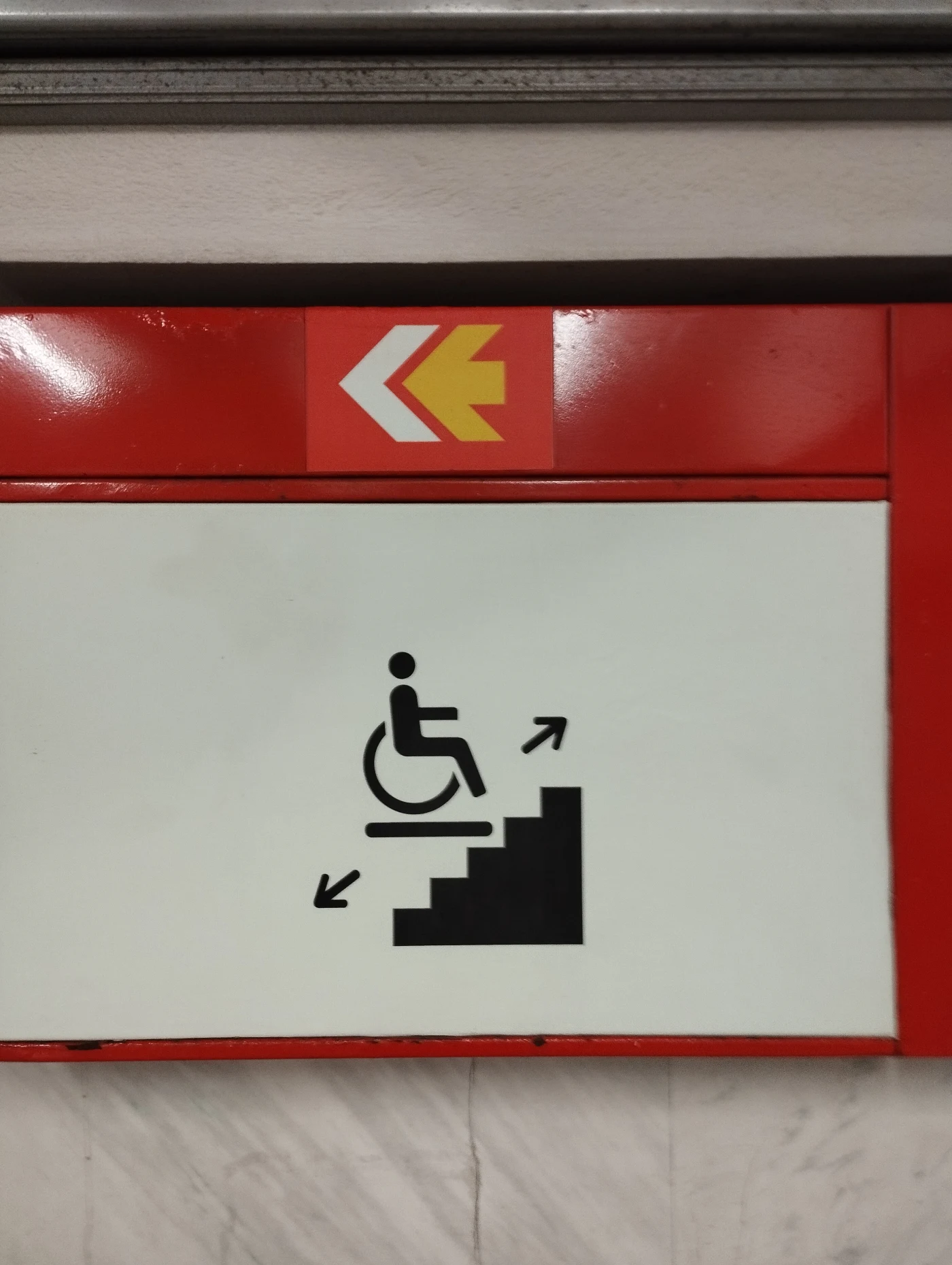
Honestly, I don’t know how to draw it better. I haven’t looked into the details or researched how signs like this are designed around the world. But what I see here scares me more than it reassures me.

There is a staircase here. These jagged steps are very prominent, very active. There is a wheelchair user on some kind of surface. But it is unclear how this surface is supposed to move along the steps, and why this movement should create any sense of safety.

I’m not saying the pictogram needs to show the entire mechanism. But it should contain at least the idea of smooth movement. Here, it doesn’t. The eye does not move upward with the platform. It trips over the steps.

The arrows look strange, too. They seem to live in a world of their own. It is unclear what exactly they are explaining. If the sign is located below, inside the passage, then the downward arrow no longer makes sense. The task is not to go even lower, but to get back up. Yes, I understand that there is standardization and that there are standard templates. But the standard should follow the meaning, not the other way around.

Formally, this pictogram has everything. Stairs. A wheelchair. Some kind of platform. Arrows. The logic seems to be assembled. But the meaning gets lost.

A pictogram of this kind should be a saving symbol. A sign that a person’s problem has been solved here. But this pictogram does not solve the problem. It creates a new puzzle. Where should this person go? What will move? How does it work? Is this person supposed to overcome this staircase?

I look at it and see not accessibility, but a barrier. Not “you will be lifted,” but “here are the stairs, good luck.”

This is a small scene of tension, not a sign of help.

Recently I already wrote about the lighting that pretends. I had a feeling they’d outdo themselves. And just the other day, I was “lucky” (and there’s really no other word for it) to ride yet another version — or configuration — of this miracle of engineering and design thinking. Are you ready? They’ve added a red LED strip along the windows. Cool, right? Innovation!

But that’s not all.

A photo of a red LED strip under the window in the trolleybus
Now there’s a red strip too!

Huh? What do you think of this design? I even had to squint from how bright the interior was.

Trolleybus interior: bright red seats with the “MAZ” logo

Now, seriously.

When there’s no taste, everything slowly turns into a Christmas tree. Unfortunately, that’s the case here now.

From series Liveness
  1. The Lighting That Pretends

Recently I stumbled upon the idea of liveness (see “Liveness” by Venkatesh Rao). I think it’s better to approach such ideas gradually — to let them unfold and notice how they echo in reality. I’m not yet sure it fits here, but I’ll see later. For now — a small step in that direction.

Why do modern trolleybuses have LED strips running along the windows? Stylish? Fresh?

I don’t think good design has to be invisible — but it depends on where we apply it. In a Mercedes or a Tesla, that kind of lighting works: motion, speed, space as an extension of yourself — dynamic, successful, hair blowing in the wind, your favorite song playing — welcome to the future!

Meanwhile, somewhere in an unheated office of a design department, a cheerful young designer proudly presents his project, pointing out all the stylish details. The designer has done his job well: the task was to make the trolleybus interior modern. Time to issue a bonus — and maybe a long-awaited can of government-issued condensed milk, as a reward for obedience.

Photo from the trolleybus: LED strip along the window
Light for show, not for life

But let’s go back to the trolleybus. Dirt, slush, sleepy people coming back from work. This “freshness” feels out of place here, and it only highlights the gray reality. Practical use? Only if the lights help you find what you dropped, or notice that your shoes are covered in chemical slush. Venkatesh Rao has a notion called “liveness” — when a thing truly lives instead of pretending. In public transport, it’s the kind of light that helps you see and read, clear signs, comfortable handles — things that serve people and, over time, become part of the route’s history, its continuation. It turns out that this lighting isn’t a continuation of the story but a glitch: an element that carries nothing forward on its own. I’m not even talking about the fact that the LED strips will need replacing soon — knowing the quality of things around here, that’ll have to happen very soon. Will anyone bother? Of course not.

Yes, we need progress. Of course things should improve, become more beautiful and relevant. But when we create, it’s important to consider context, to find the link between past and future, and to have the courage to say “No” to everything unnecessary.

To be continued…

« Earlier
Later »