May 2026
Minsk, Belarus
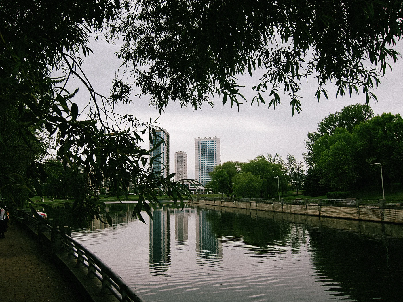
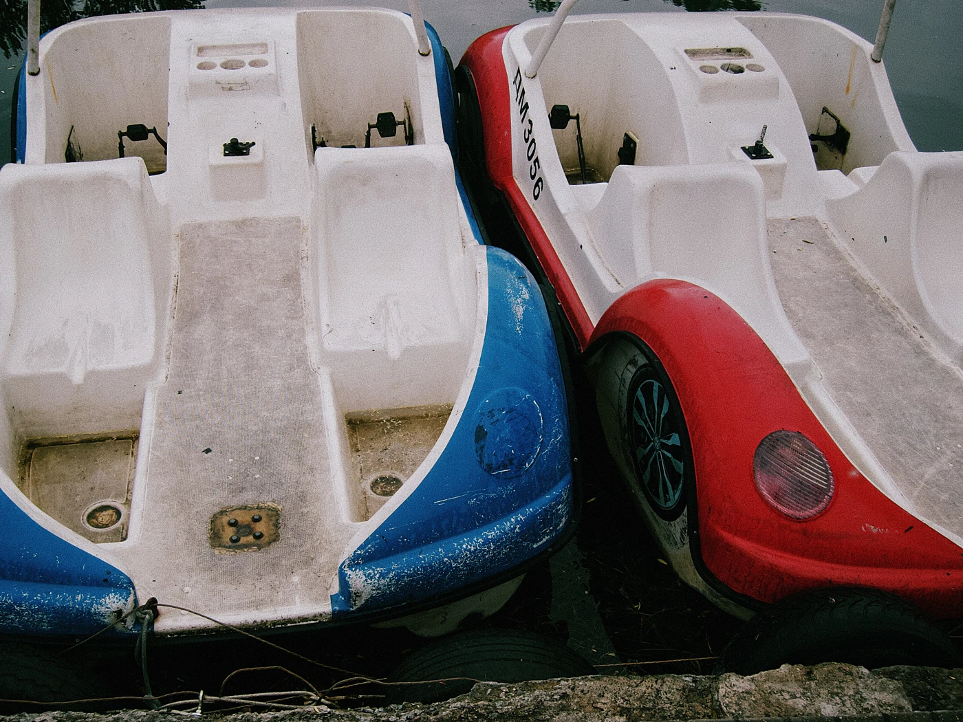
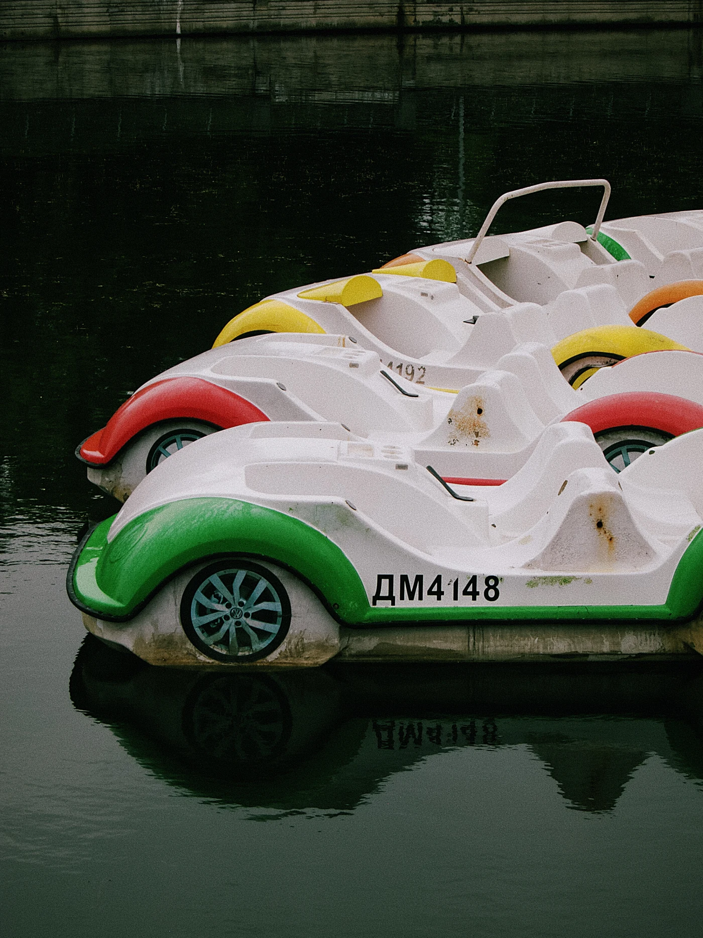
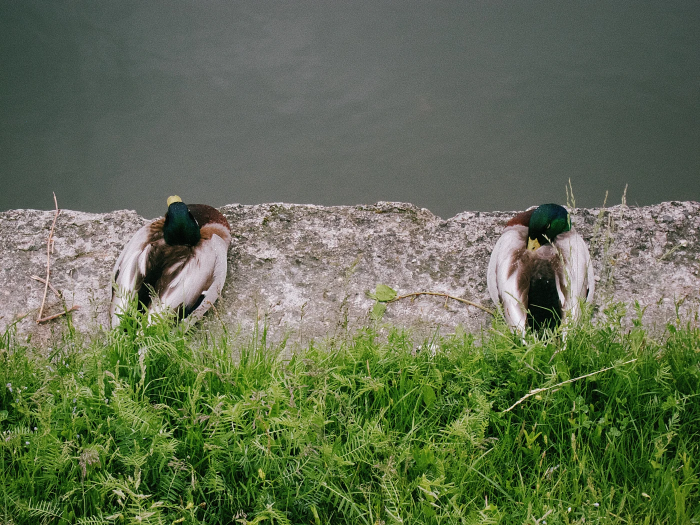
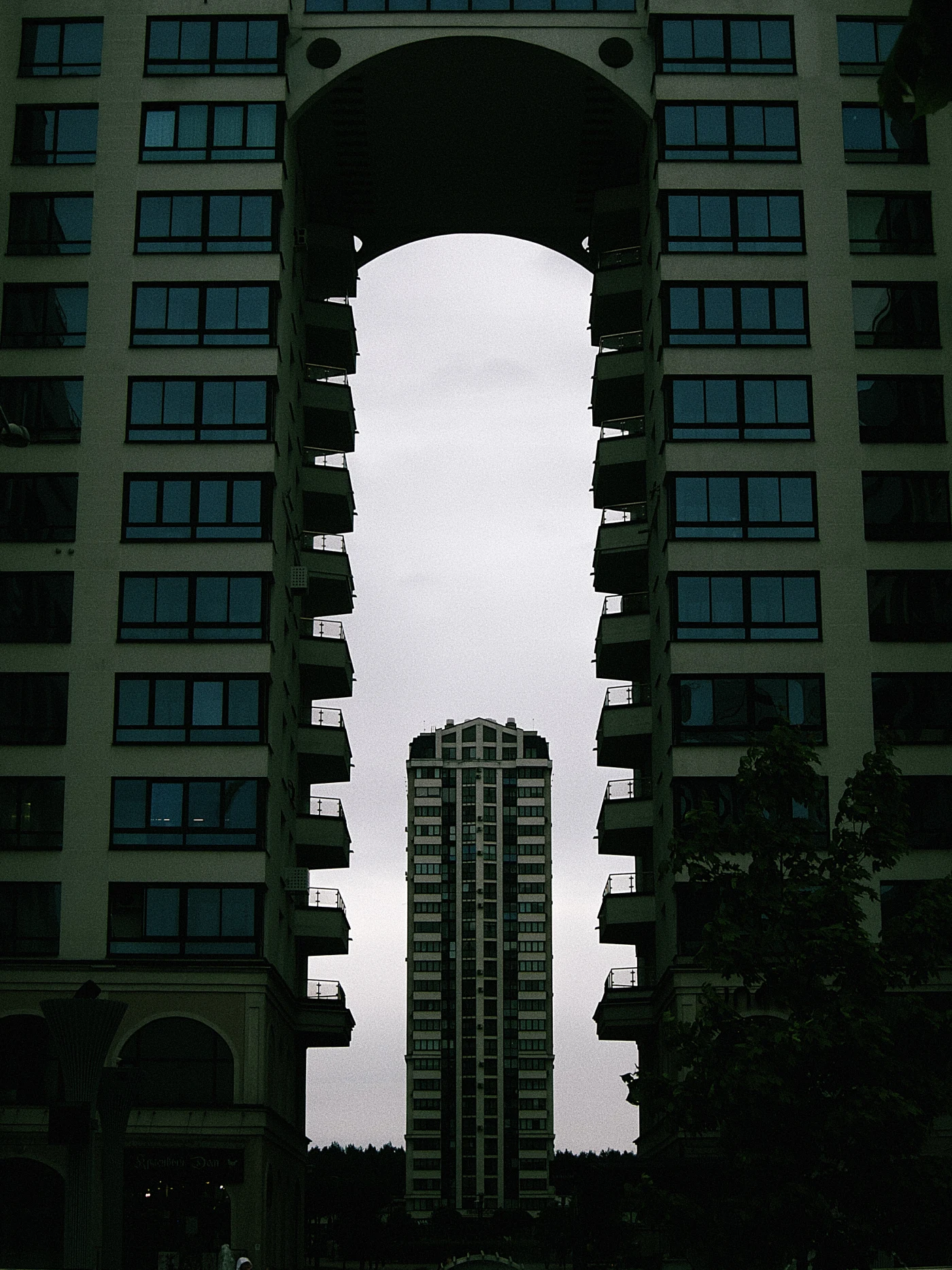
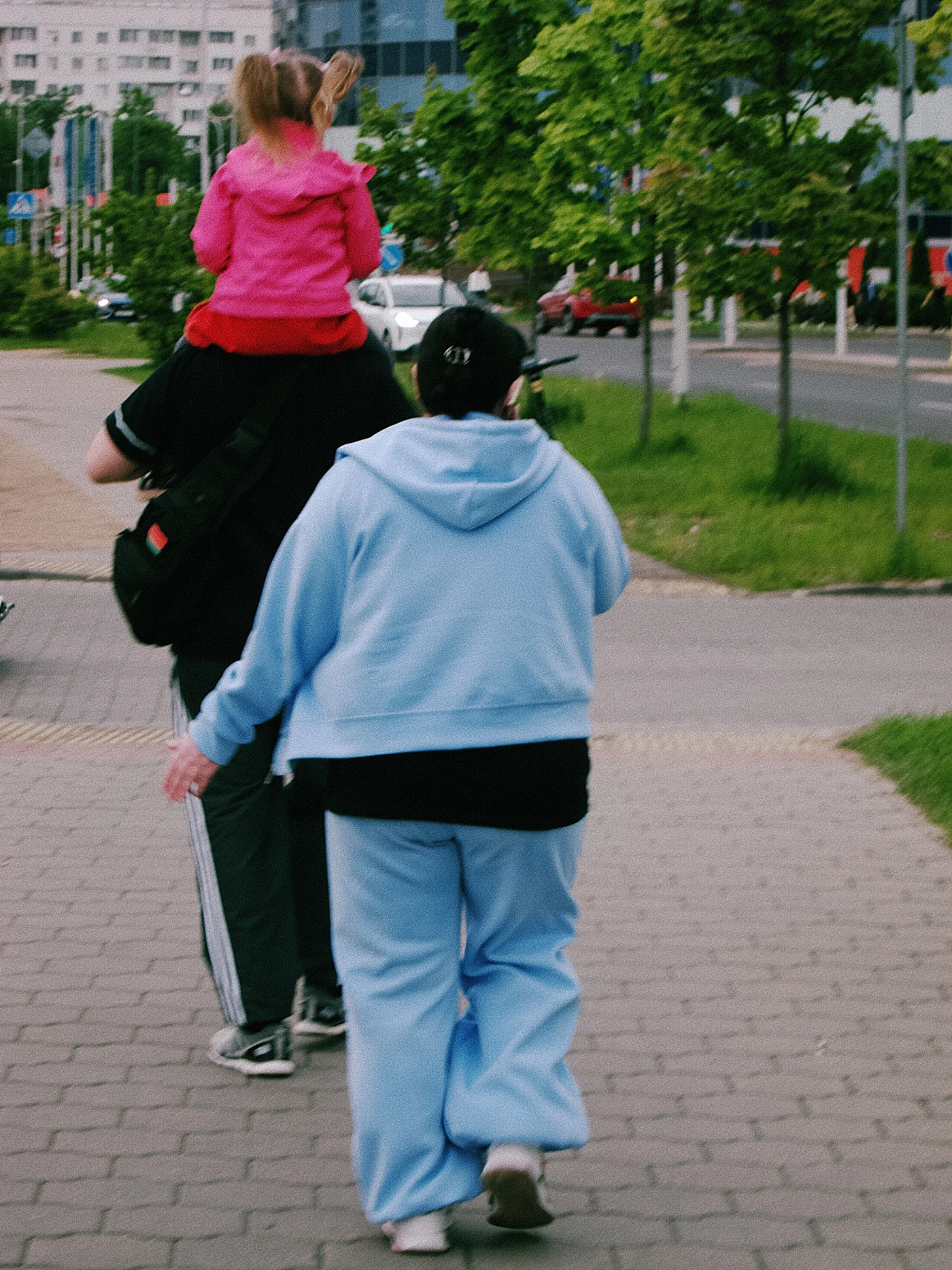
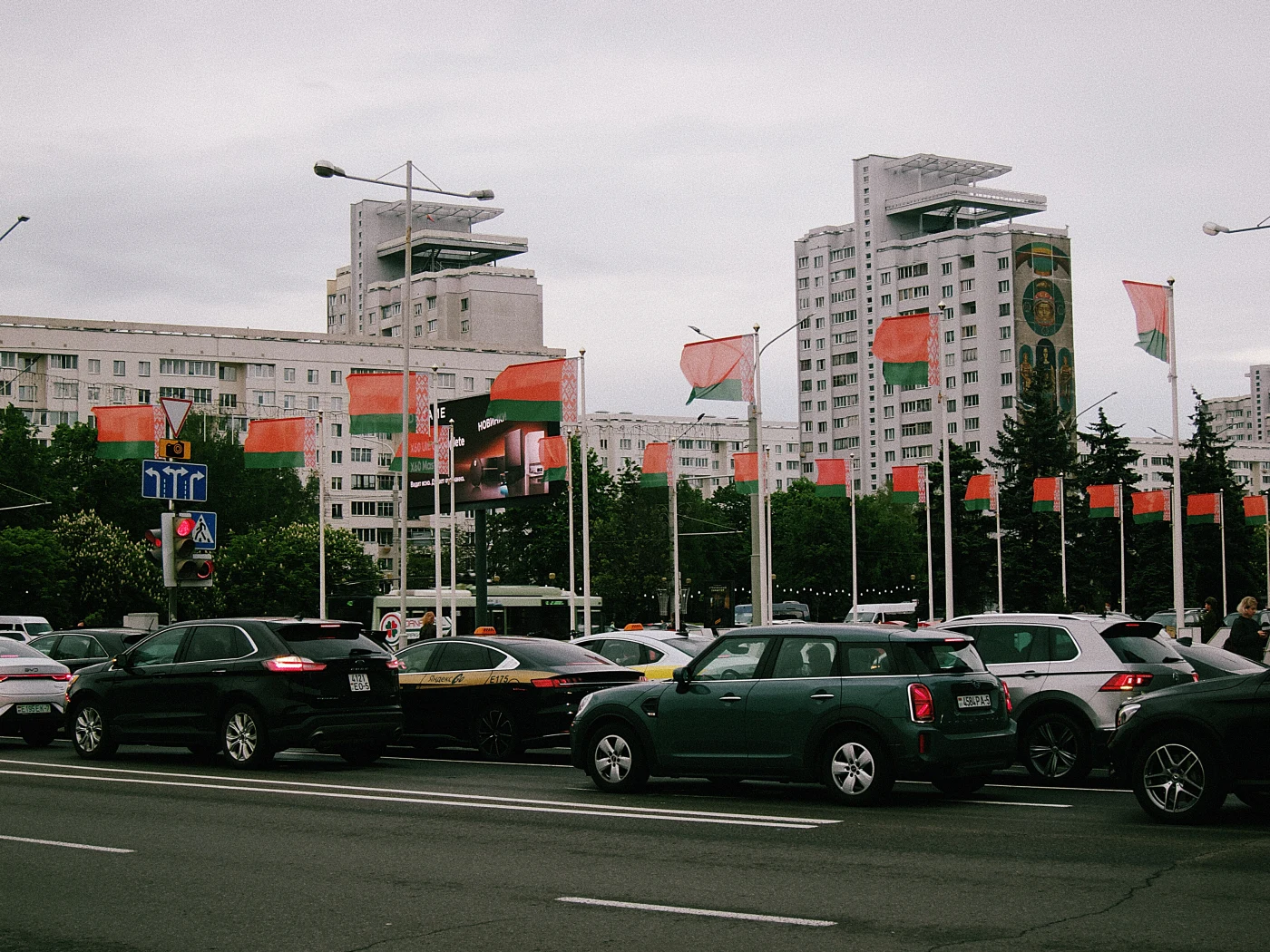
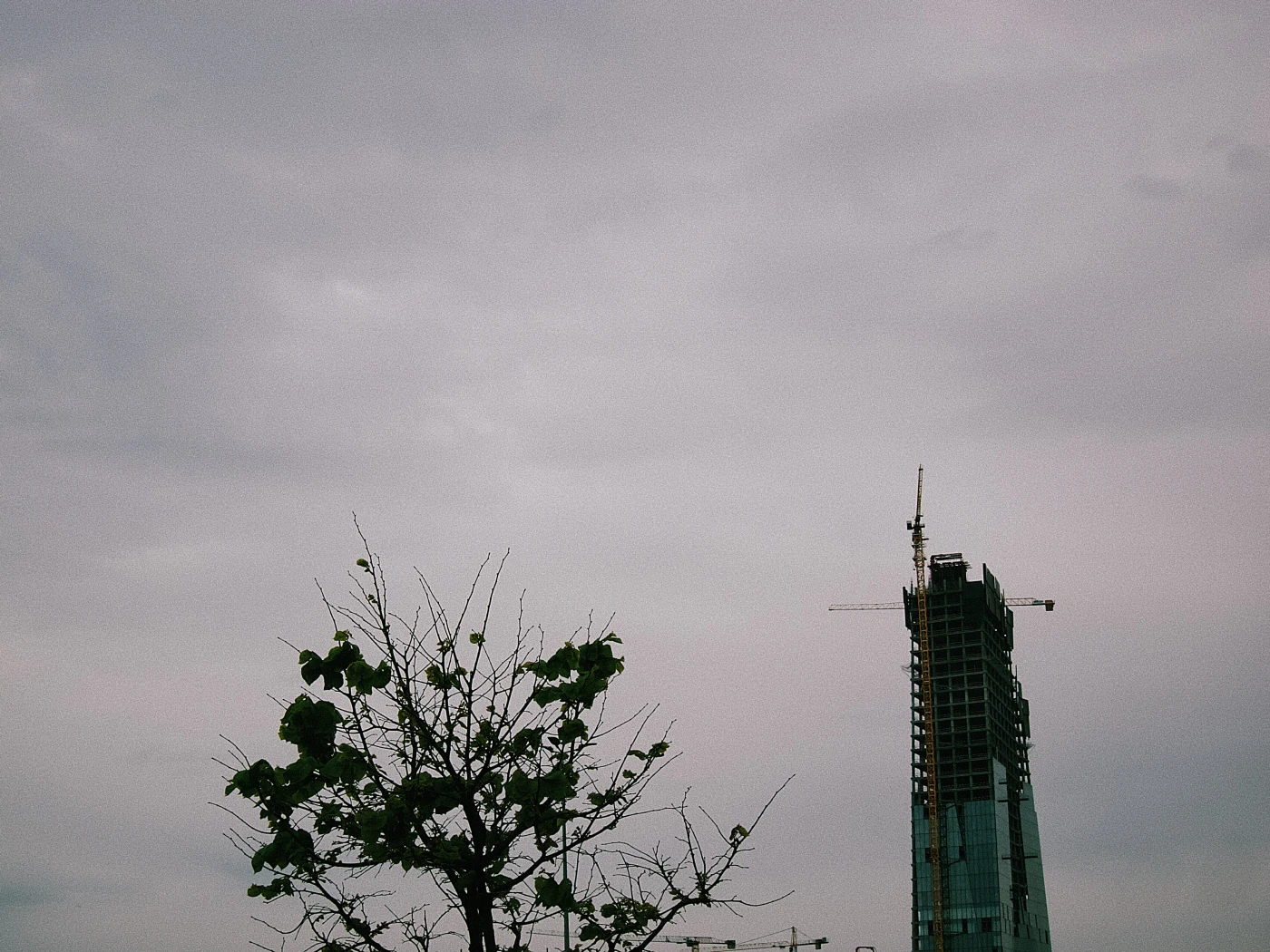
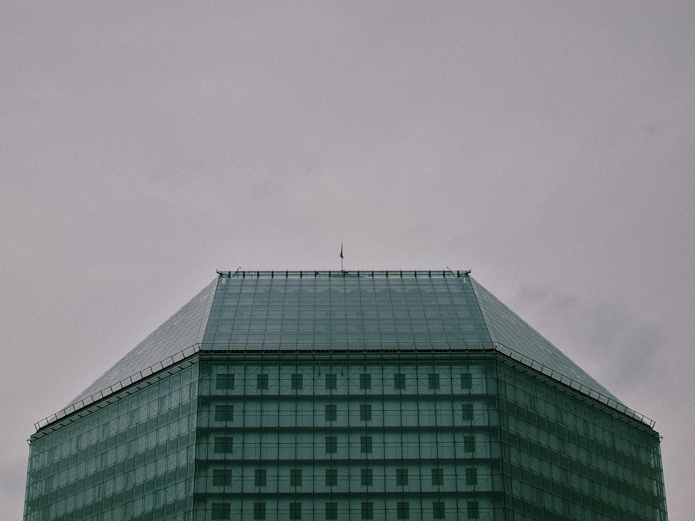
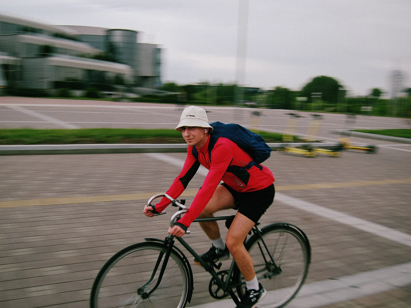
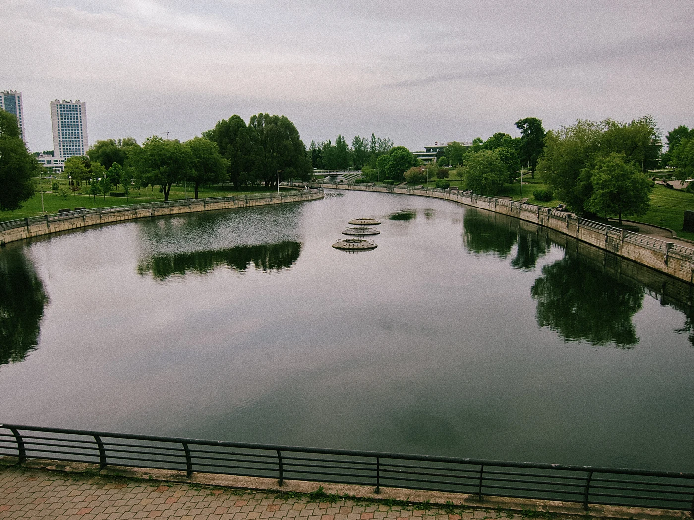
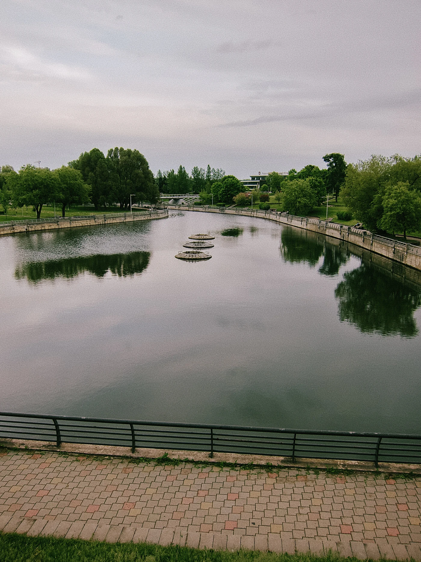
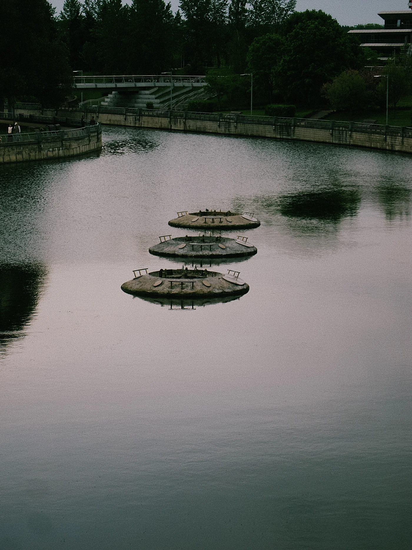
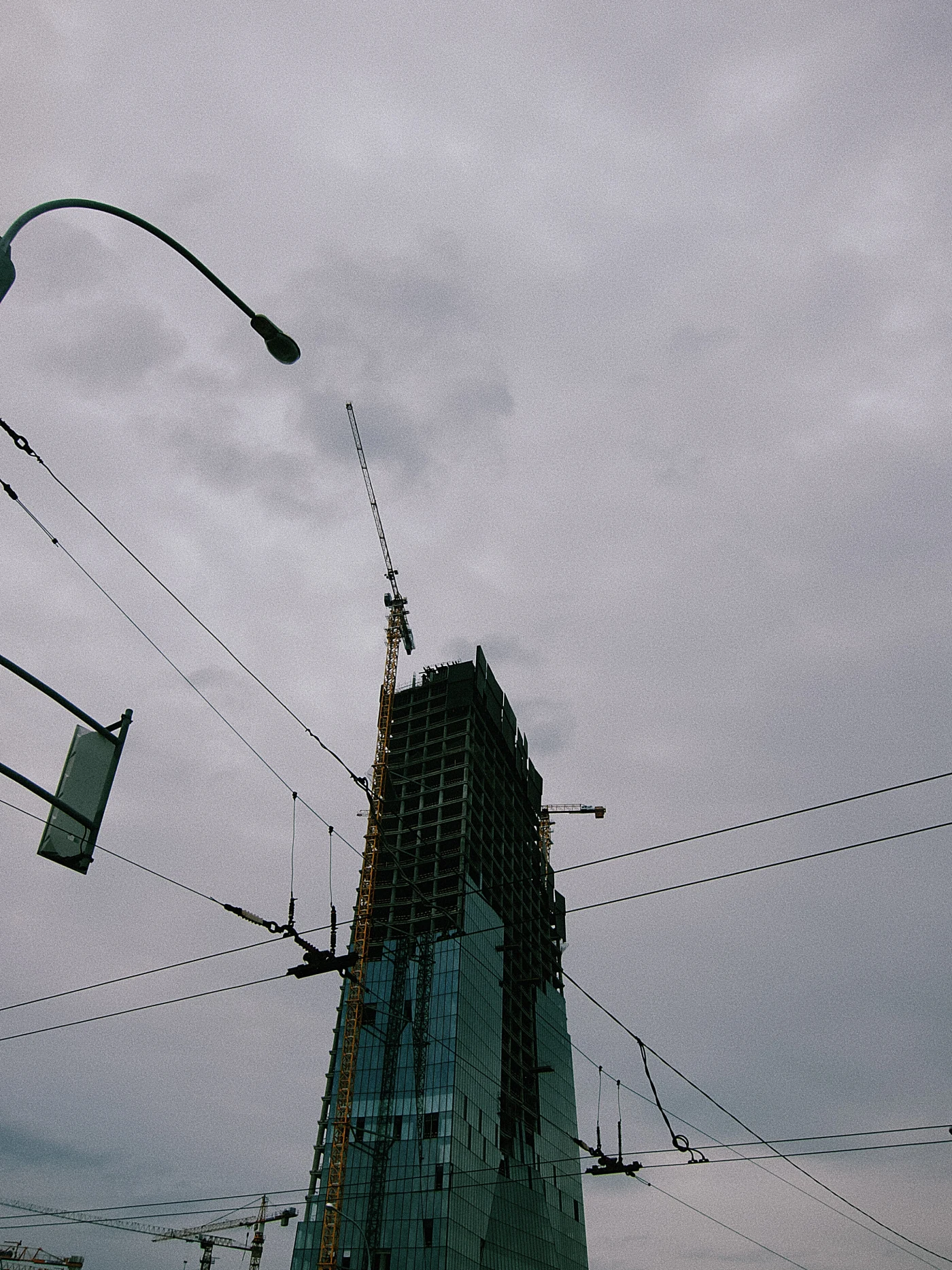
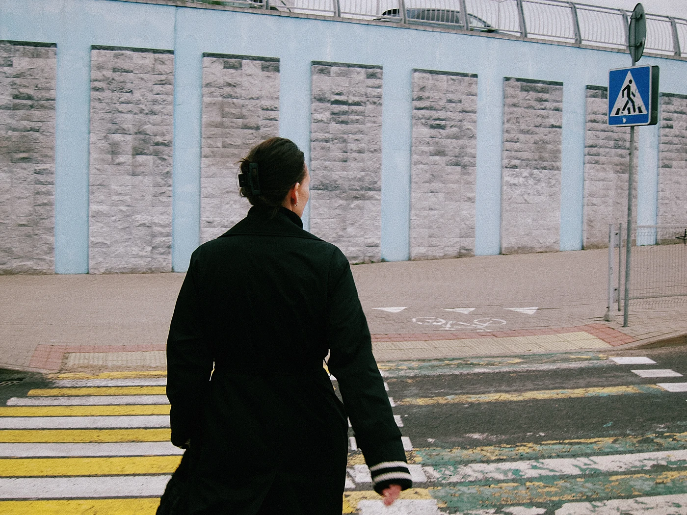
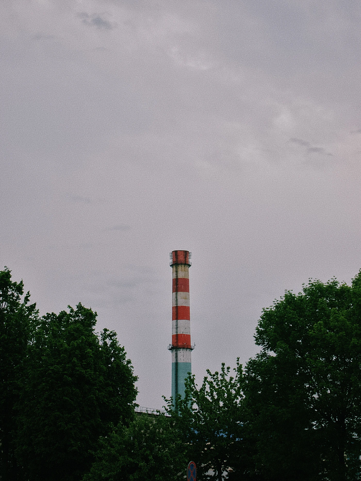
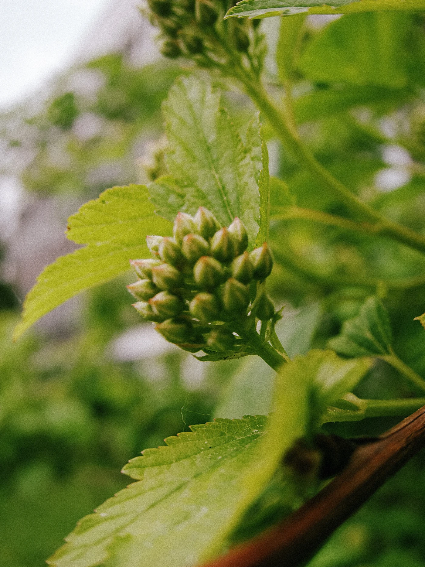
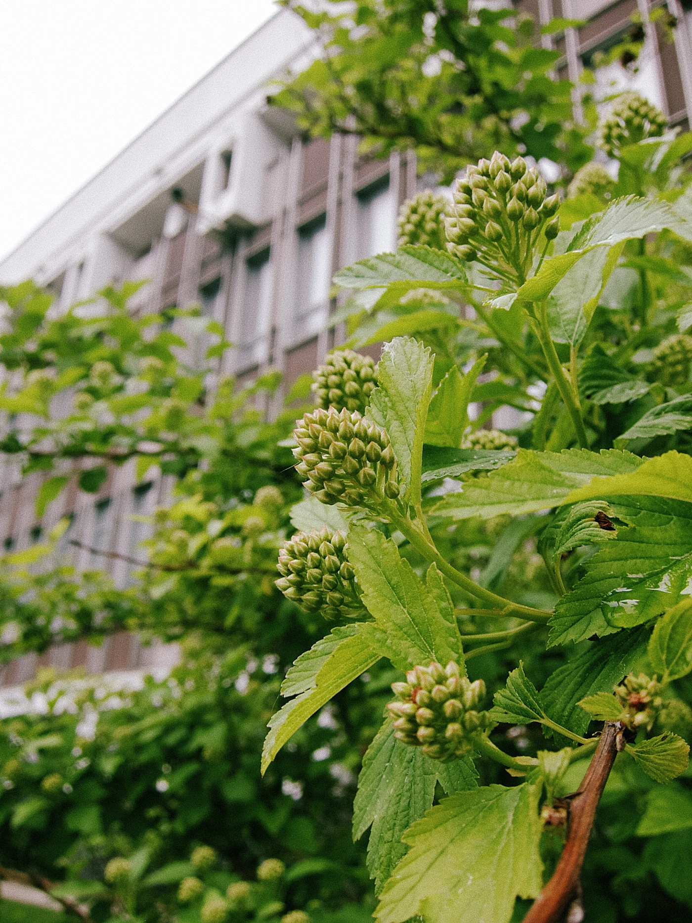
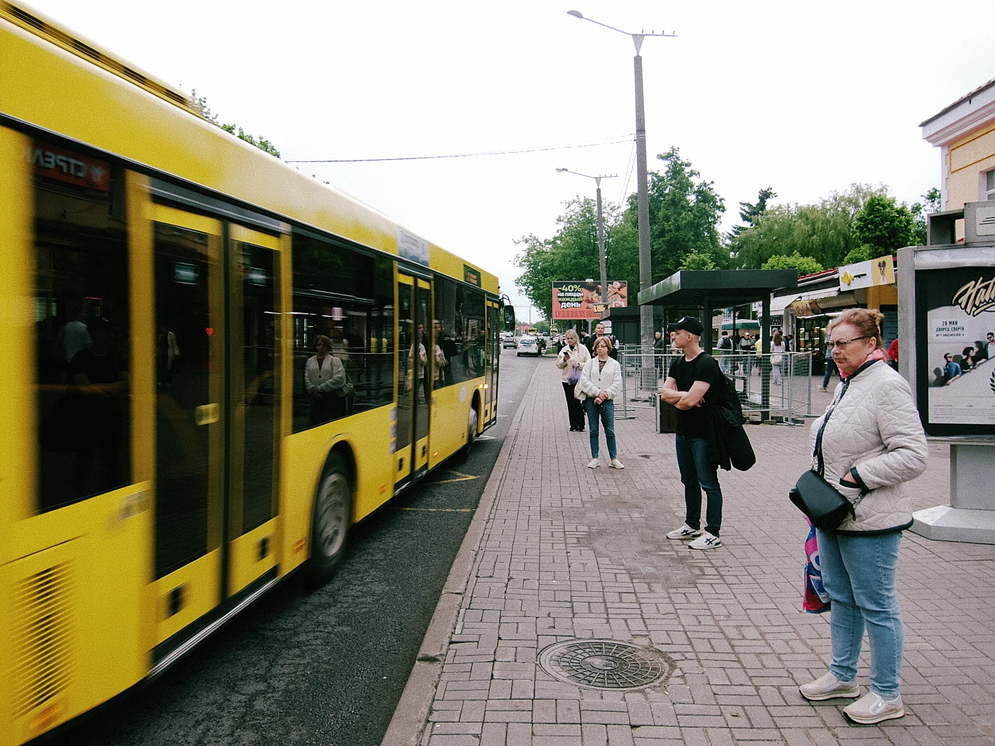
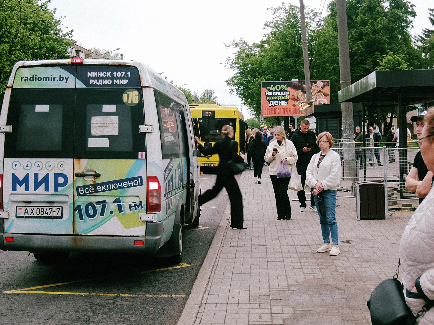
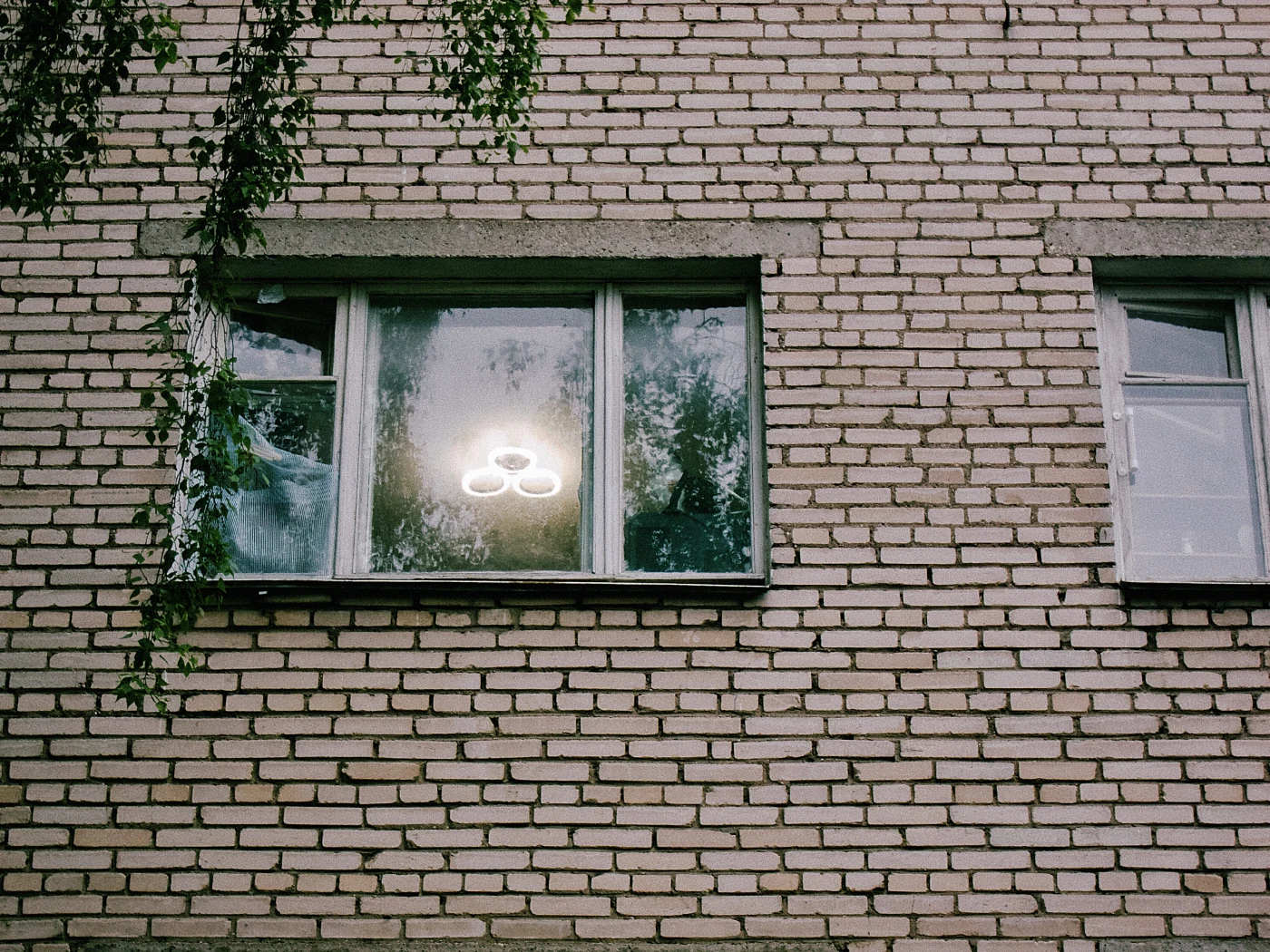
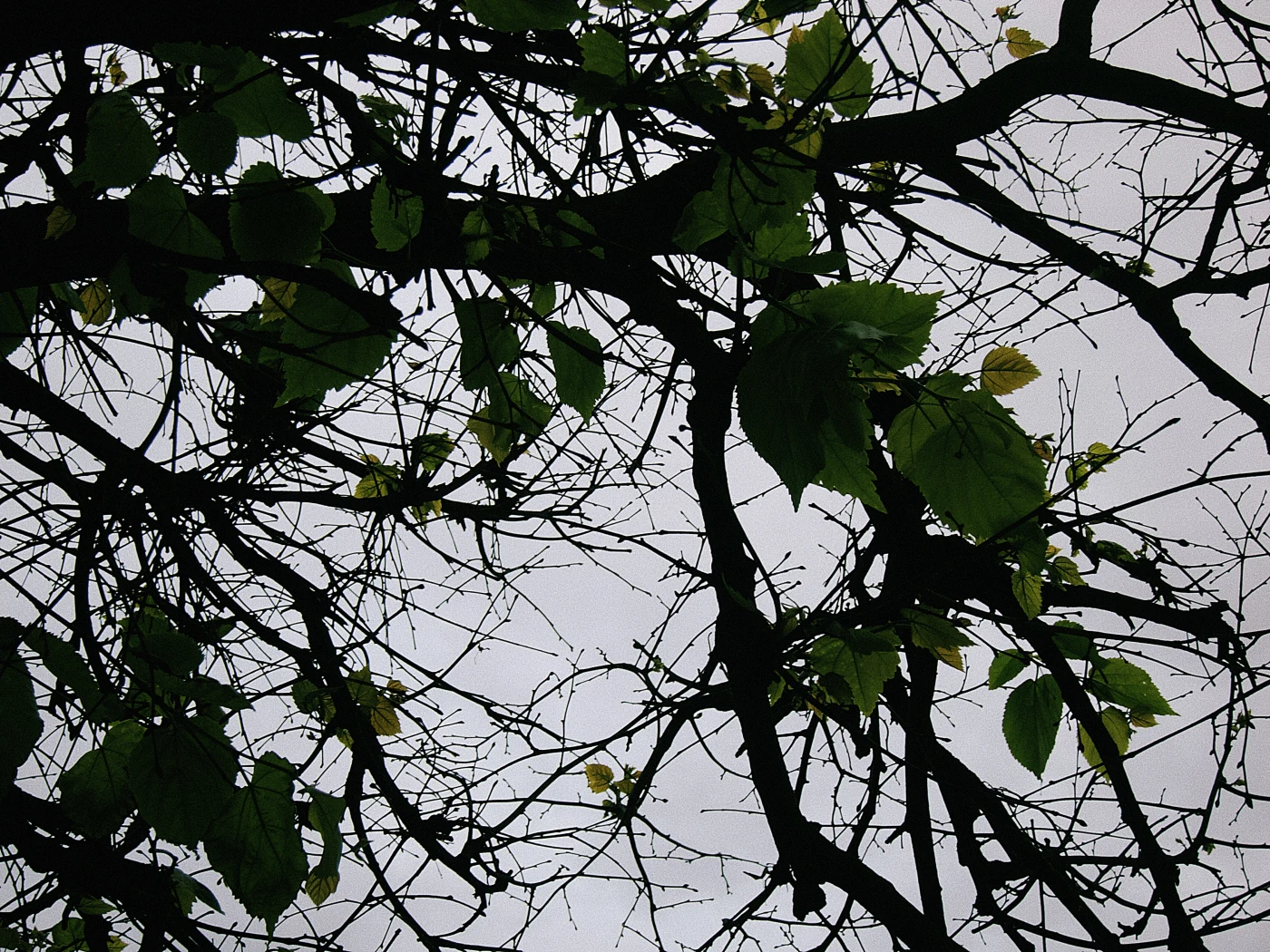
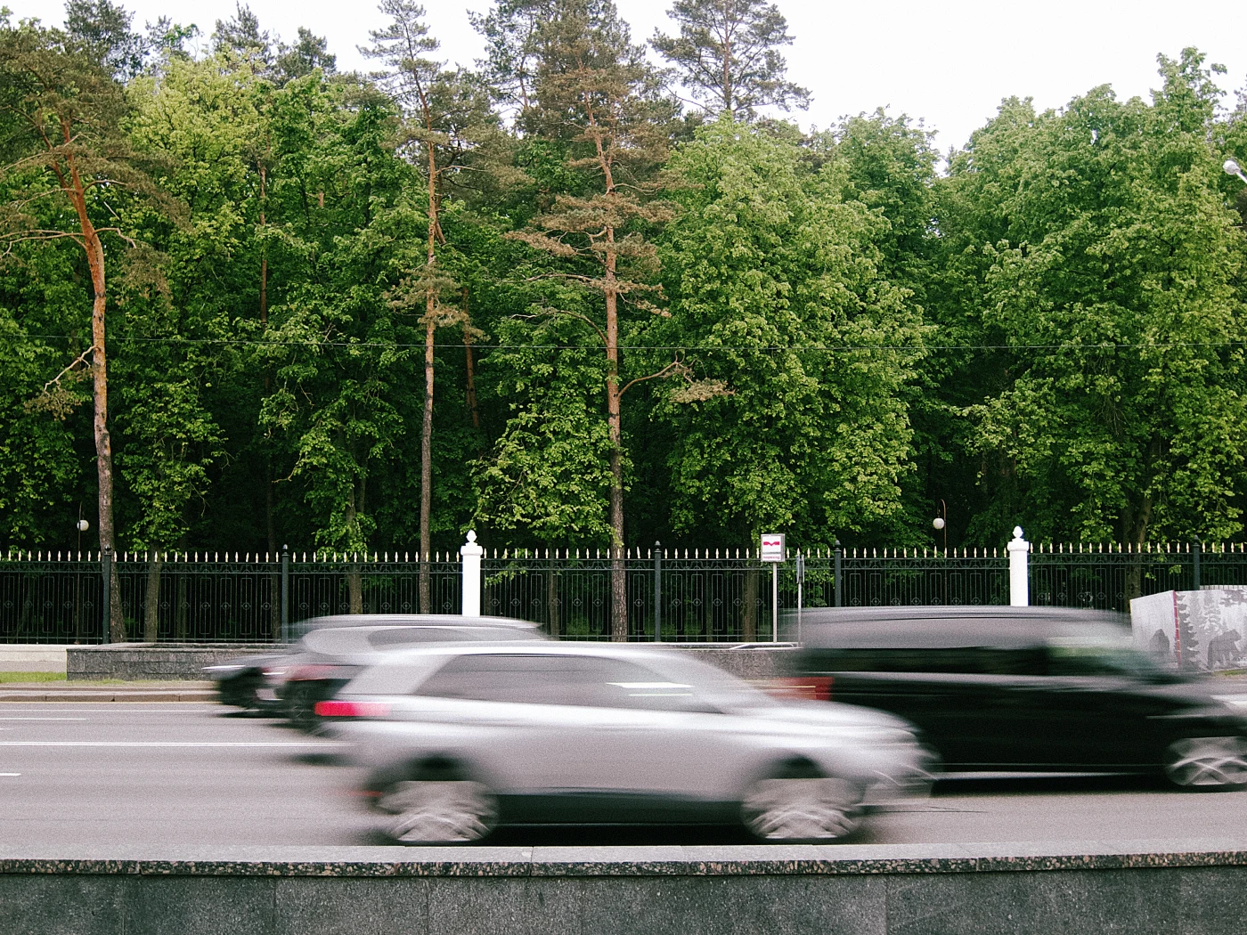
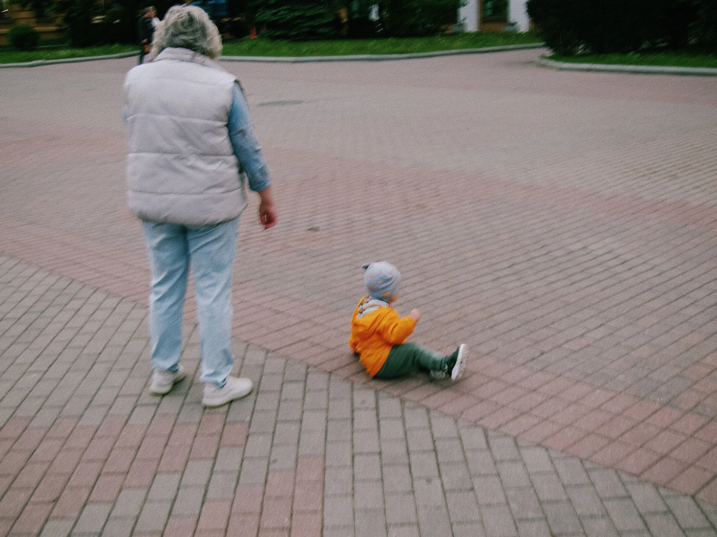
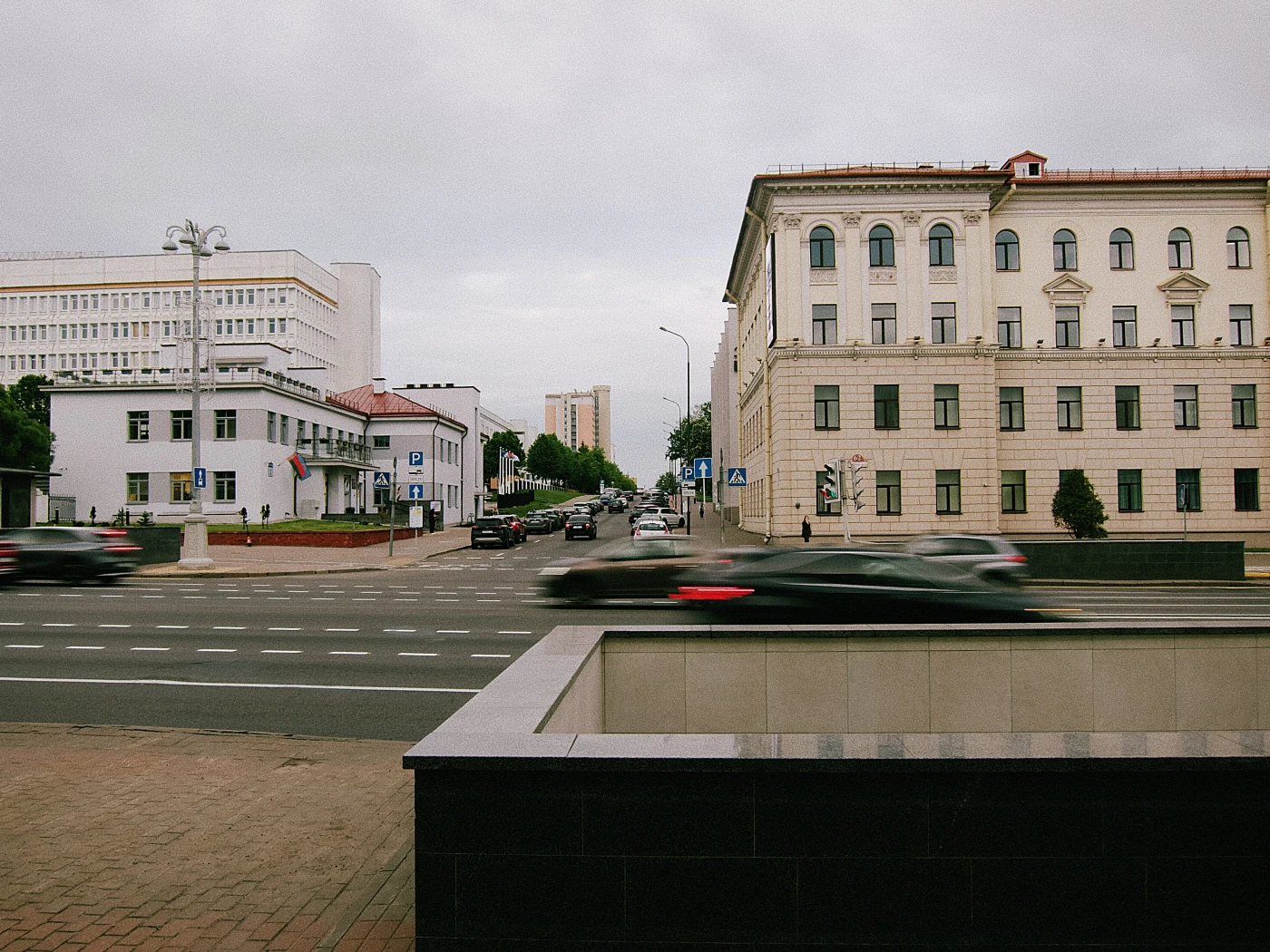
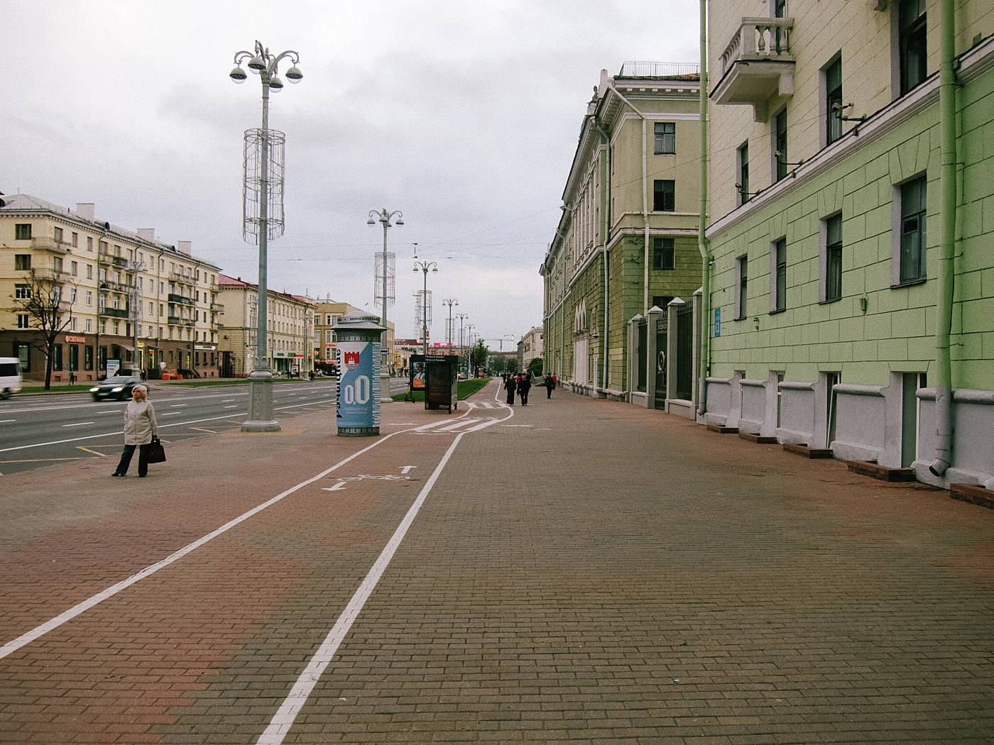
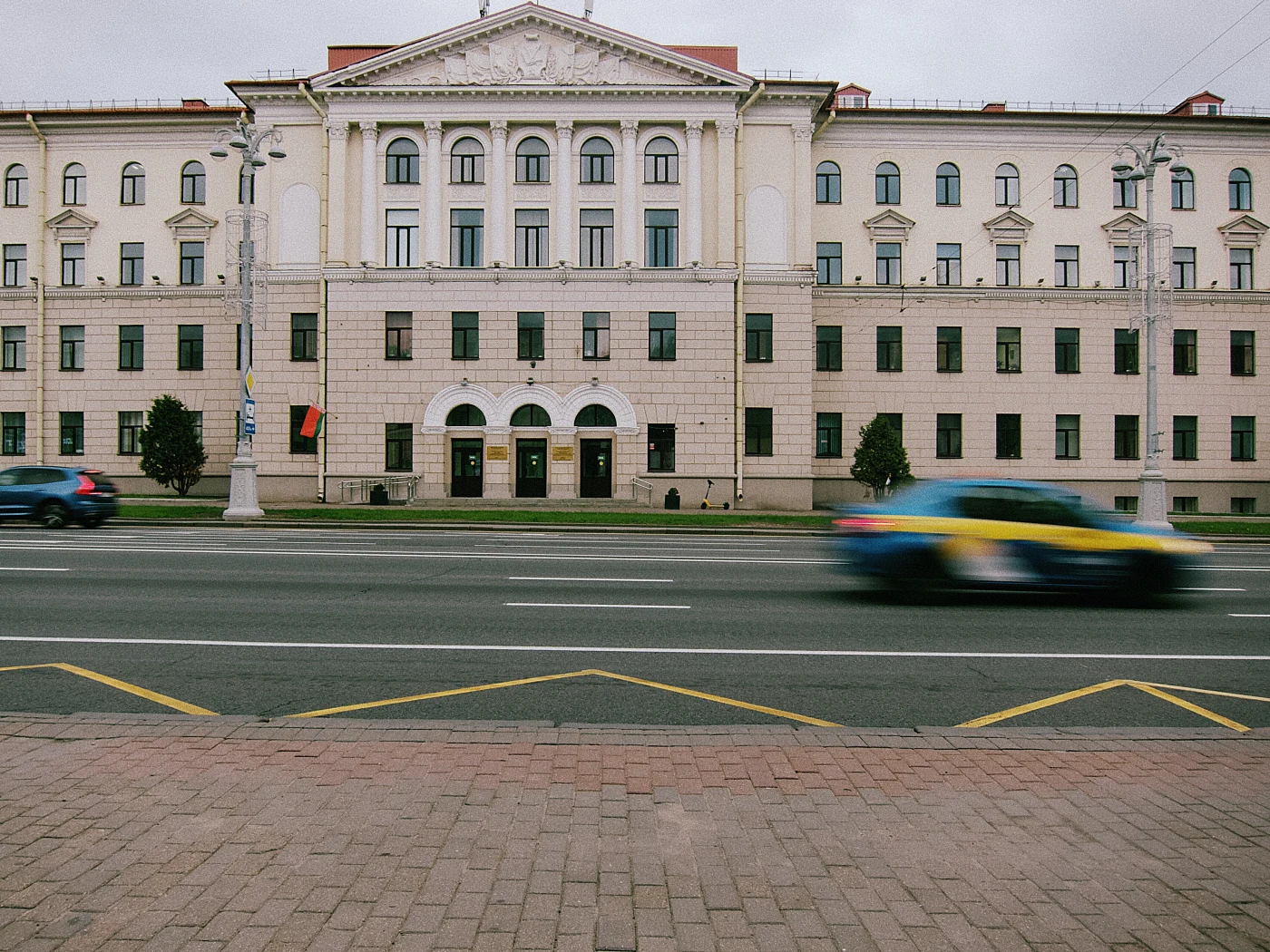
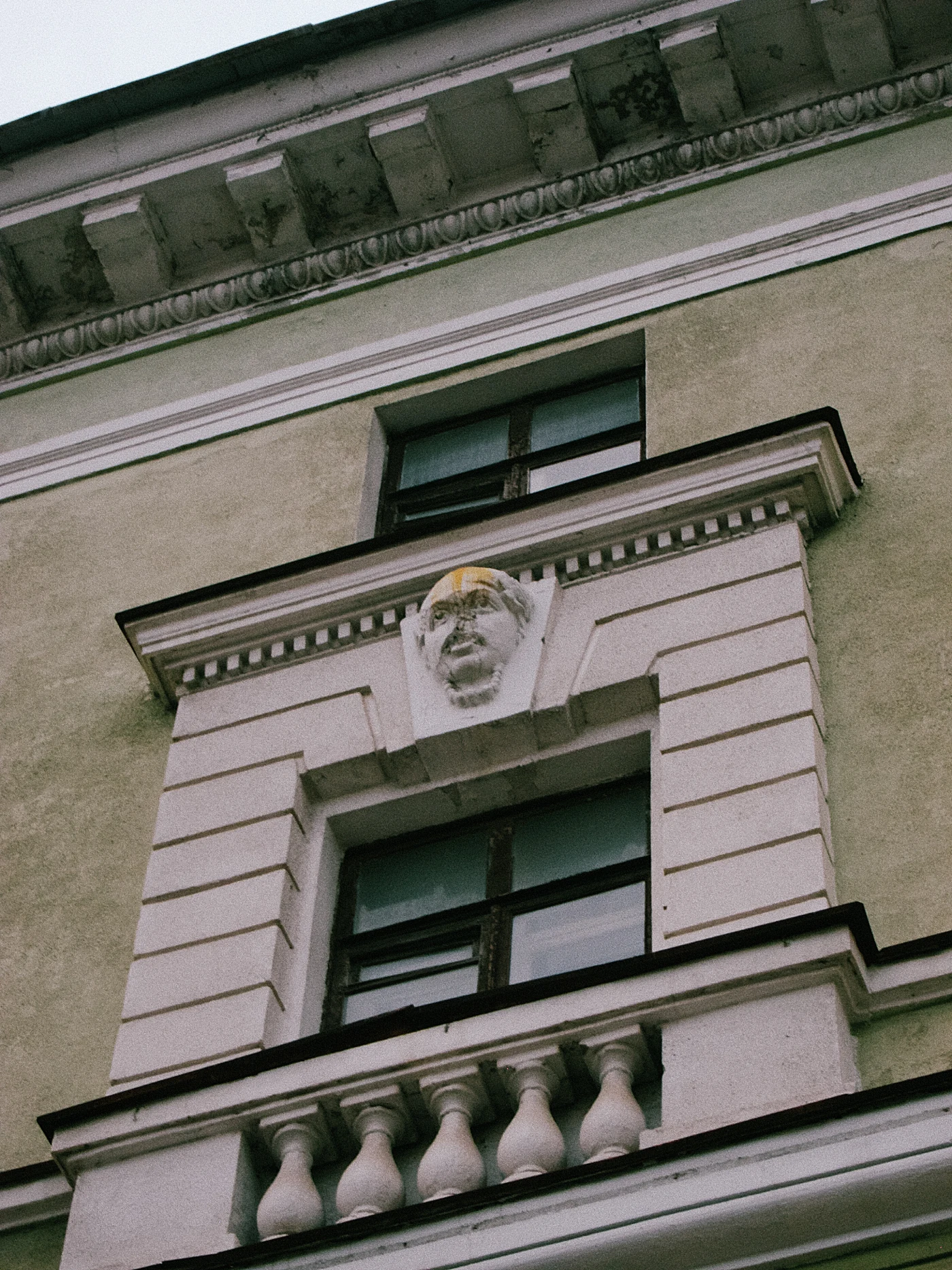
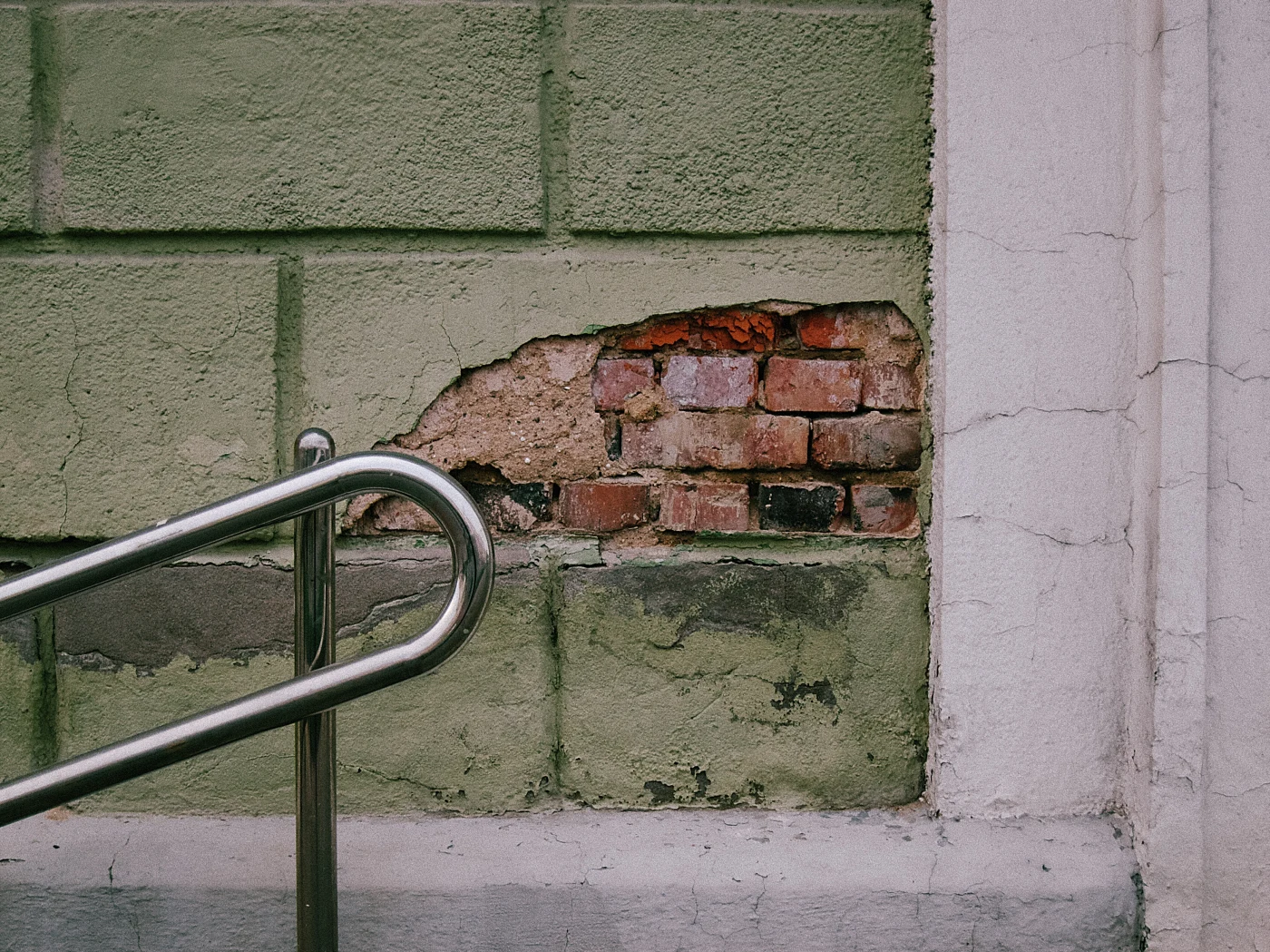
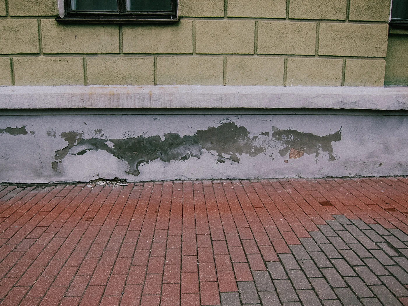
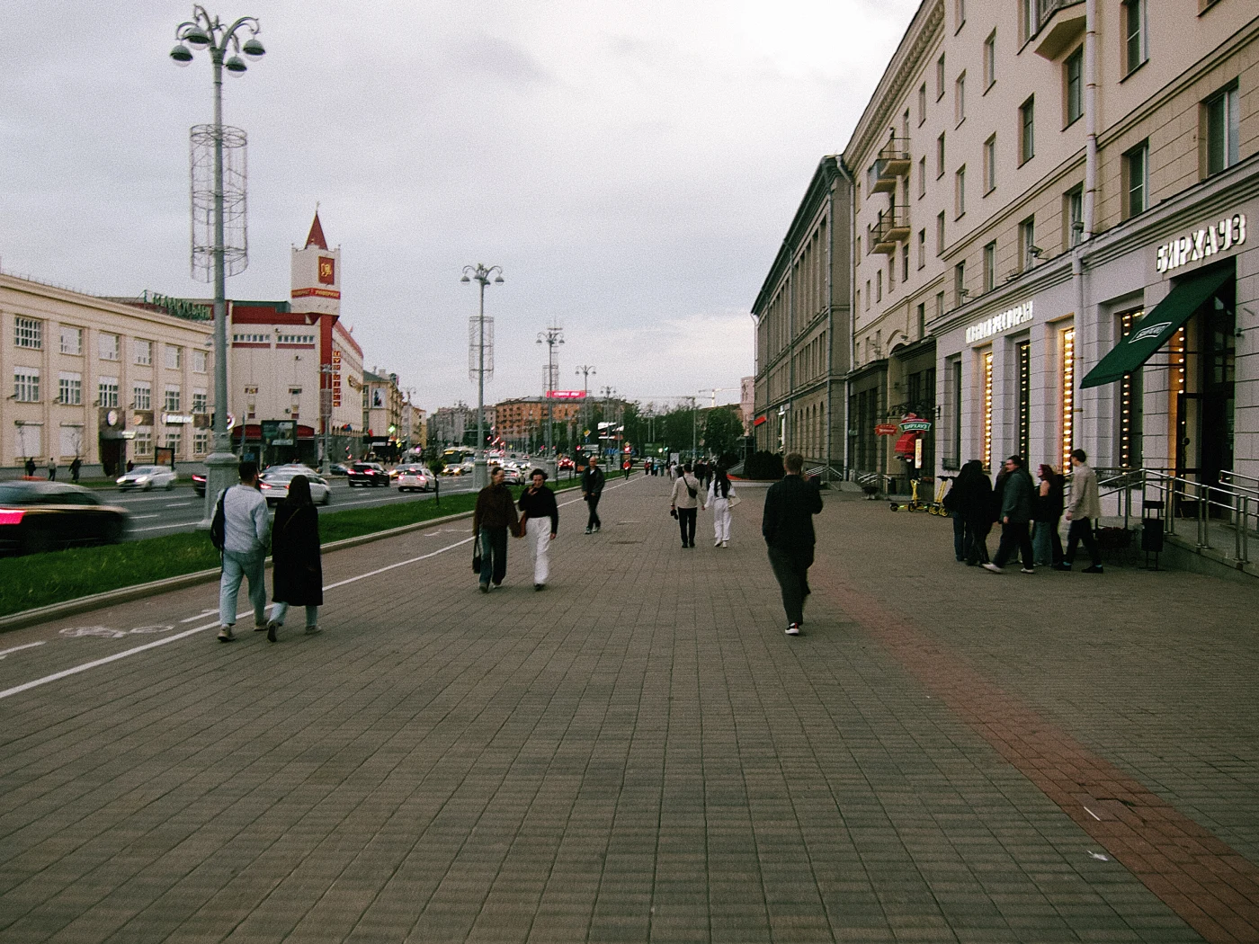
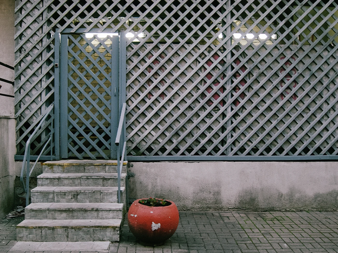
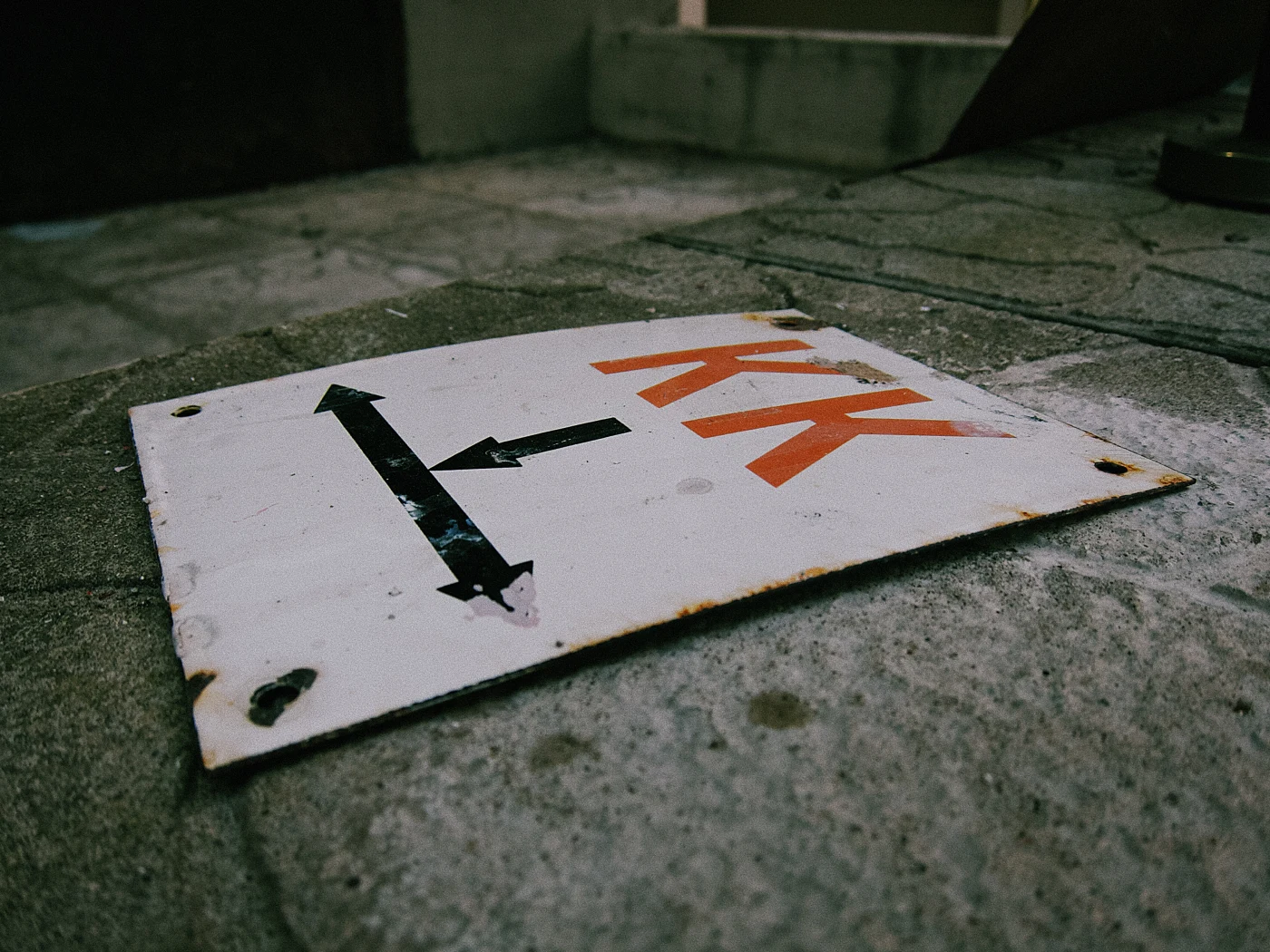
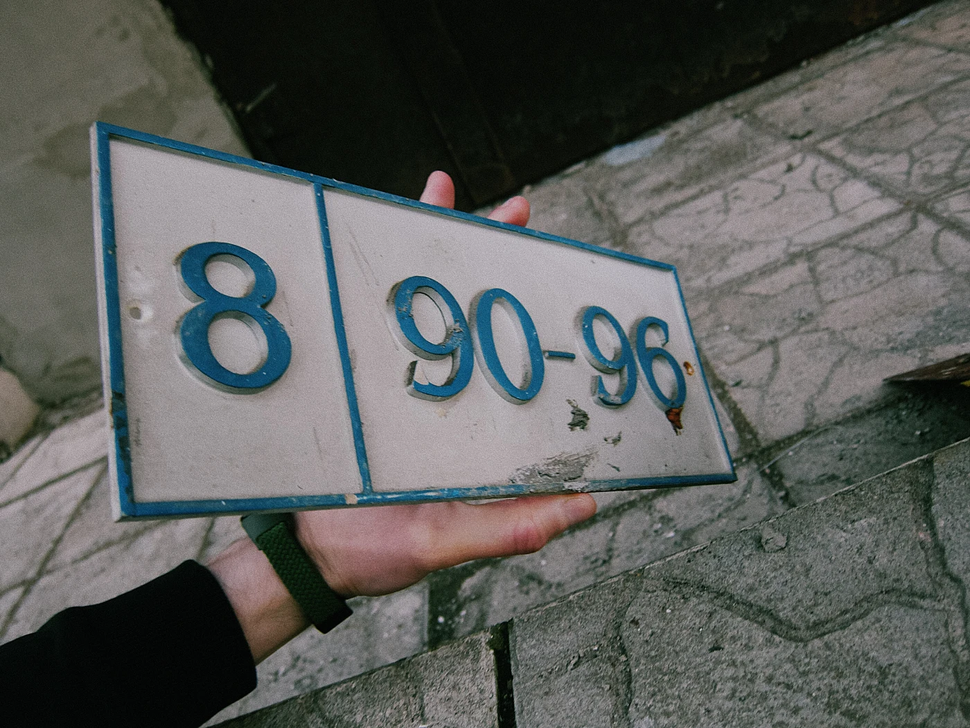
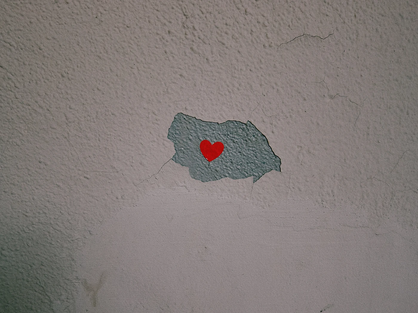
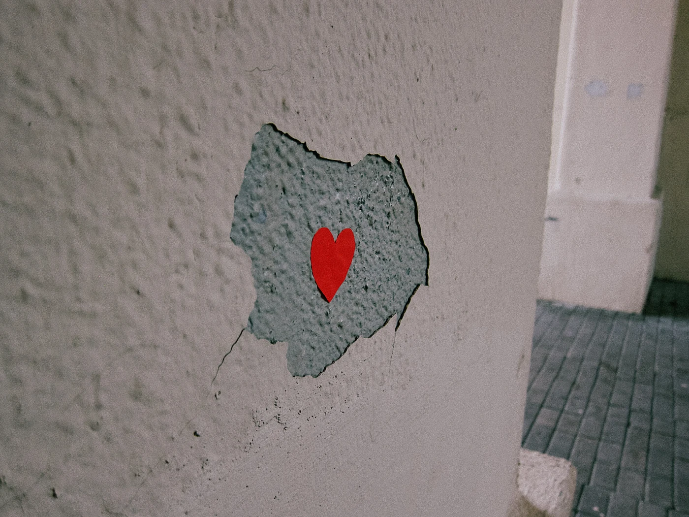
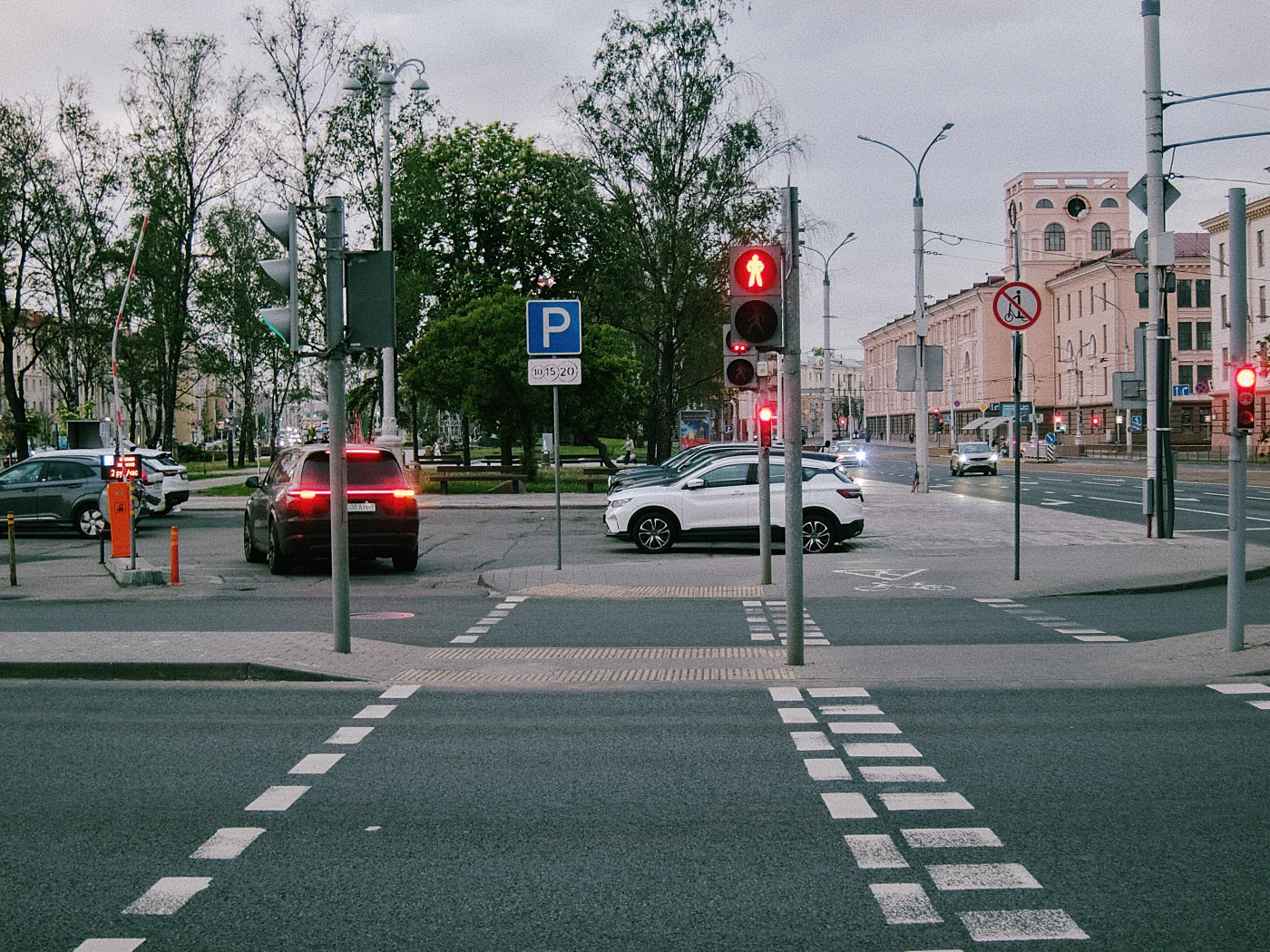
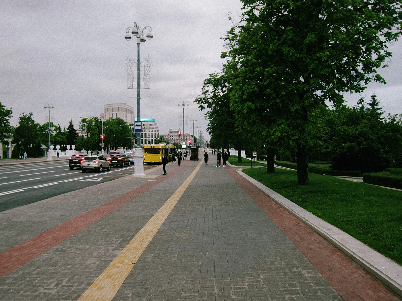
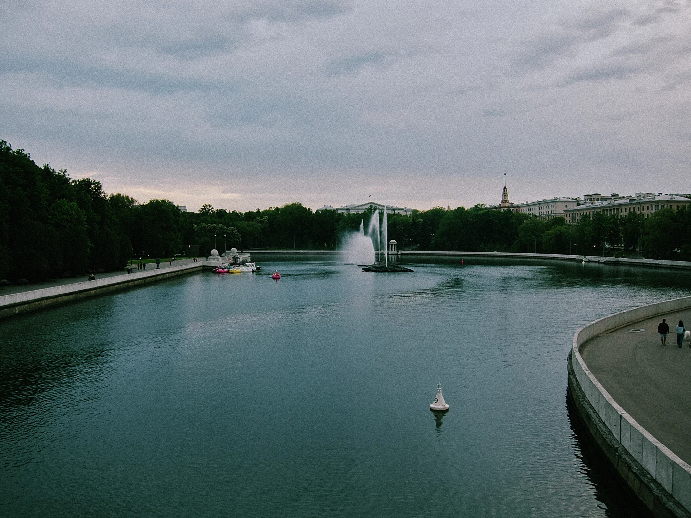
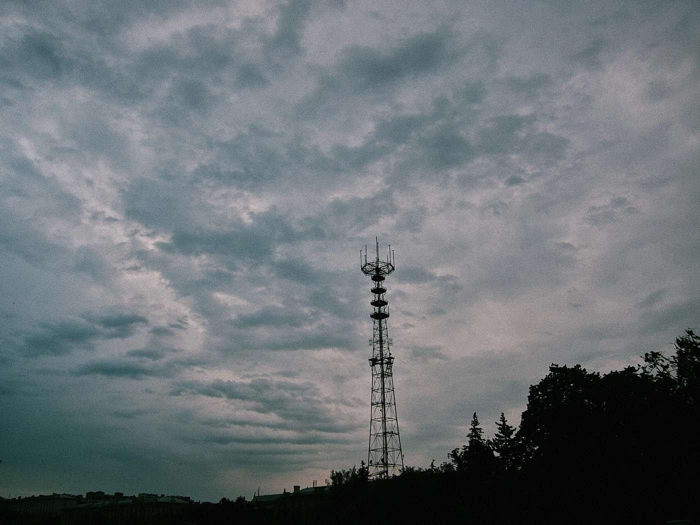
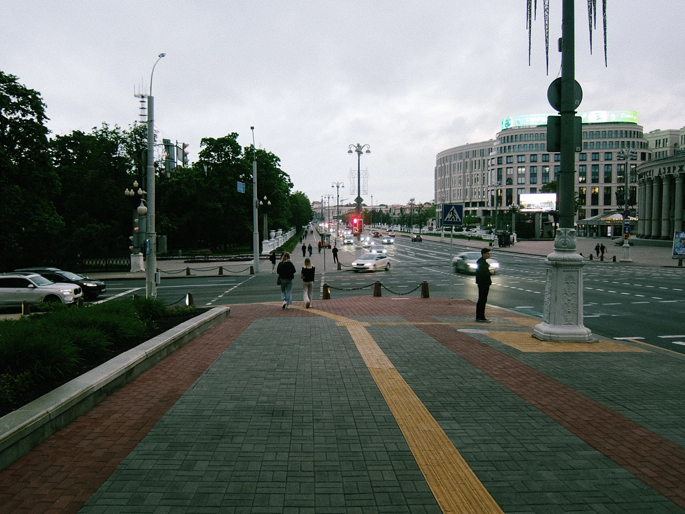
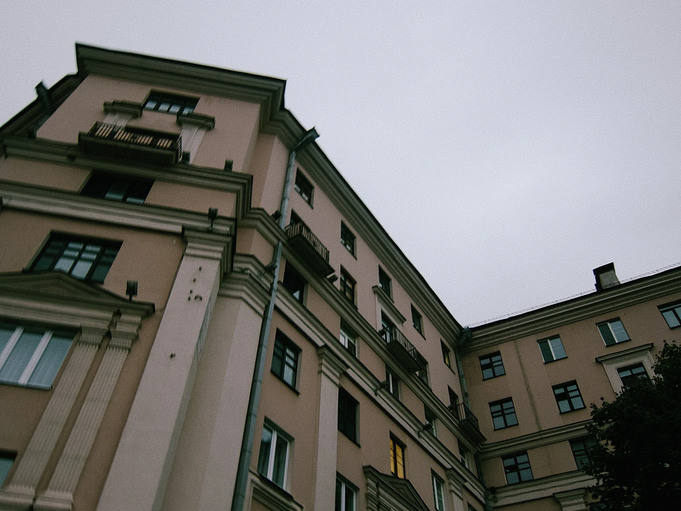
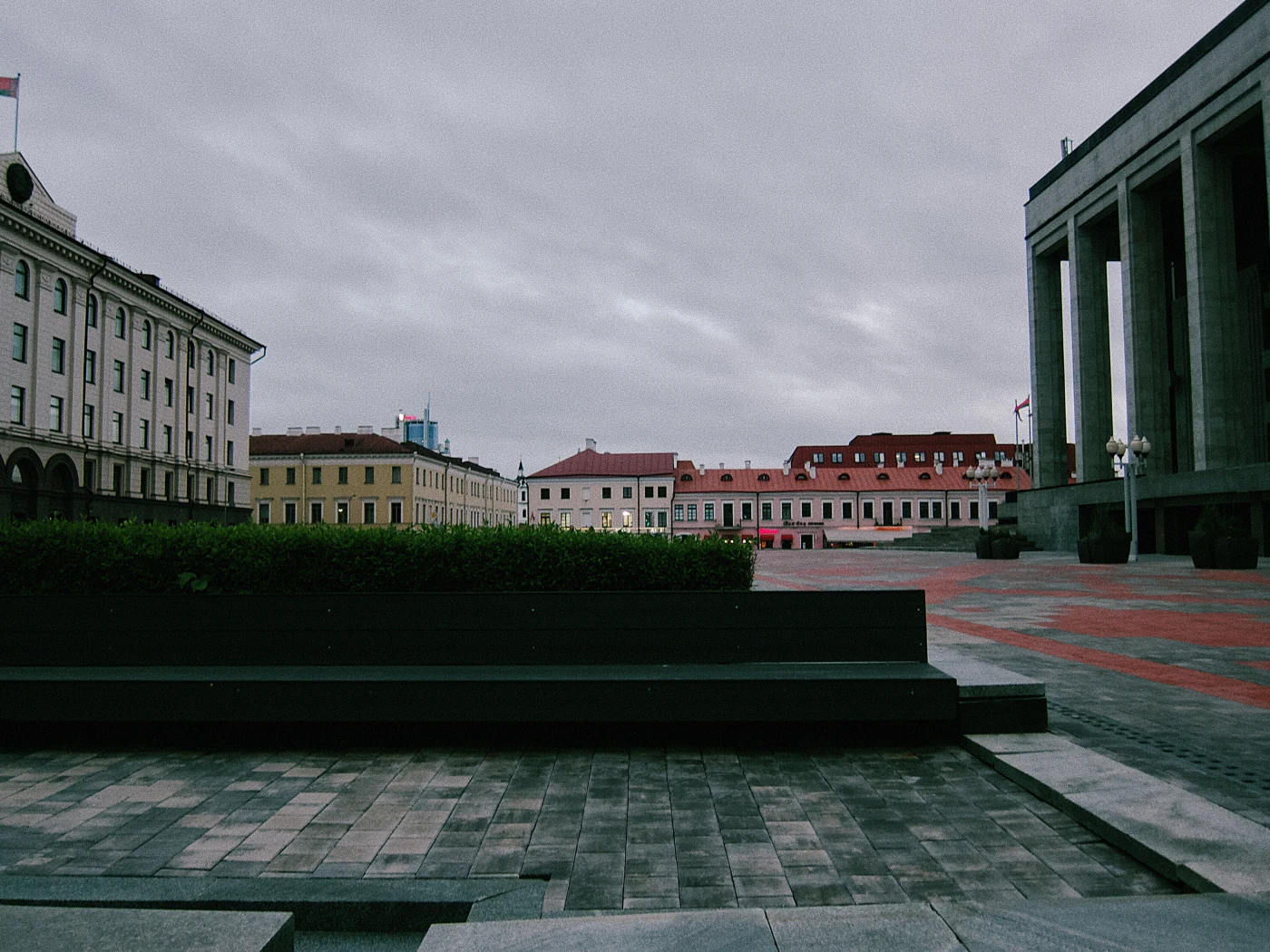
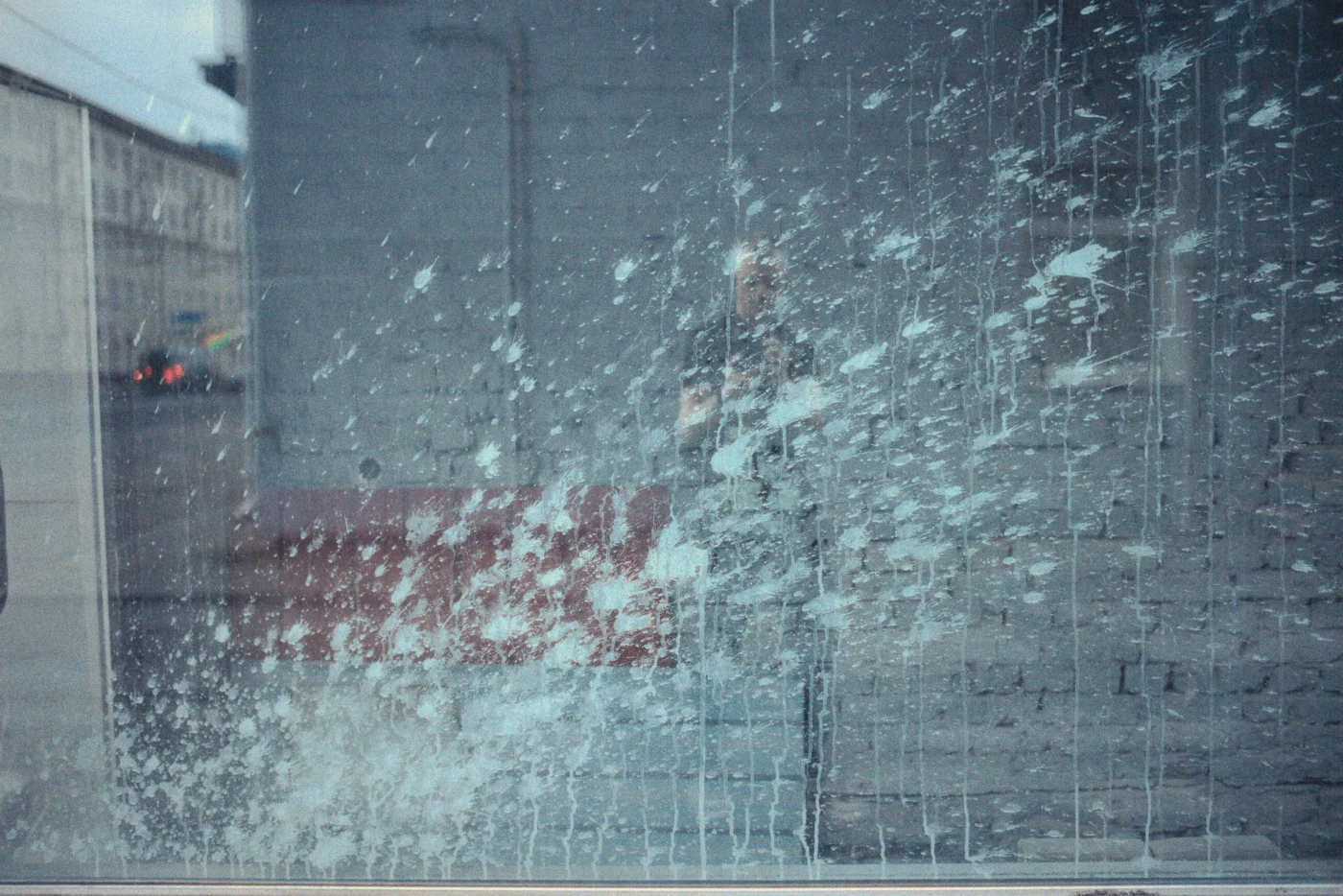
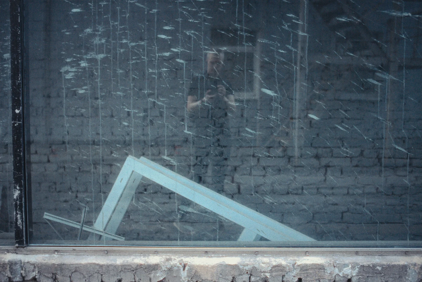
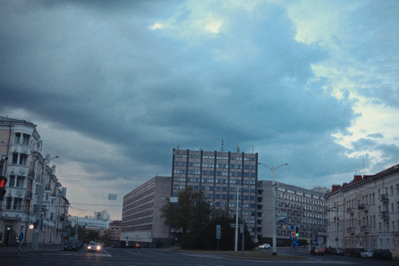
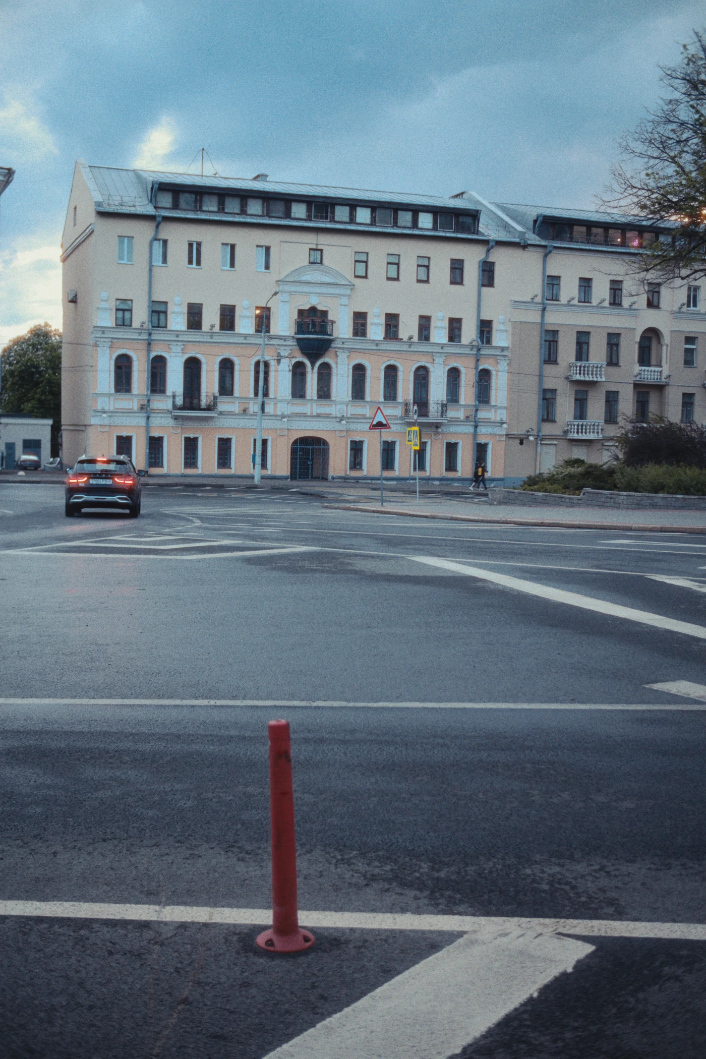
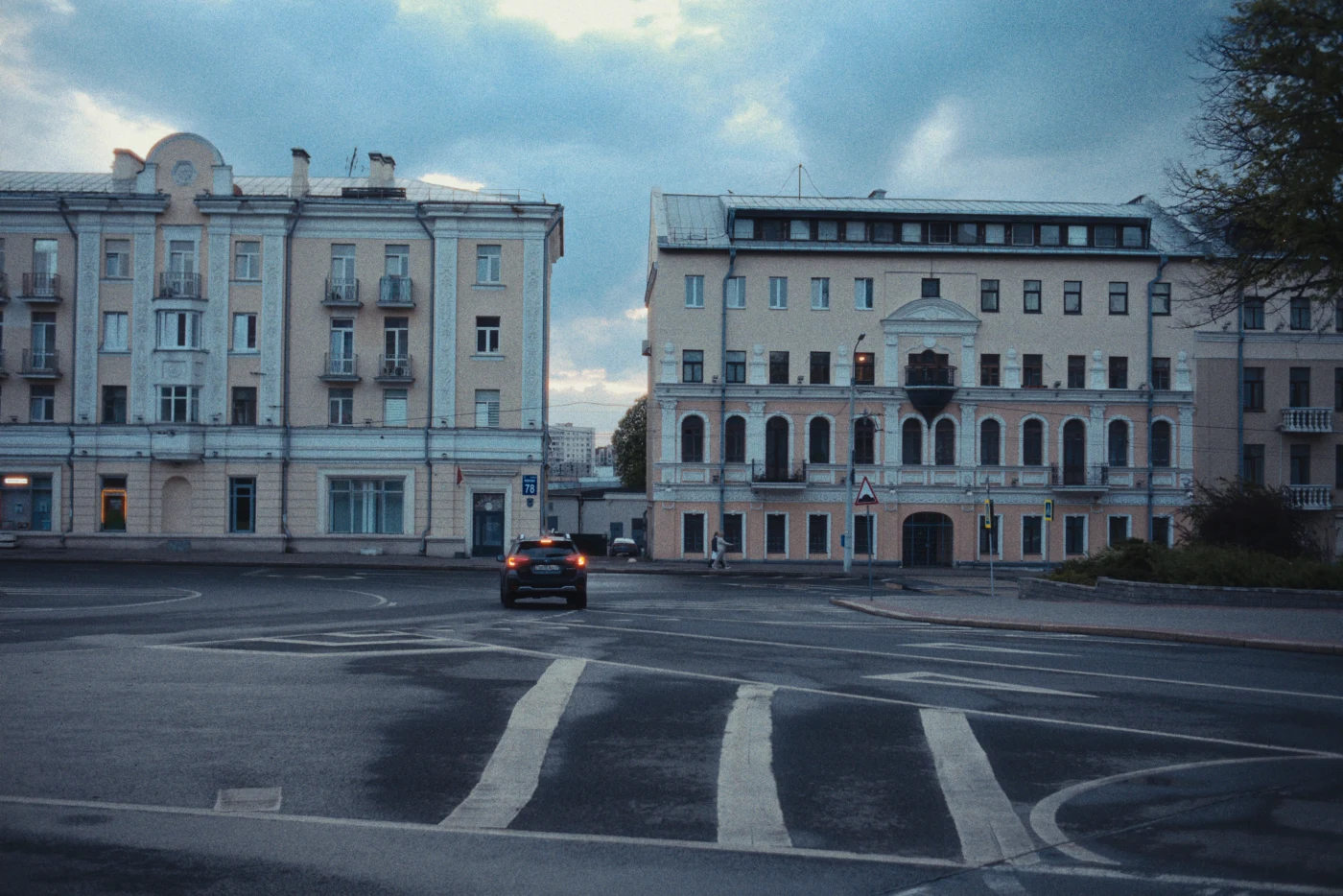
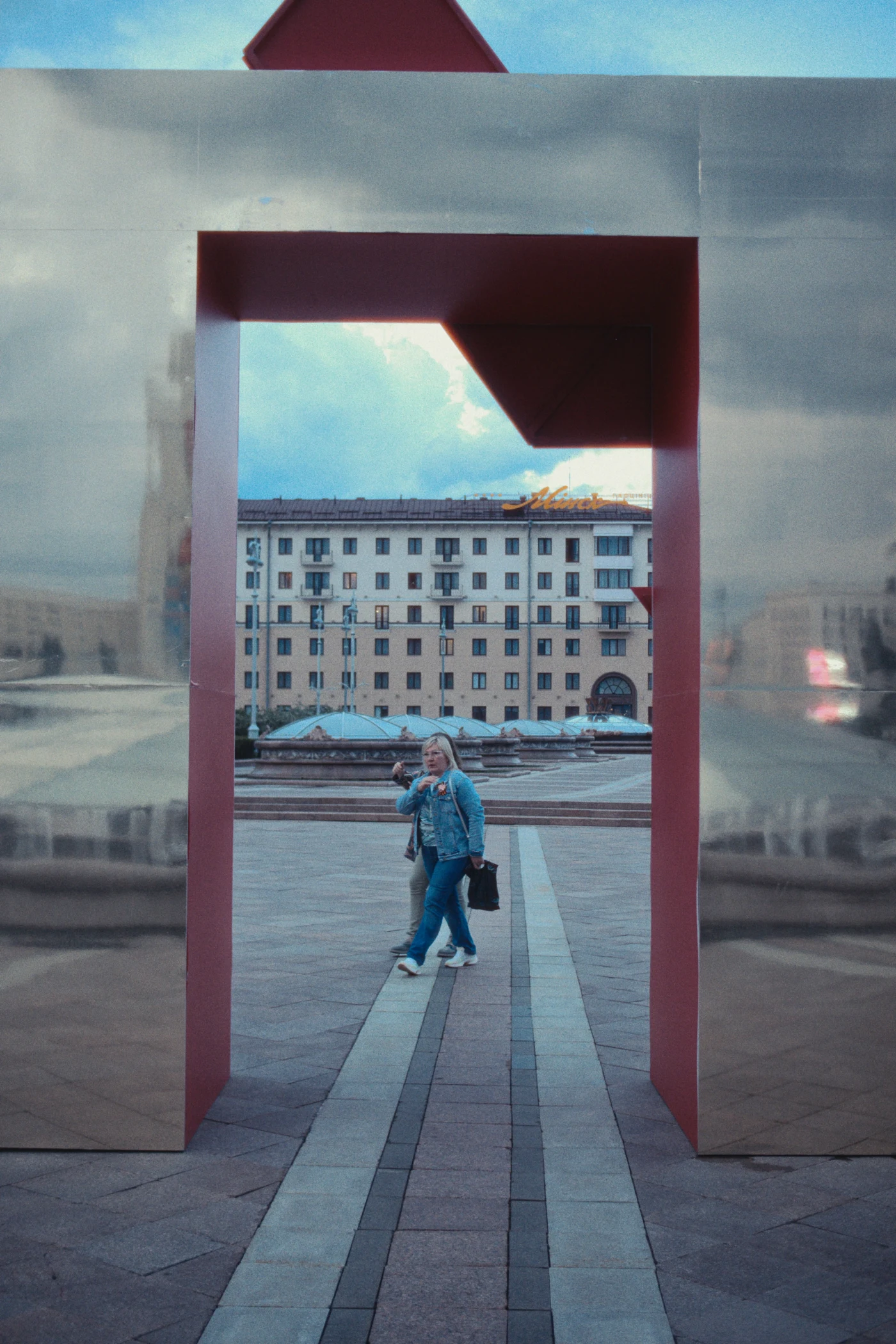
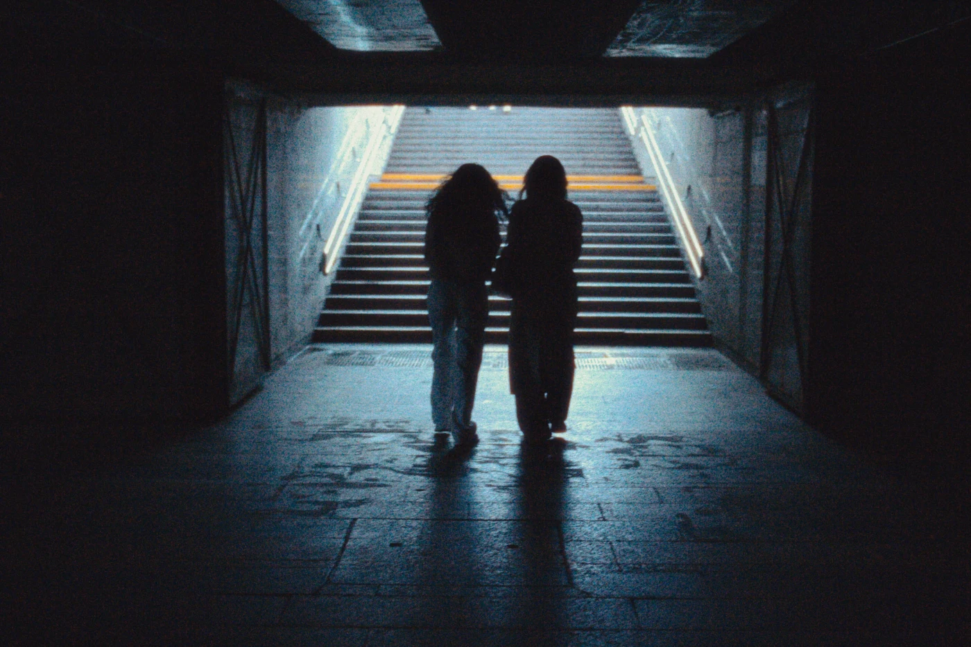
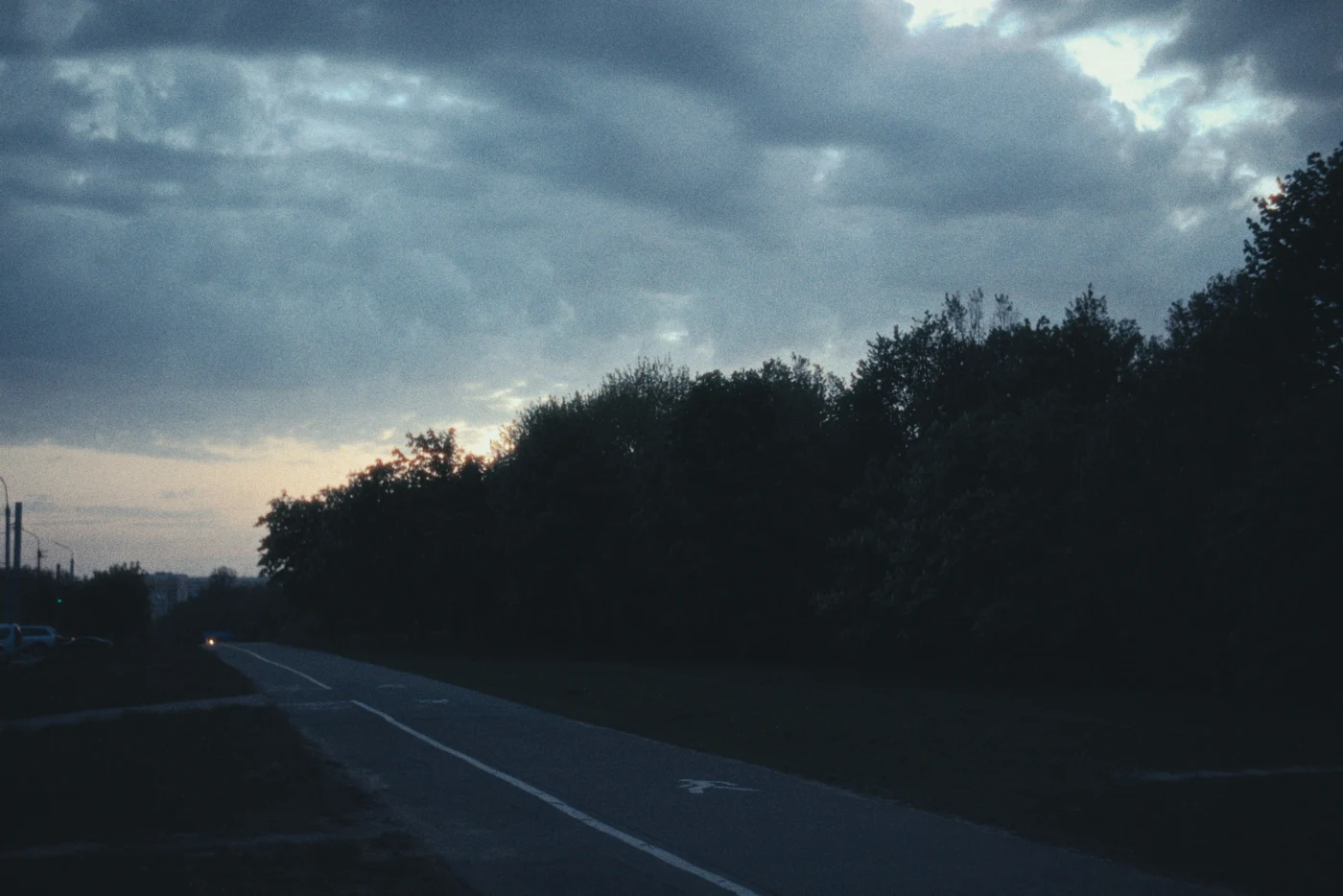
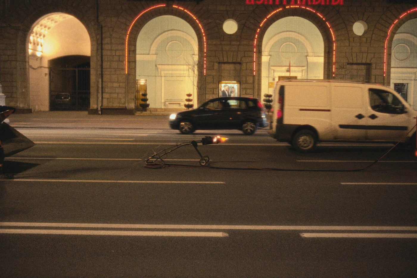
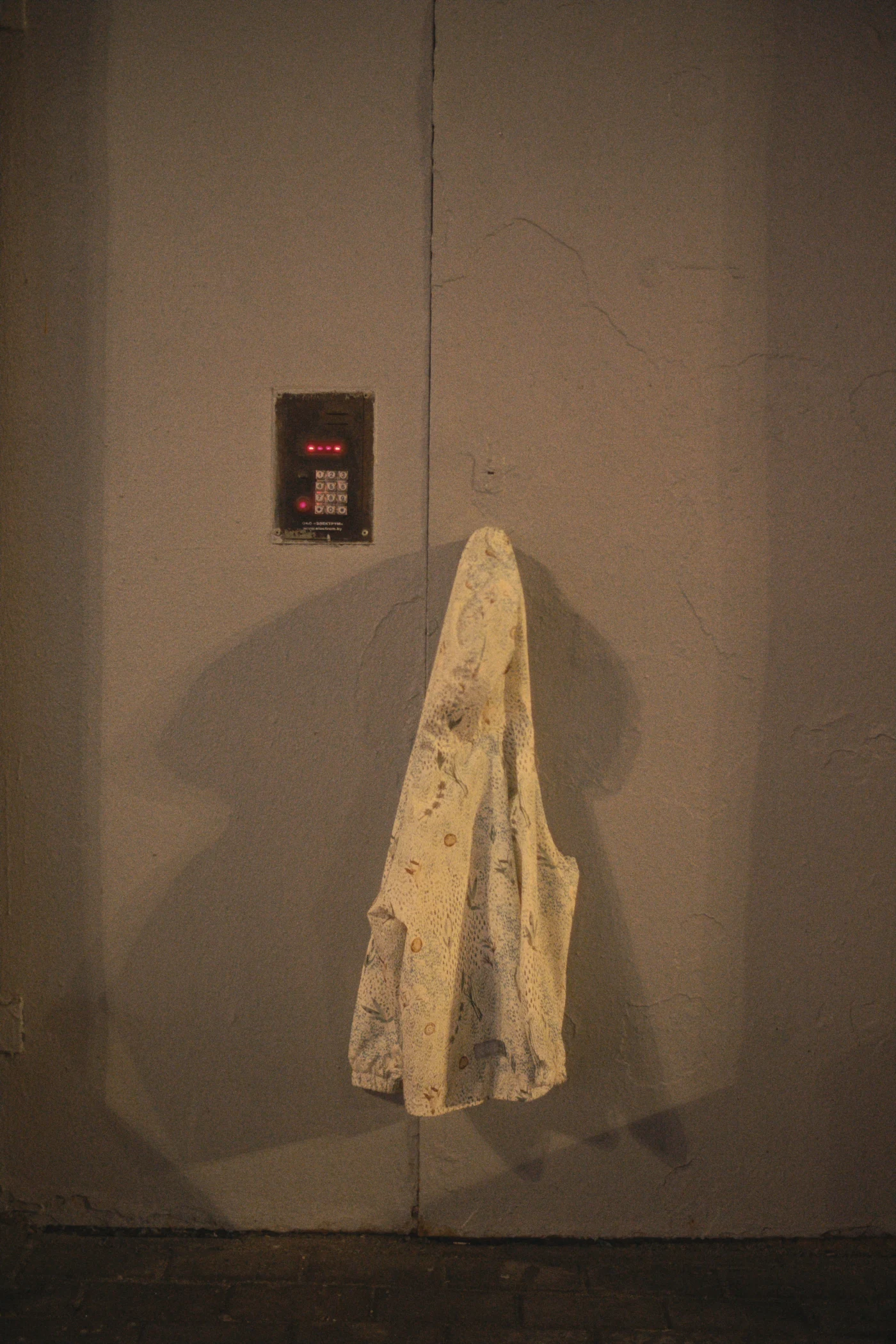
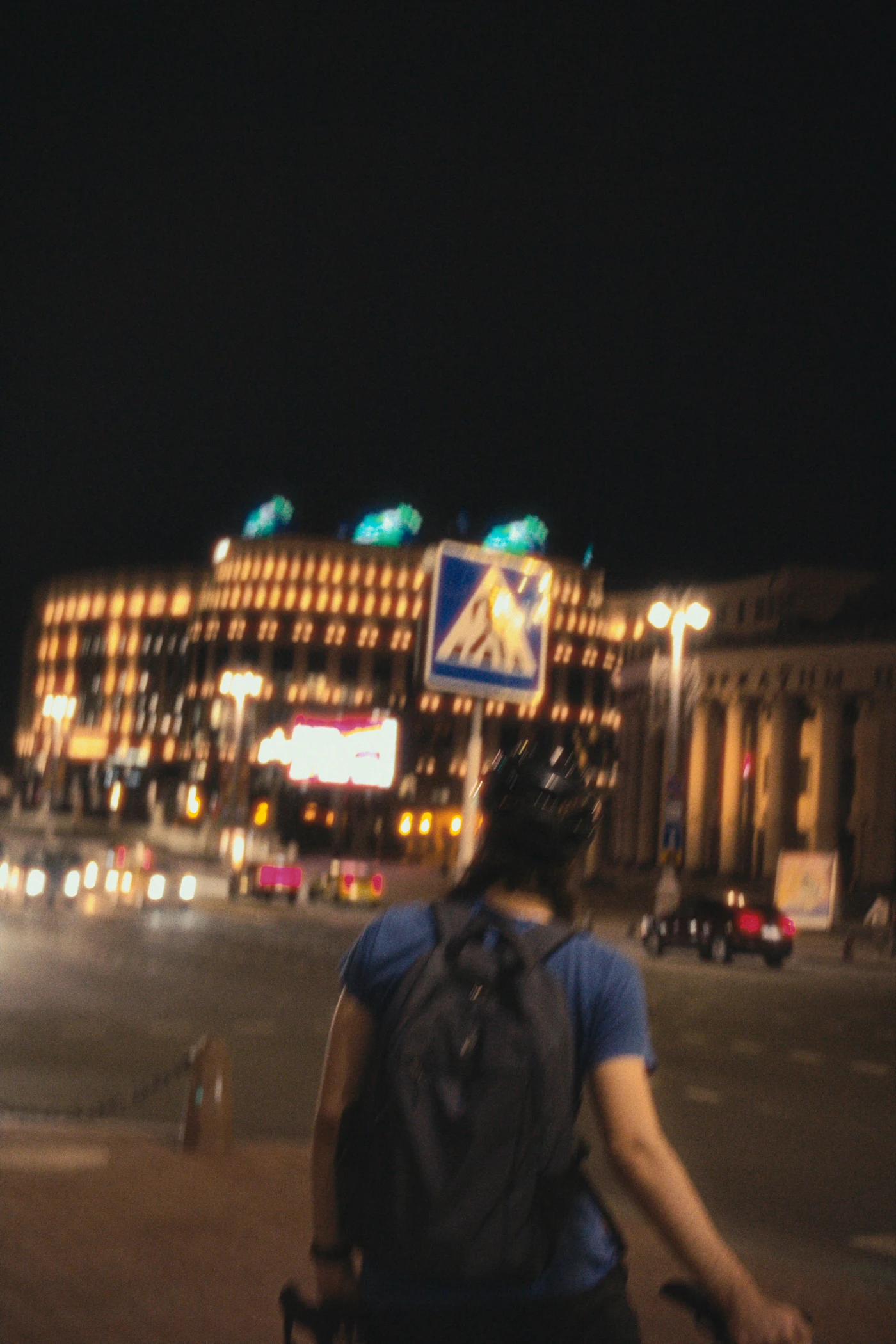
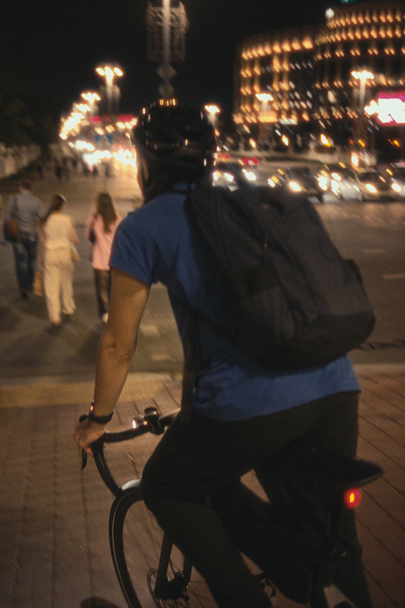
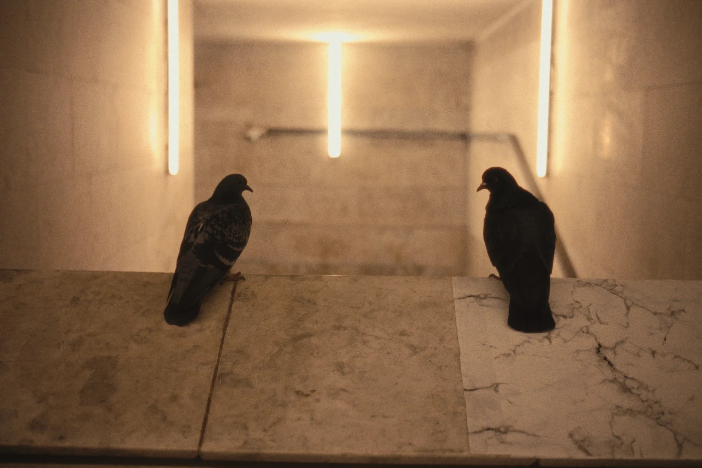
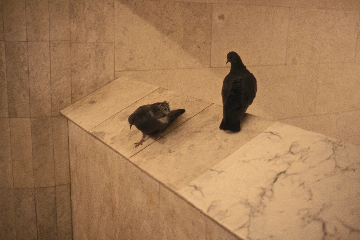
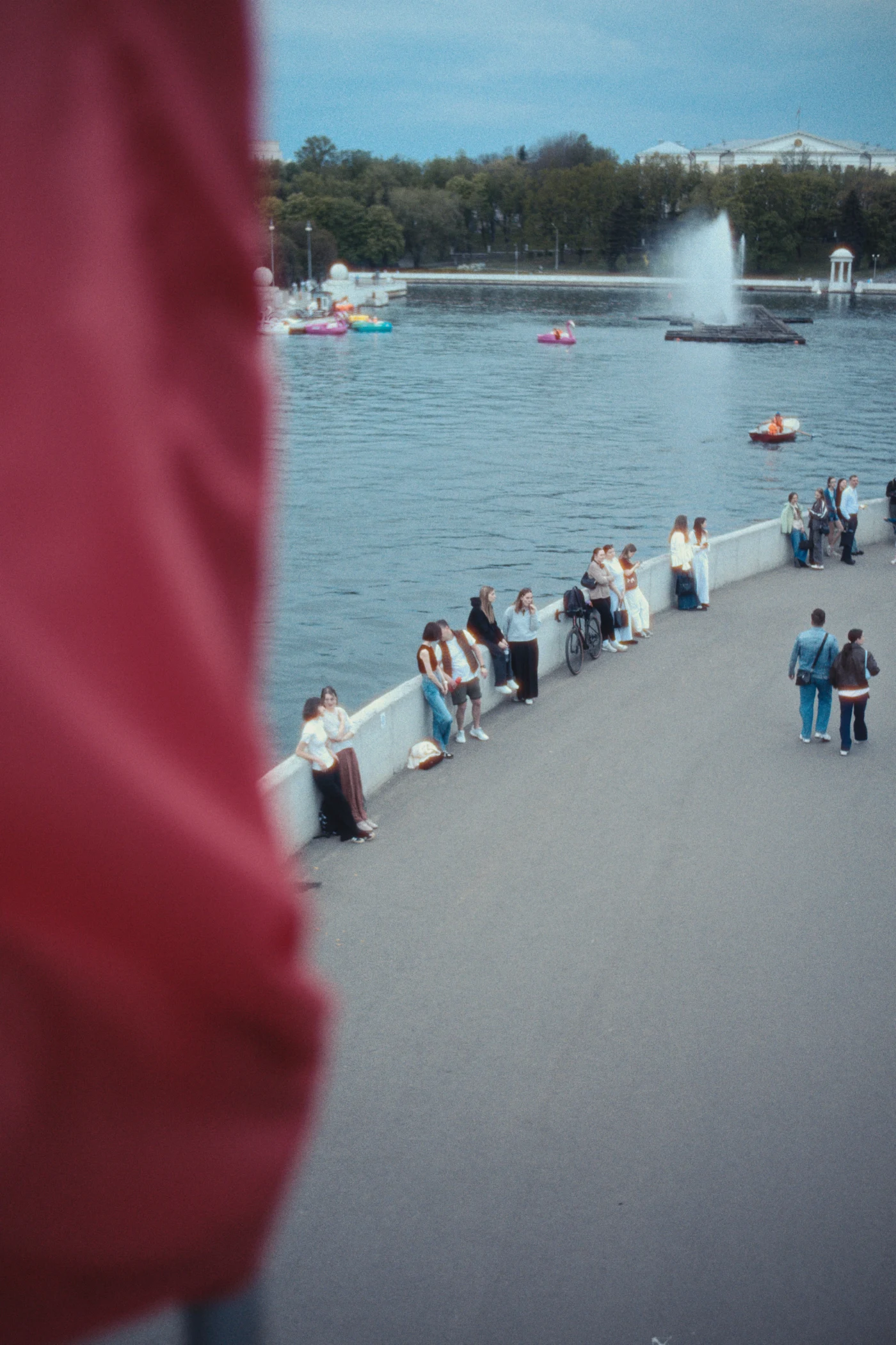
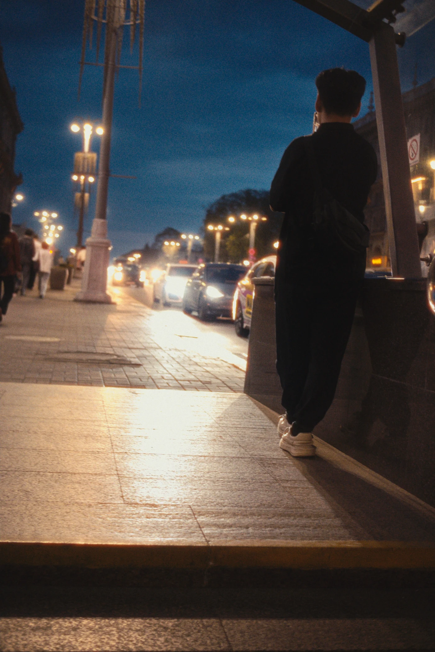
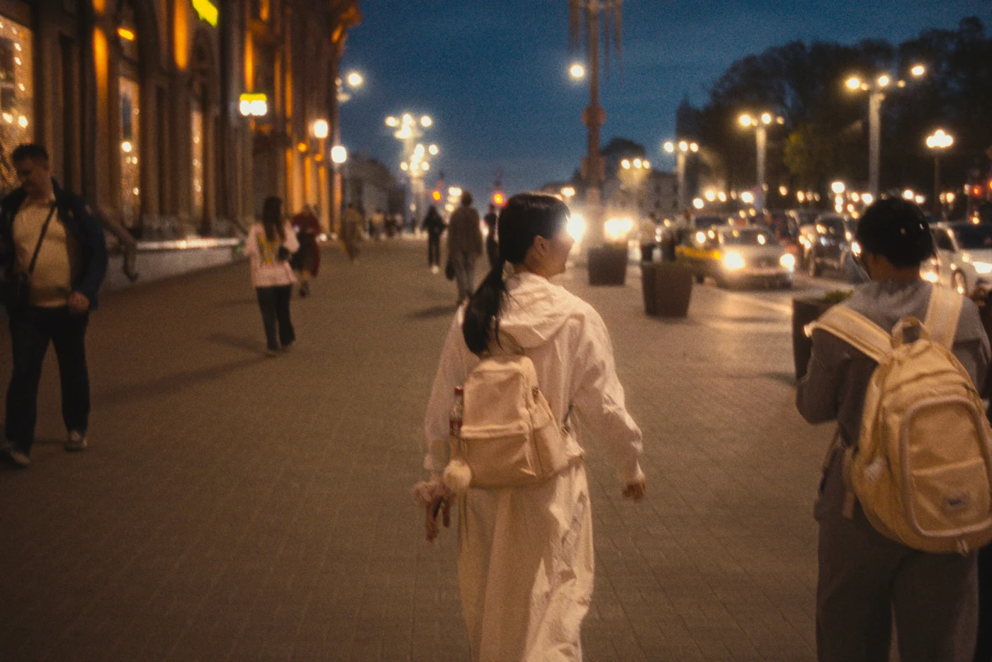
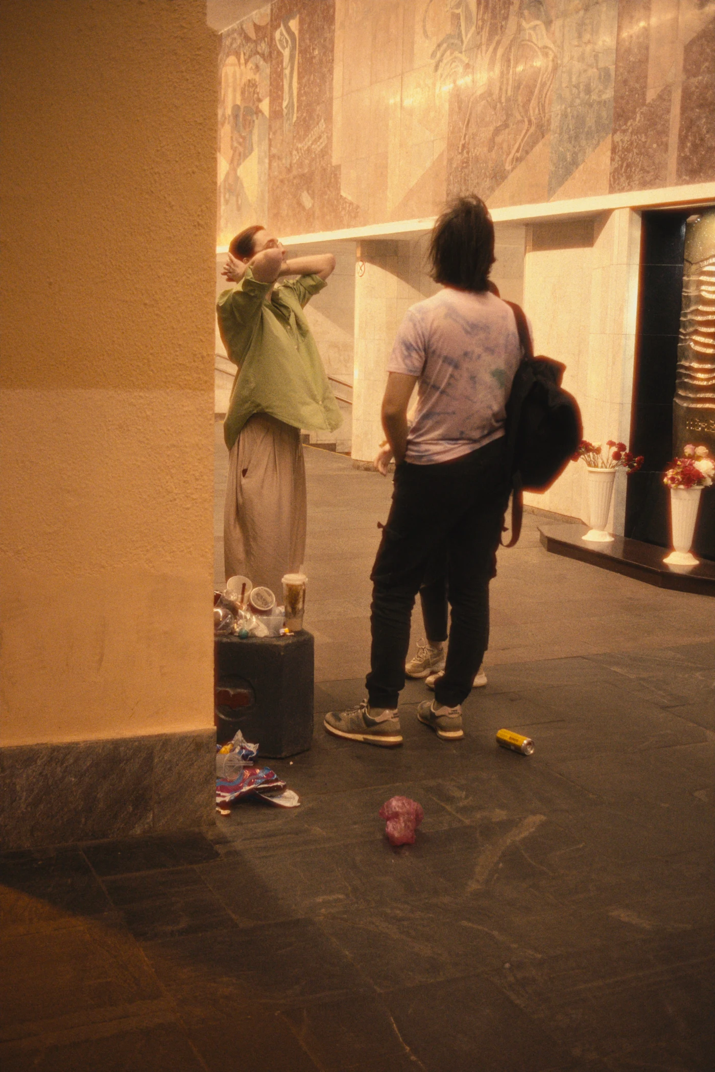
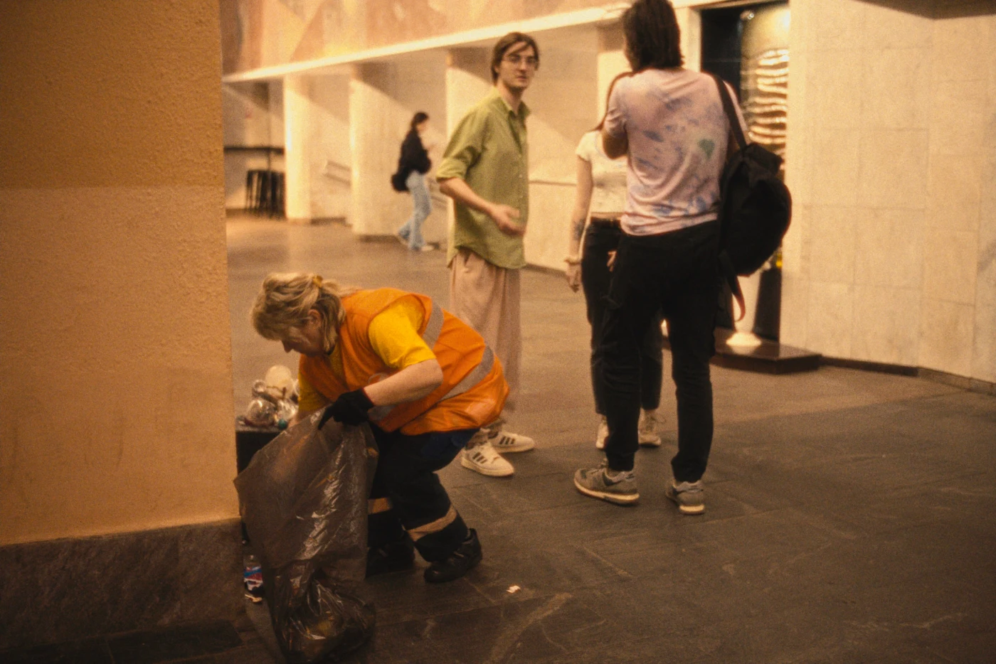
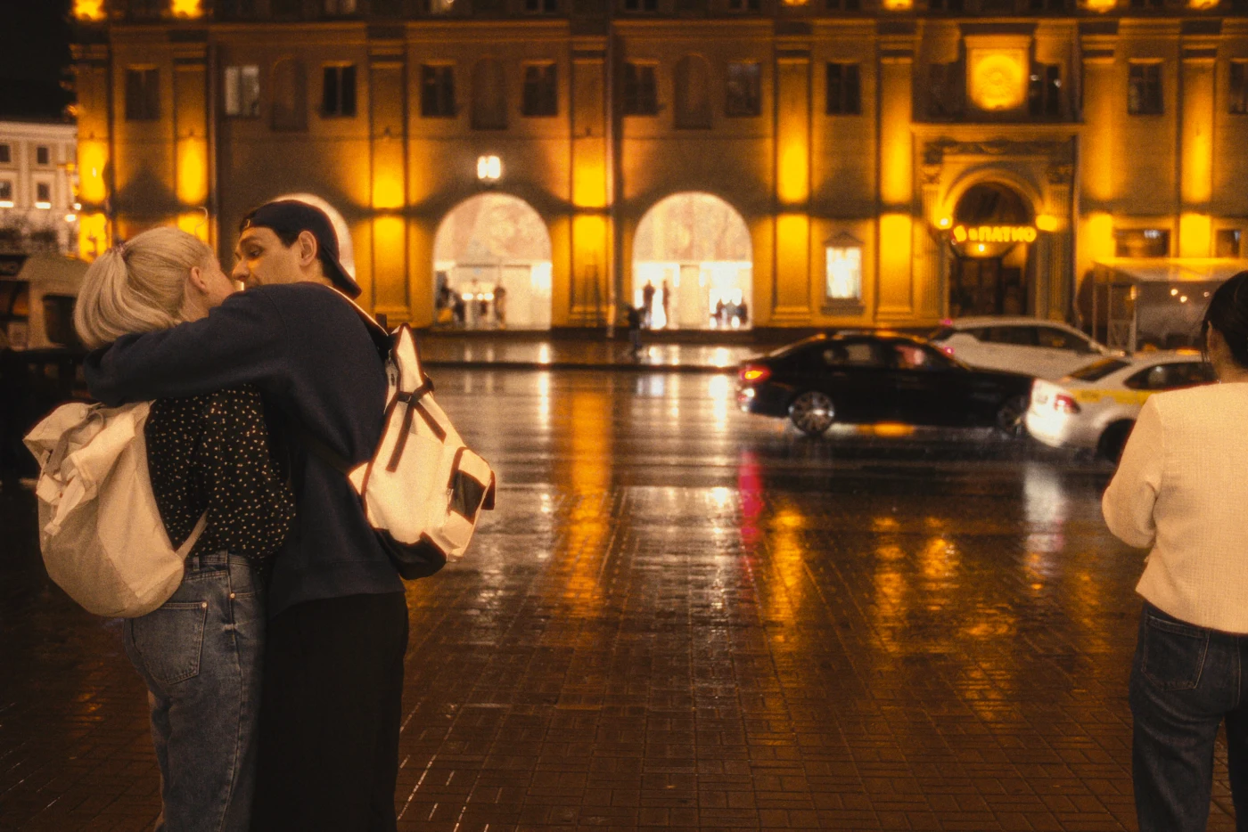
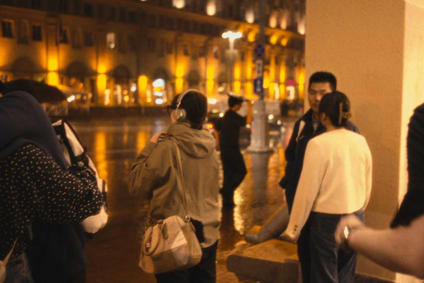
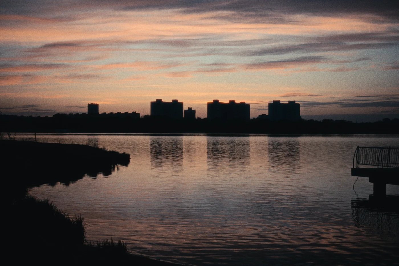
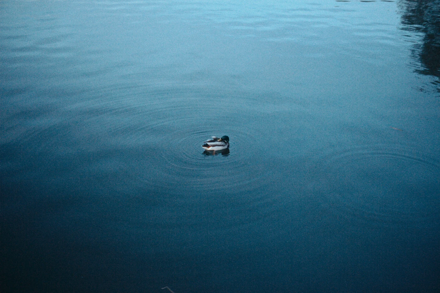
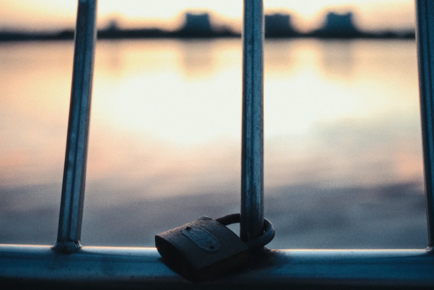
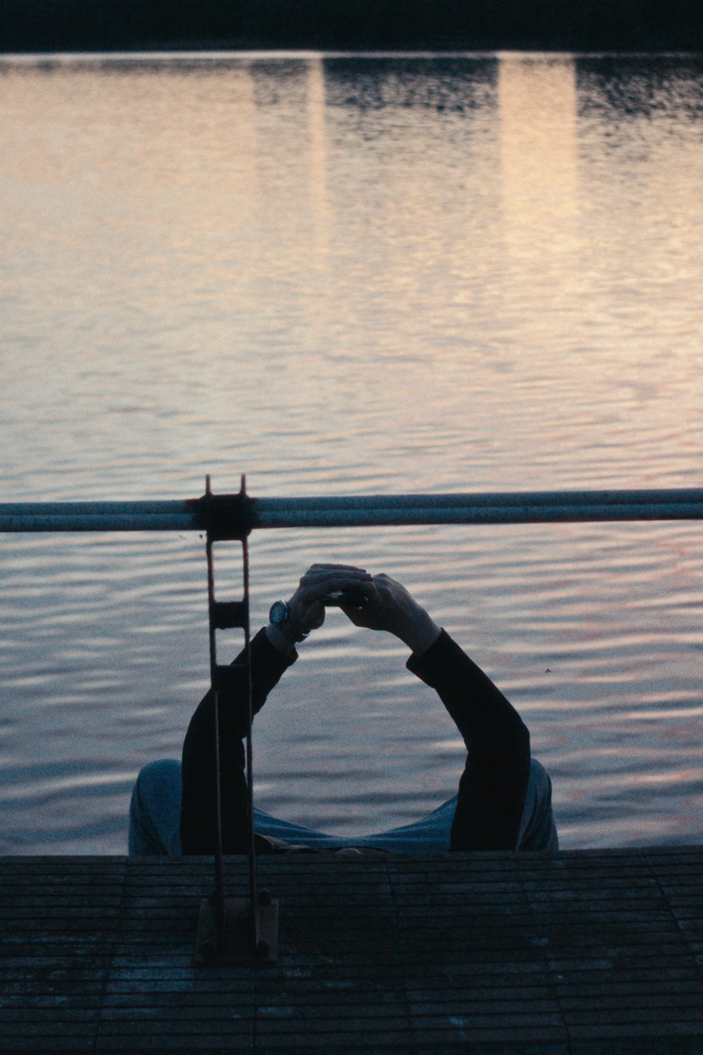
Sometimes you take a few accidental shots, and later realize there’s already a scene between them.
I’m realizing more and more how alien LinkedIn feels to me.
Not just uninteresting. Not just inconvenient. Alien in its very structure. It is a space of corporate busyness, robotic politeness, and constant self-packaging. There, a person seems to turn themselves in advance into a job description, a career signal, a neat professional silhouette.
And at some point I realized: I don’t want to be there even formally.
A good professional is not made of competencies alone. They are made of taste, character, attentiveness, experience, strangeness, pain, curiosity, mistakes, pauses, inner fire.
And LinkedIn seems to say:
“No, no. Leave only the title, the case study, the achievement, the team thank-you, and five bullet points about leadership.”
Not a person. A profile.
P.S. Symbolic how it turned out: May 1.
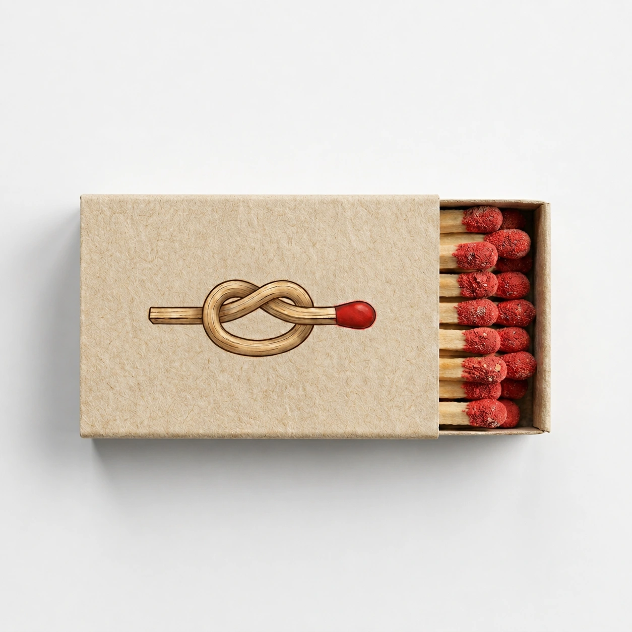
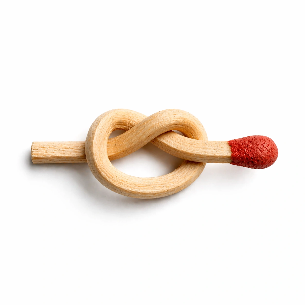
I wanted to make the packaging of an ordinary matchbox more noticeable and interesting. The visual idea is based on a match tied into a knot. I was interested in the paradox: a simple and familiar object begins to be perceived differently when its form becomes impossible.