March 4, 2026
[С01 → D01]
I designed a logo for my personal media archive — Sirius.
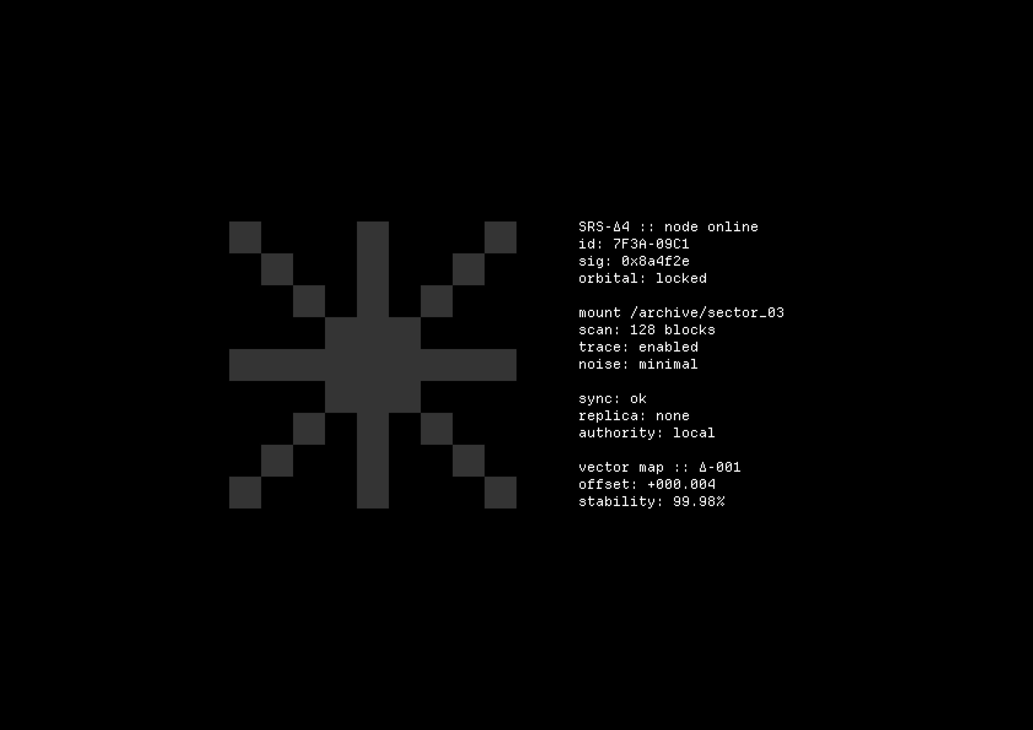
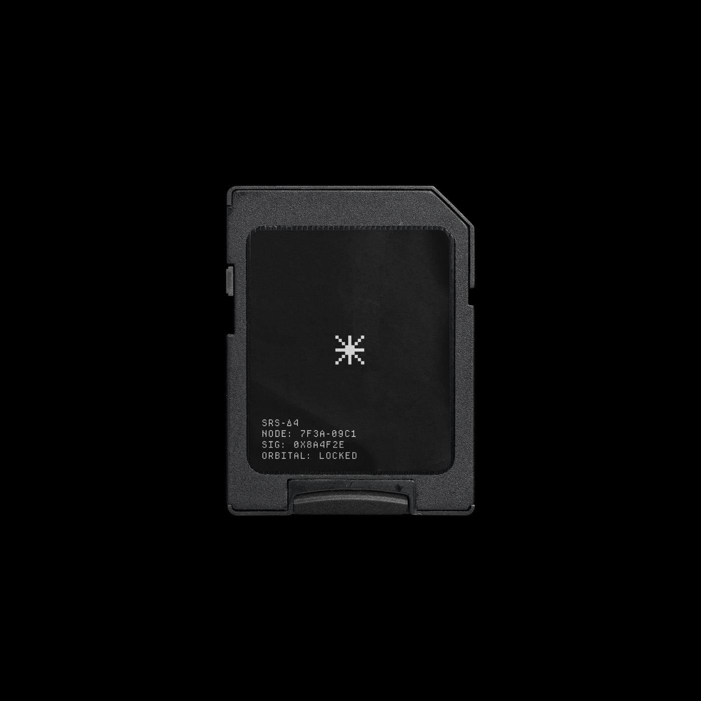
I designed a logo for my personal media archive — Sirius.


I’ve started rereading Rework (the English edition is titled Rework: Change the Way You Work Forever), and the first chapter is called “Ignore the Real World.”
I realized how my attitude toward these kinds of bold concepts has changed:
Now I look at it positively. Maybe I’ve simply come to see that rules and norms allow for mistakes. That doesn’t mean the mistaken thing will take root (probably not). But as a designer, I understand that experiments and play are necessary.
That’s what design thinking is. Not the version with sticky notes on a wall, but the one about understanding the balance between norms and errors.
I want to understand why dictating text works not only as a speed boost, but as a different mode of thinking.
I used to talk about fast capture, but it’s not just about speed. In an interview, Andy Matuschak mentioned that he walks around the room and dictates text instead of typing. What caught my attention wasn’t that it’s faster, but that speaking seems to switch off the inner editor. When you type, you’re constantly tweaking, deleting, rewriting, and that can look like thinking. But sometimes it’s more like a brake.
I had often heard about this, but I could never truly grasp the idea myself. I’m talking about the fact that notes, in any format or medium, are first and foremost for ourselves.
Earlier, inspired by Luhmann, Matuschak, and others, I wrote notes because “that’s what you’re supposed to do.” I had heard they worked, that “evergreen” notes should produce some kind of effect in the future. I believed it, but I didn’t really understand what it meant for a note to “work.” Of course, I enjoyed writing, and that gave me energy to continue, but from time to time I would find myself facing a concrete wall with a large inscription: “WHY?”
Another small tool for my workspace. And one more logo.


I created a small tool for my workspace and decided to design a logo for it. It matters to me that even a utilitarian thing has a simple, recognizable cover: in the Obsidian interface, in the repository, and in the portfolio, the project immediately comes together as a coherent object instead of looking like a collection of files.
This is not about a brand or a service, but about a neat working tool. There is a calm version for everyday use, and an accent red one for moments when you want to present the project as a standalone artifact.