May 10, 2026
[С01 → D01]
In feed all projects in general
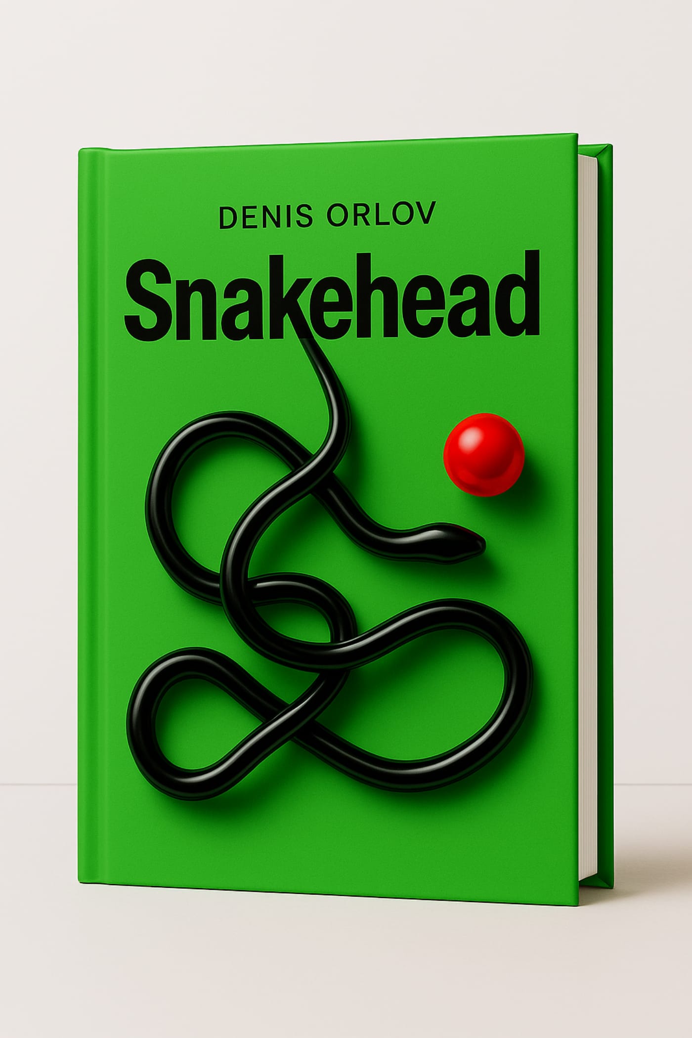
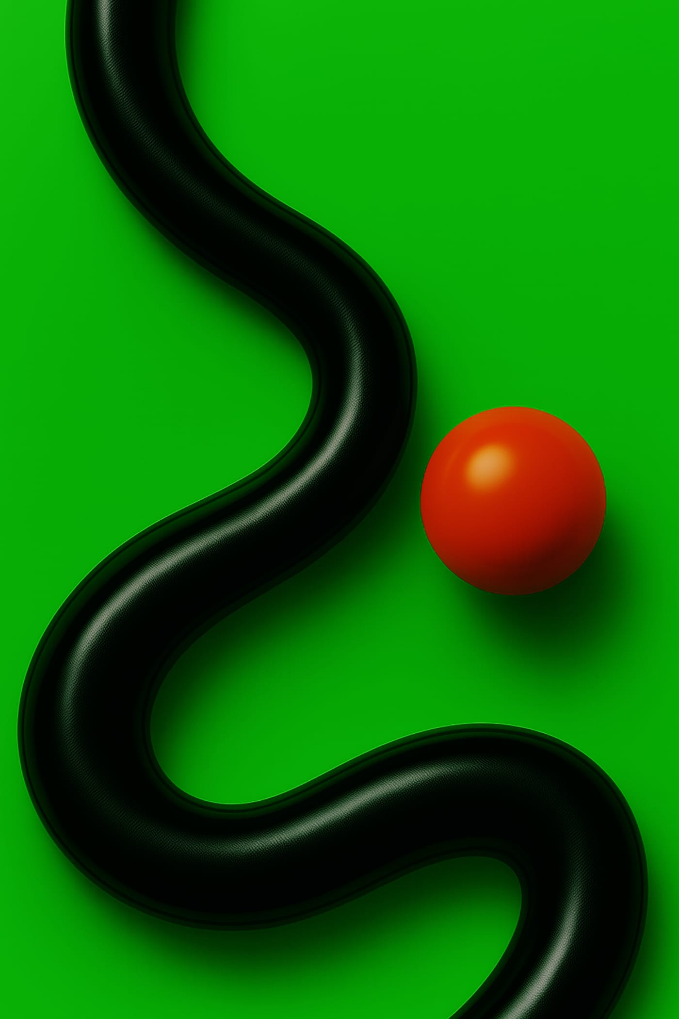
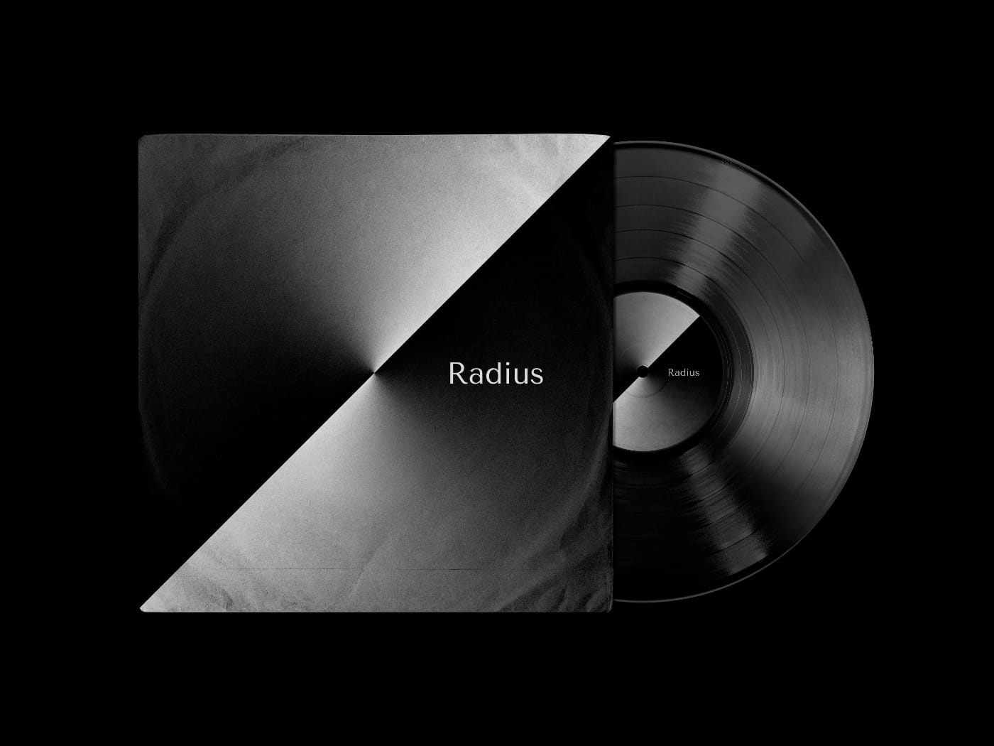
Title, concept, and visual identity of Denis Orlov’s novel.
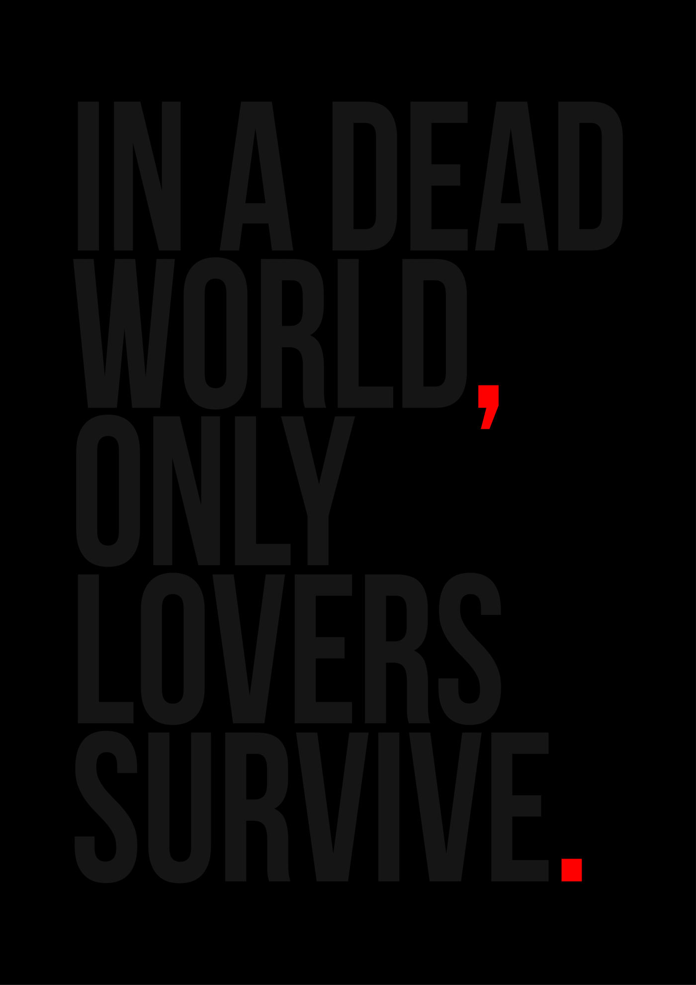
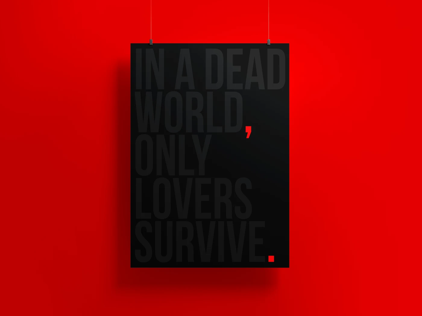
This is a novel about a man who follows an elusive goal. His movement becomes a form of existence and a way not to disappear. He lives in a new environment where the familiar has lost its shape. The world around him loses density, turning into a network of reflections and surfaces. Reality feels like a program, and its glitch holds the memory of the past. He is not looking for an answer but for the sensation of purpose, like a snake reaching toward a point that cannot be caught.
Usually a designer joins the process when the idea is already complete and only the text needs to be shaped. Here it’s different. At an early stage, we work with the author to identify the story’s core, define its axis and title. From this foundation emerges the concept, which evolves into a visual language and image that set the direction for the novel.
The cover and visual imagery are not decoration. They are part of the statement, the same line that resonates in the text. The visual code makes meaning visible, giving the story form and a point of entry for the reader.
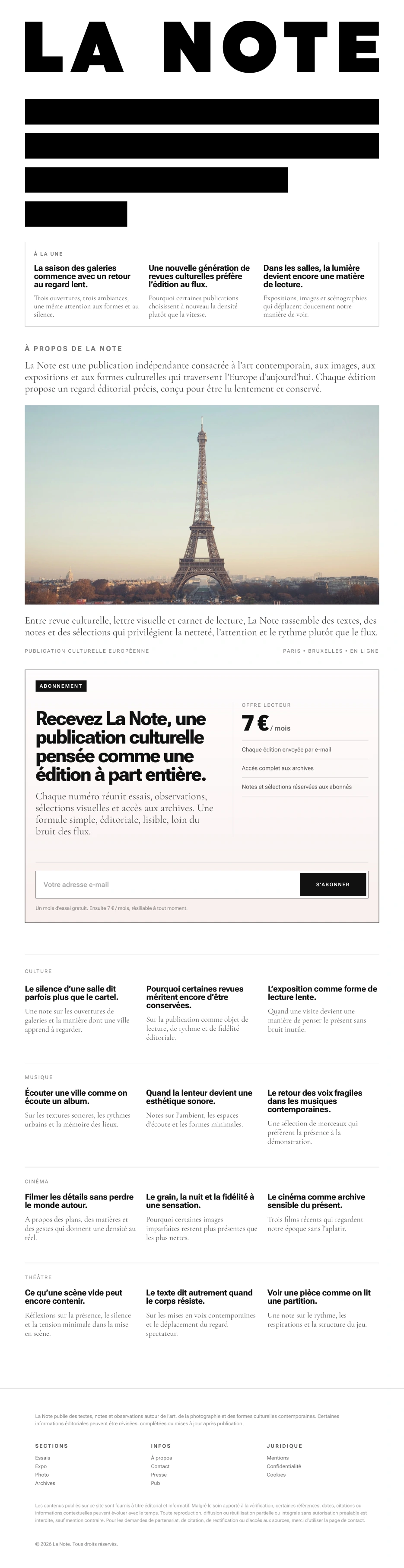
My task was to create the visual identity for LA NOTE, a digital cultural publication focused on contemporary art, exhibitions, photography, and the emerging artistic scenes of Paris. The project was conceived as a subscription-based media platform with a clear editorial rhythm, where each issue is built not around the news cycle, but around a single theme, a single observation, or a single cultural shift. From the outset, the visual language was intended to convey not decoration, but focus, precision, and editorial rigor.
Initially, the client expected a more refined, distinctly French-style logo, with serifs and a recognizable Parisian cultural tone. I proposed a different approach and built the mark around dense typography, rhythm, and the discipline of print layout. This led to a logo in which the name merges with abstract lines of text, immediately setting the tone for the publication.
The next task was to reduce the mark without losing its character. The shortened version was created for situations where the full logo would be impossible or impractical to use: in limited space, at small sizes, and across more compact formats. At the same time, it was important to me that it would not feel like a simplified symbol, but would retain the core elements, structure, and rigor of the original solution. As a result, the reduced version works as an independent part of the system while preserving the character of the main mark.
After creating the mark, I translated this logic into the publication’s homepage. Here, the visual identity unfolds more fully and operates not only through the logo, but through the editorial structure itself. Article previews, the introductory block about the publication, a strong visual focal point, sections, and subscription are brought together into a single, coherent system. It was important to me that the homepage would not simply present LA NOTE, but immediately show how the publication is structured, what kinds of themes it engages with, and what reading rhythm it offers.
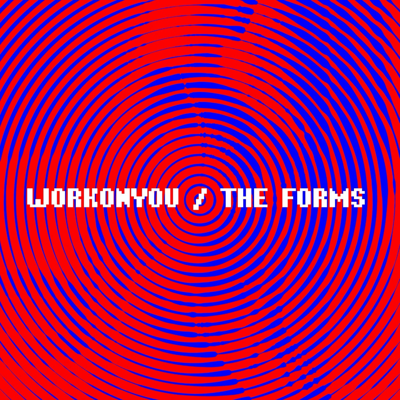
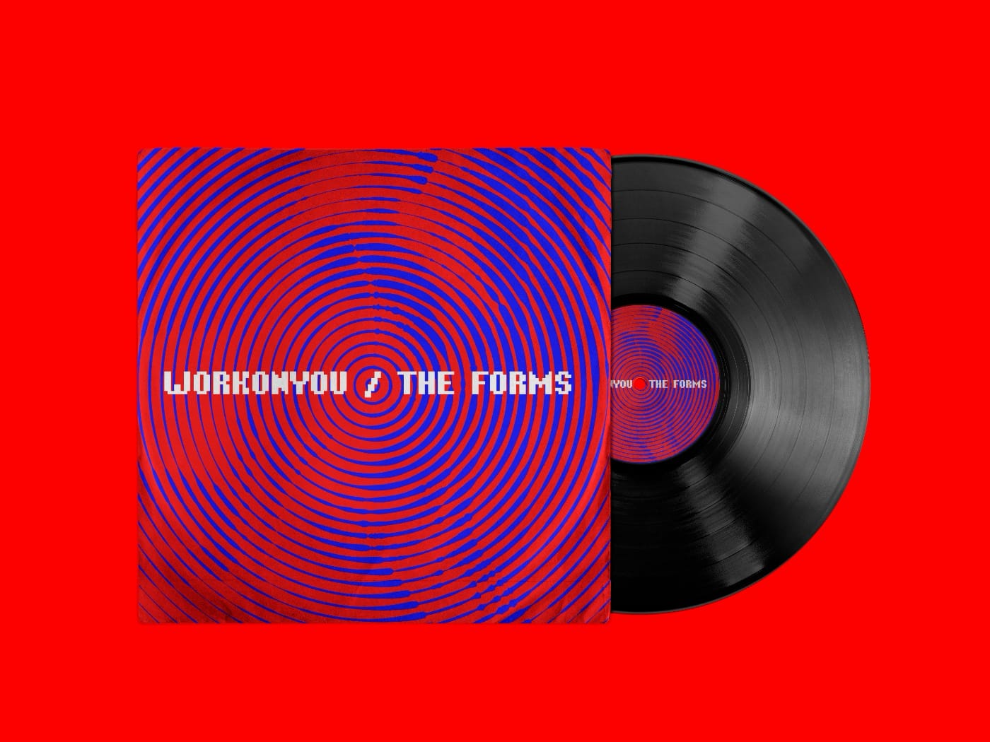
WORKONYOU - THE FORMS
Designed the cover, the music is still on its way.
This poster is a reflection on the standardization of thought, on the habit of hiding behind ready-made forms. On people who choose convenient packaging over living presence.
Canned — a symbol of how we preserve ourselves: sealed, sterile, faceless. But inside — there’s still a human. Maybe.
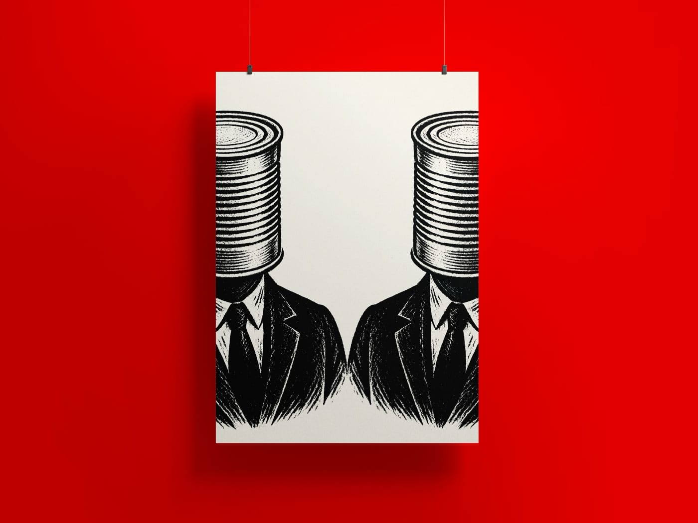
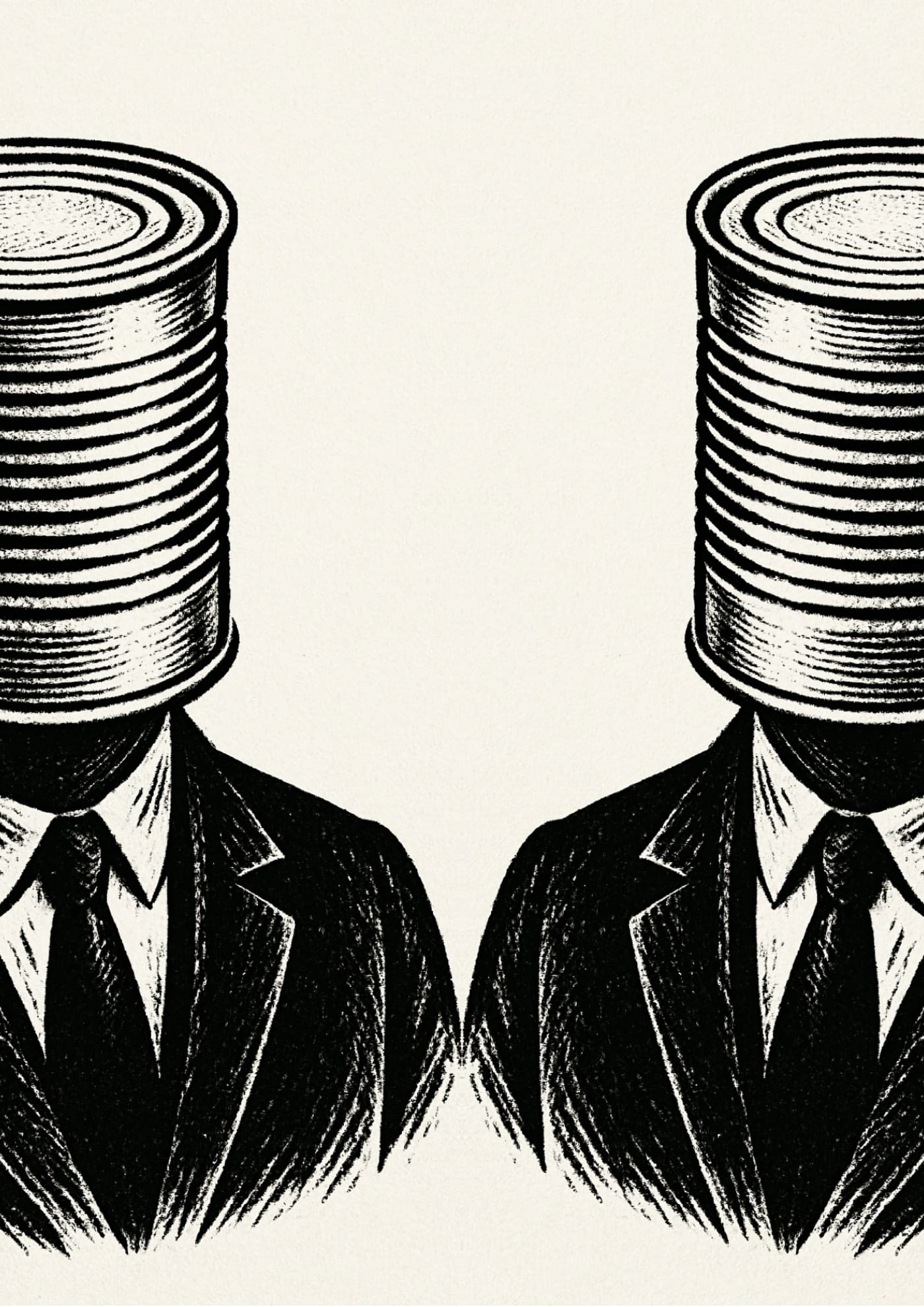
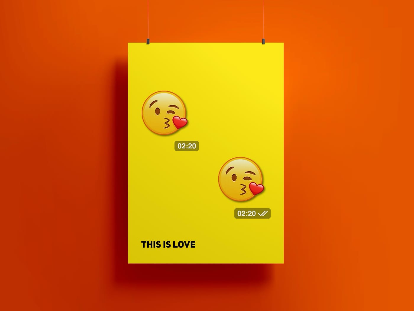
Remade the poster “Icon of This Age”. The new version is simpler.

Designed the album cover.

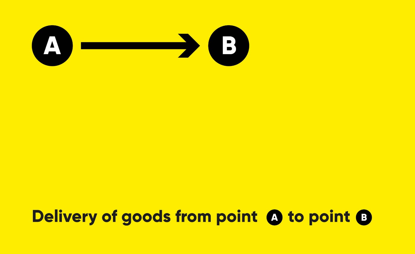
The task was to create a brand identity for a cargo delivery company. Transportation companies today have a similar style, do not stand out and are not memorable. For example, in Russia (and the CIS countries), many transportation companies are called “Transauto”, “Transtechtsal”, etc. I wanted the name to stand out, reflecting the delivery process - from point A to point B.
Deadlines are abstract concepts that are represented by calendar events or phone reminders. But what if we could make them real? I came up with a device (and created its logo) that has only one function: to show deadlines.
![]()