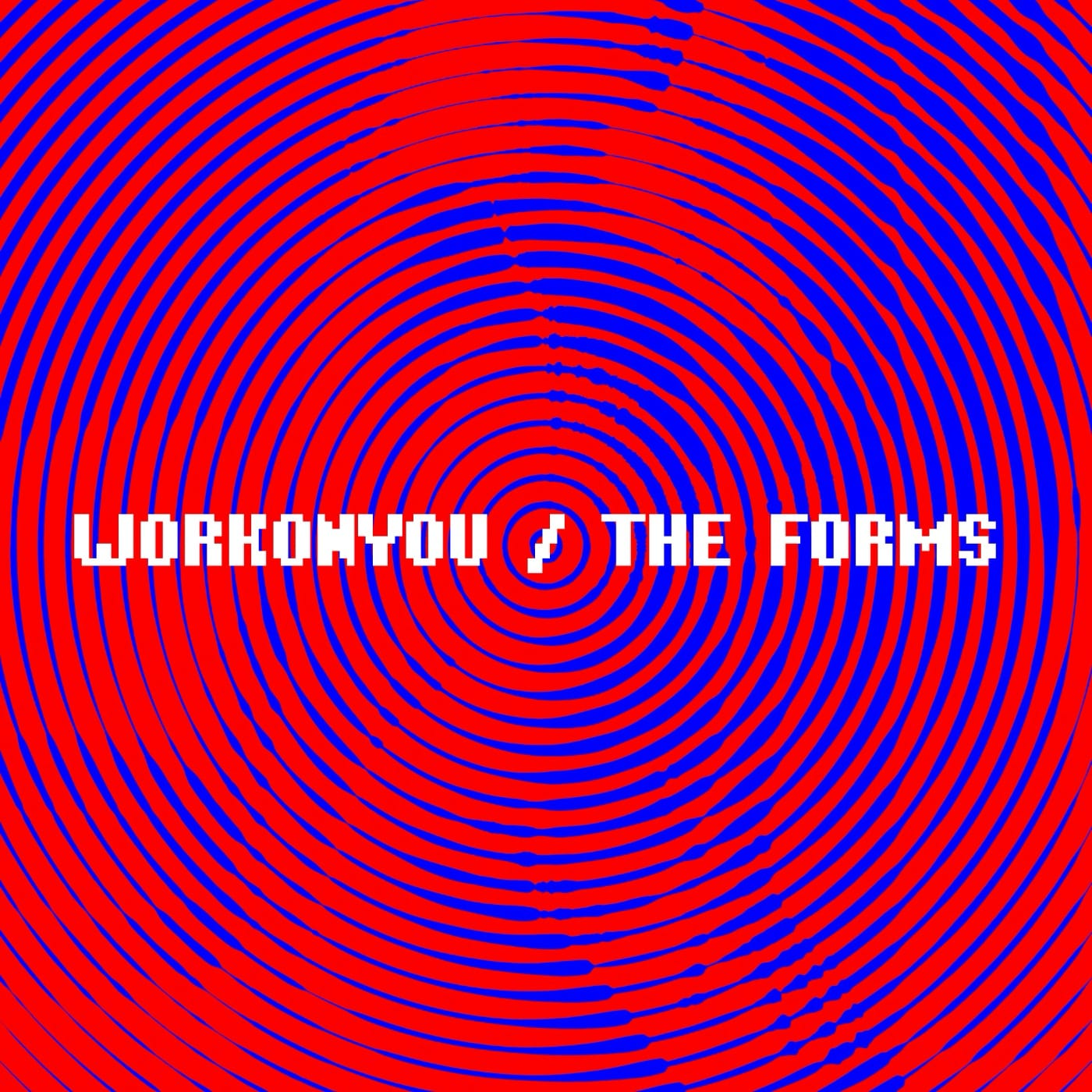
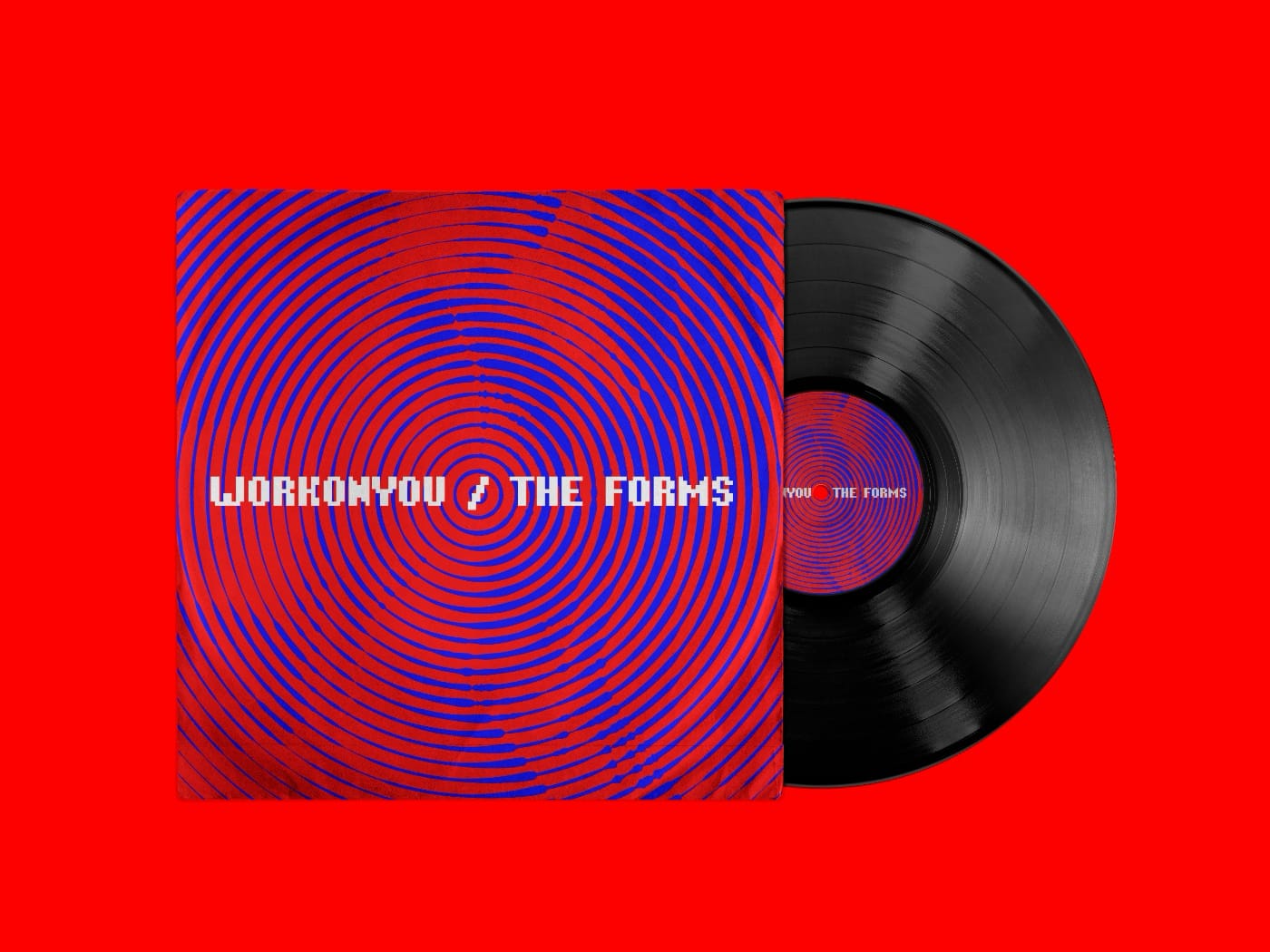
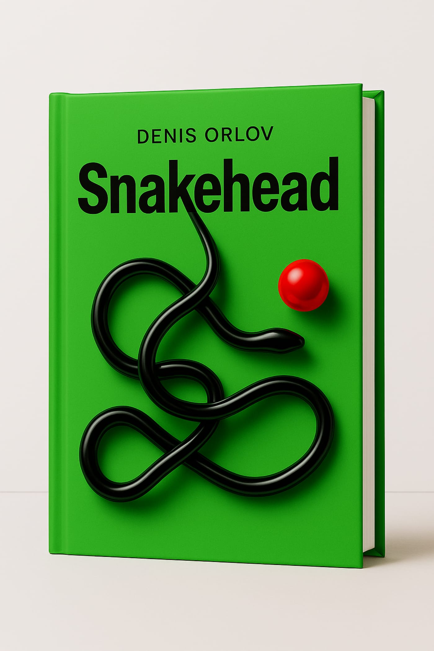
Title, concept, and visual identity of Denis Orlov’s novel.
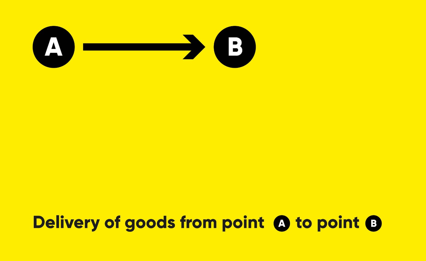
This is a novel about a man who follows an elusive goal. His movement becomes a form of existence and a way not to disappear. He lives in a new environment where the familiar has lost its shape. The world around him loses density, turning into a network of reflections and surfaces. Reality feels like a program, and its glitch holds the memory of the past. He is not looking for an answer but for the sensation of purpose, like a snake reaching toward a point that cannot be caught.
Usually a designer joins the process when the idea is already complete and only the text needs to be shaped. Here it’s different. At an early stage, we work with the author to identify the story’s core, define its axis and title. From this foundation emerges the concept, which evolves into a visual language and image that set the direction for the novel.
The cover and visual imagery are not decoration. They are part of the statement, the same line that resonates in the text. The visual code makes meaning visible, giving the story form and a point of entry for the reader.