Identity "A — B"
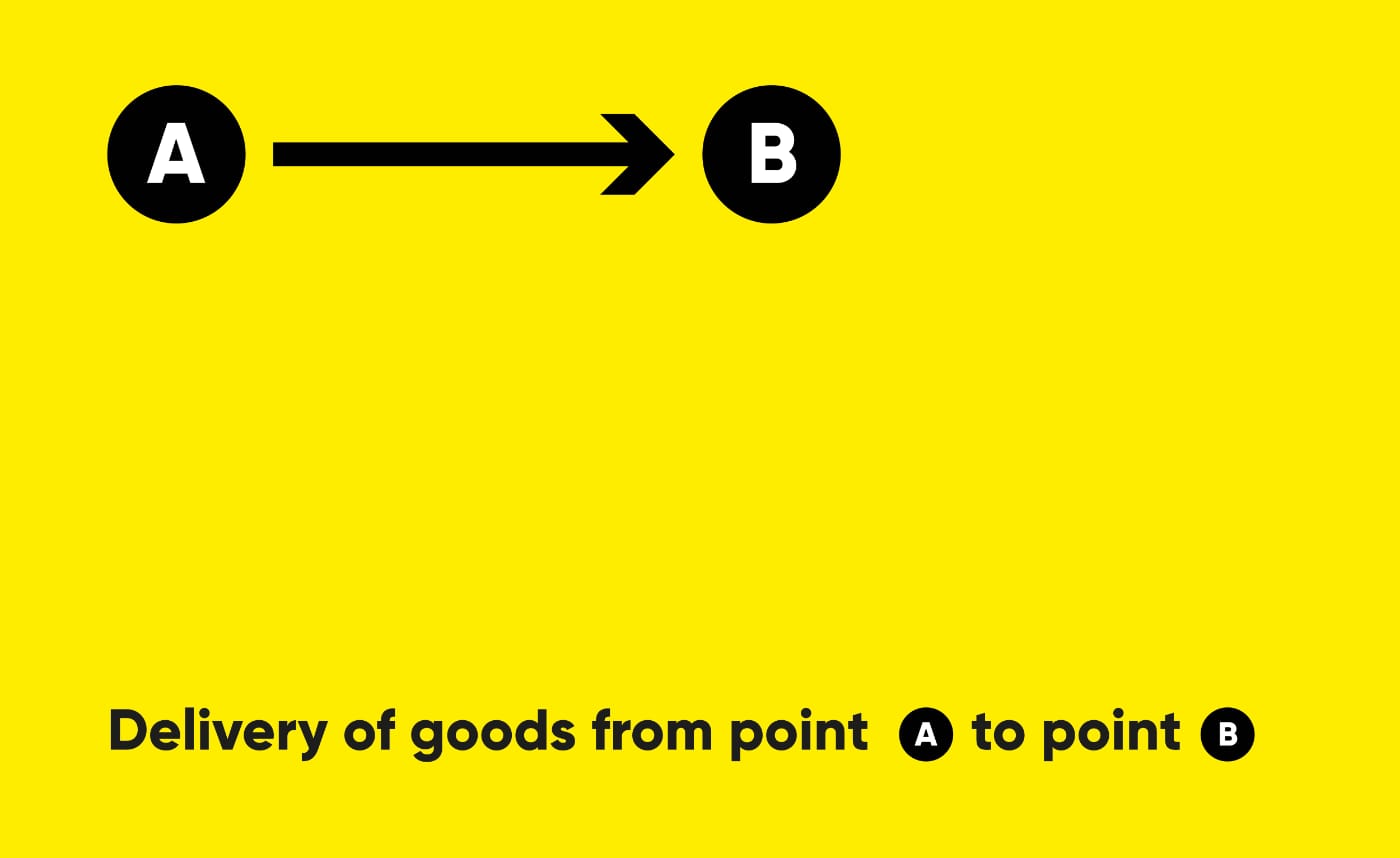
The task was to create a brand identity for a cargo delivery company. Transportation companies today have a similar style, do not stand out and are not memorable. For example, in Russia (and the CIS countries), many transportation companies are called “Transauto”, “Transtechtsal”, etc. I wanted the name to stand out, reflecting the delivery process - from point A to point B.


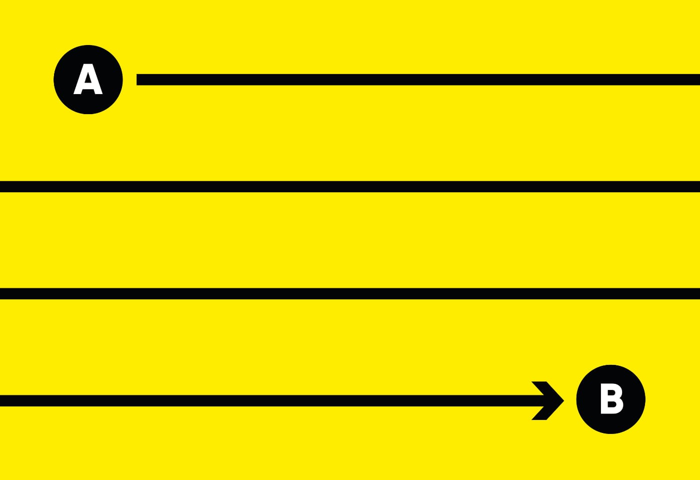
The line between A and B symbolizes the journey. We can use this graphic element in various media. The viewer sees points A and B, as well as the path between them, which can be long or short.

The logo is independent of the font: any font and style can be used. A — B is easy to read, fits into the context, and can be used on a billboard or in an SMS message without losing meaning.
